General
💬
"Trusted by professionals worldwide."
Why it works
Emphasizes credibility and reputation through social proof.
Visual translation
Clean typography, neutral colors (navy, gray), balanced layout, professional spacing.
Real examples reveal how ethos builds authority, pathos creates emotional resonance, and logos delivers clear, evidence-based arguments.
Understanding ethos, pathos, and logos becomes clearer through examples. Each appeal creates persuasion differently: ethos through credibility, pathos through emotion, and logos through logic. These examples show how to recognize and apply each appeal effectively.
Find examples by industry and goal
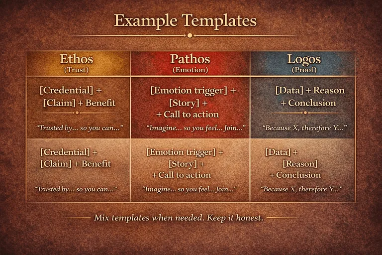
Use these templates to craft your own persuasive messages
Building credibility and trust
"Trusted by professionals worldwide."
Emphasizes credibility and reputation through social proof.
Clean typography, neutral colors (navy, gray), balanced layout, professional spacing.
"Over 20 years of industry expertise."
Establishes authority through experience and longevity.
Classic serif fonts, stable color palette, traditional composition, refined details.
"Certified by leading industry standards."
Builds trust through third-party validation and credentials.
Badge-like elements, official color schemes, structured layouts, quality indicators.
"Recommended by experts in the field."
Leverages authority through expert endorsement.
Professional typography, authoritative colors, clean lines, expert positioning.
"Proven track record with Fortune 500 companies."
Demonstrates credibility through prestigious client associations.
Corporate aesthetics, premium materials, sophisticated palette, executive presence.
"Award-winning design recognized globally."
Establishes excellence through external recognition and achievements.
Premium finishes, distinguished typography, refined color choices, quality craftsmanship.
"Powering innovation for leading tech companies."
Establishes credibility through association with industry leaders.
Modern sans-serif, tech-forward colors (blue, teal), geometric shapes, digital aesthetic.
"Trusted by medical professionals for 30 years."
Builds authority through longevity and professional trust in critical field.
Clean, clinical design, trustworthy blues and greens, medical cross elements, professional clarity.
"Regulated and certified by financial authorities."
Demonstrates compliance and trustworthiness through official oversight.
Secure imagery (shields, locks), authoritative navy/gold, structured grid, institutional feel.
"Endorsed by top universities worldwide."
Leverages academic authority and institutional credibility.
Scholarly typography, academic colors (burgundy, navy), traditional emblems, educational prestige.
"Preferred by leading retailers for quality assurance."
Establishes market leadership through industry preference.
Commercial aesthetics, retail-friendly colors, quality badges, market-leader positioning.
"Backed by transparent impact reporting."
Builds trust through accountability and measurable outcomes.
Honest design, earth tones, open layouts, transparency indicators, authentic imagery.
Creating emotional connections
"Imagine a future where your ideas finally stand out."
Appeals to hope and aspiration, creating emotional investment.
Warm colors (orange, yellow), expressive shapes, upward movement, optimistic energy.
"Join a community that truly understands you."
Evokes feelings of belonging and acceptance.
Friendly curves, welcoming colors, inclusive symbols, approachable design.
"Protect what matters most to your family."
Triggers protective instincts and care for loved ones.
Secure shapes (shields, circles), protective colors, nurturing tones, safe imagery.
"Experience the joy of creating something beautiful."
Appeals to desire for self-expression and fulfillment.
Vibrant colors, playful elements, creative flourishes, expressive typography.
"Never feel left behind again."
Addresses fear of missing out and desire for inclusion.
Dynamic movement, progressive colors, forward-facing design, momentum indicators.
"Celebrate your unique story."
Connects to personal identity and individual pride.
Personal touches, authentic colors, distinctive shapes, character-driven design.
"Technology that understands your needs."
Creates emotional connection through empathy and personalization.
Human-centered design, approachable tech colors, soft gradients, friendly interfaces.
"Caring for your family's health, every single day."
Evokes protective feelings and ongoing commitment to loved ones.
Nurturing colors (soft blue, green), caring imagery, gentle curves, comforting presence.
"Build the future your family deserves."
Appeals to aspirations and responsibility for family wellbeing.
Growth imagery, stable foundations, hopeful colors, forward-looking design.
"Unlock your child's full potential."
Triggers parental hopes and dreams for children's success.
Bright, optimistic colors, growth symbols, upward movement, potential indicators.
"Discover products that match your lifestyle."
Creates personal connection through lifestyle alignment and self-expression.
Lifestyle imagery, aspirational colors, personal style elements, identity-driven design.
"Together, we can change lives."
Evokes collective purpose and emotional investment in shared mission.
Unity symbols, warm community colors, connected elements, collaborative imagery.
Persuading through logic and evidence
"Our system cuts design time by 50%."
Uses measurable, quantifiable claim backed by data.
Simple geometry, strong hierarchy, clear structure, data-driven aesthetics.
"Three simple steps to complete results."
Presents logical process and clear methodology.
Sequential elements, numbered indicators, process flow, systematic layout.
"Proven formula: input + process = output."
Demonstrates cause-and-effect relationship logically.
Mathematical precision, balanced equations, logical flow, structured composition.
"Compare features side-by-side and decide."
Encourages rational evaluation through direct comparison.
Grid layouts, comparison tables, organized information, analytical presentation.
"Based on 10,000+ data points analyzed."
Supports claims with substantial evidence and research.
Data visualization, chart elements, analytical colors, information-rich design.
"If A, then B. Simple cause and effect."
Uses logical reasoning and clear conditional statements.
Arrow indicators, logical connectors, clear pathways, rational structure.
"99.9% uptime guaranteed by infrastructure data."
Provides specific, verifiable metric demonstrating reliability.
Technical precision, system diagrams, reliability indicators, performance metrics.
"Clinically proven effective in 50+ peer-reviewed studies."
Supports claims with rigorous scientific evidence and research.
Scientific aesthetics, research-backed imagery, clinical colors, evidence-based design.
"Average 15% ROI based on 5-year client data."
Presents concrete financial outcomes with specific timeframe.
Financial charts, growth indicators, ROI visualization, performance data.
"Students improve test scores by 25% on average."
Quantifies educational outcomes with measurable improvement.
Progress bars, achievement metrics, educational data, improvement indicators.
"Rated #1 in customer satisfaction for 3 consecutive years."
Provides verifiable ranking with consistent track record.
Award badges, ranking indicators, satisfaction metrics, competitive positioning.
"92% of donations directly fund programs (verified annually)."
Demonstrates transparency with specific, audited allocation data.
Transparency charts, allocation diagrams, accountability indicators, verified data.
Learn how to transform messaging into visual direction
Extract the main persuasive element from your example. What is the primary feeling, claim, or authority being established?
Pull out descriptive words that suggest visual direction. Look for adjectives, emotions, or qualities that translate to design.
Define the overall aesthetic approach. Consider whether the design should be modern, classic, minimal, bold, or playful.
Choose colors that reinforce your message. Ethos uses professional tones, pathos uses emotional colors, logos uses clear contrasts.
Merge all elements into a clear, actionable prompt. Start with the goal, add visual keywords, specify style, and include color guidance.
"Trusted by professionals worldwide"
Create a professional logo that conveys trust and global credibility. Use clean sans-serif typography, balanced geometric composition, and a sophisticated color palette of navy or gray. The design should feel authoritative, reliable, and established, suitable for a worldwide professional audience.
"Imagine a future where your ideas finally stand out"
Design an emotionally engaging logo that inspires hope and aspiration. Use expressive shapes with upward movement, warm colors like orange or yellow, and dynamic composition. The design should feel optimistic, energizing, and forward-looking, evoking feelings of possibility and achievement.
"Our system cuts design time by 50%"
Generate a clear, logical logo with strong visual hierarchy and precision. Use simple geometric shapes, clean lines, and high contrast colors like blue or black on white. The design should communicate efficiency, systematic thinking, and measurable results through organized, data-driven aesthetics.
Copy these prompts or use them directly to generate logos that embody each appeal
Create a professional logo that conveys trust and credibility. Use clean typography, balanced composition, and a sophisticated color palette (navy, gray, or muted tones). The design should feel authoritative and reliable.
Design an emotionally engaging logo that creates instant connection. Use warm colors (orange, red, yellow) or expressive shapes that evoke feelings. The design should feel welcoming, inspiring, or energizing.
Generate a clear, logical logo with strong visual hierarchy. Use simple geometric shapes, high contrast, and organized structure. The design should communicate clarity, precision, and rational thinking.
💡 Tip: Customize these prompts with your brand name and industry for best results