Optimizing your app icon’s visual appeal can increase user acquisition by up to 25% and significantly improve your organic conversion rates in digital marketplaces. If you are a SaaS founder, product manager, or developer aiming to capture attention in a saturated market, mastering the art of visual persuasion is essential. This analysis explores the intersection of App Store Optimization, color psychology, and brand identity, providing actionable insights for creating high-performing digital assets. We will delve into how tools ranging from Adobe Illustrator to modern AI generators can be leveraged to craft SaaS logo design concepts that not only look professional but actively drive clicks.
- The critical impact of color psychology on user decision-making and conversion metrics.
- Why minimalism and scalability are non-negotiable for modern App icon design.
- Strategies for maintaining brand identity consistency across different platforms and devices.
- How to utilize A/B testing to validate aesthetic choices before full deployment.
- The role of AI-driven tools in accelerating the design iteration process.
The Psychology of Color and Click-Through Rates
The color palette you choose for your icon is arguably the most significant factor influencing a user’s subconscious decision to click. It is not merely about aesthetics; it is about communication. According to industry data from 2024, finance applications that utilized bold, high-contrast colors saw an average conversion lift of 12%. This suggests that in sectors requiring trust and action, visual distinctiveness is a key driver of engagement.
When selecting colors, you must consider the emotional response they elicit. Blue often conveys stability and trust, making it a favorite for enterprise SaaS platforms, while red or orange can create a sense of urgency and excitement, suitable for consumer apps. However, standing out requires analyzing your competitors. If every competitor uses blue, a well-executed purple or green icon can create a “visual gap” on the user’s screen, drawing the eye naturally to your product.
Summary: Strategic use of color psychology can directly impact App Store Optimization metrics; choosing a palette that contrasts with competitors while aligning with industry expectations is crucial for maximizing visibility.
Minimalism vs. Complexity in SaaS Logo Design
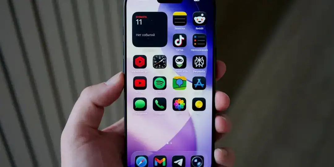
There is a constant tension in design between wanting to show everything your app does and the need for clarity. In the context of mobile interfaces, “less is more” is a rule written in stone. Complex illustrations with intricate details often become unrecognizable “visual noise” when scaled down to the size of a notification icon on a smartphone. The most successful icons communicate a single, clear idea.
You should avoid including text in your icon design whenever possible. Text is rarely legible on smaller screens and can clutter the visual field. Instead, focus on a strong, central symbol that encapsulates your brand identity. Think of a camera lens for a photo app or a stylized lightning bolt for a productivity tool. This approach ensures that your icon remains recognizable whether viewed on a 27-inch monitor or a smart watch.
Summary: Effective SaaS logo design prioritizes scalability and simplicity; stripping away non-essential elements to focus on a single visual metaphor ensures clarity across all device sizes.
Aligning App Icon Design with Brand Identity
Your app icon is often the very first interaction a potential user has with your brand, serving as a digital handshake. Therefore, it is critical that this small square accurately reflects the broader brand identity of your application. Disconnects between the icon and the actual in-app interface (UI) can lead to higher uninstall rates, as users may feel the product does not match the promise made by the icon.
Consistency builds trust. If your marketing materials and website feature a specific typography or gradient, these elements should be subtly integrated into the icon’s design language. However, it is important to distinguish between a logo and an icon. While a logo represents the company, an app icon represents the product’s function. For many SaaS companies, these are the same, but for multi-product companies, the icon must have its own distinct personality while staying within the family.
Summary: A cohesive brand identity that flows from the app icon through to the user interface reduces friction and builds long-term user loyalty and trust.
Technical Execution: From Adobe Illustrator to AI
Historically, creating professional-grade vectors required mastering complex software like Adobe Illustrator. While this remains the industry standard for granular control, the technical barrier can be high for agile teams needing rapid results. The goal is to produce a vector-based asset that retains crispness at any resolution, from the App Store’s large feature graphics to the tiny settings menu icon.
You must also consider the environment in which the icon lives. Modern operating systems allow users to switch between light and dark modes. An icon that looks fantastic on a white background might disappear completely on a dark grey one. Testing your design against various background colors is a mandatory step in the quality assurance process to ensure visibility is never compromised.
Summary: whether using Adobe Illustrator or other tools, ensuring technical excellence through vector scalability and light/dark mode compatibility is essential for a professional appearance.
Accelerating Iteration with Modern Tools
In the fast-paced world of app development, speed is often as important as perfection. The traditional design cycle can take weeks, but the market demands agility. This is where modern solutions are changing the landscape. By utilizing advanced generation platforms, teams can rapidly prototype dozens of variations based on specific keywords and aesthetic preferences in minutes rather than days.
For those looking to streamline this process, tools like Ailogocreator provide an efficient way to generate professional-quality concepts that adhere to design best practices. These platforms allow you to experiment with different styles and color combinations instantly, giving you a diverse set of options to test without the heavy overhead of traditional design workflows. This capability is particularly valuable when you need to create seasonal variations or test new concepts for different markets.
Summary: Leveraging AI-driven design tools can significantly shorten the production cycle, allowing for rapid testing and optimization of App icon design assets.
The Science of A/B Testing Your Assets
Designing a beautiful icon is only half the battle; proving it works is the other. App Store Optimization is not a “set it and forget it” task. Leading mobile growth experts recommend A/B testing your icons to see which version actually drives more installs. You might be surprised to find that a design you subjectively dislike performs significantly better with your target audience.
When conducting these tests, change only one variable at a time—such as the background color or the central glyph. If you change everything at once, you won’t know what caused the shift in performance. Data from 2024 indicates that regular optimization of creative assets, including icons, is a primary lever for growth in competitive categories.
Summary: rigorous A/B testing converts subjective design choices into objective data, ensuring that your SaaS logo design is optimized for maximum conversion.
FAQ
Q: What is the difference between a logo and an app icon?
A: A logo generally represents the entire brand or company and is used across various media. An app icon is a specific functional button on a device that represents the software product itself. While they should share visual DNA, the icon must be optimized for a square format and immediate recognition.
Q: How often should I update my app icon?
A: It is beneficial to refresh your icon for major version updates or seasonal events (like holidays) to signal to users that the app is active and being maintained. However, avoid drastic changes that might confuse existing users unless you are doing a complete rebrand.
Q: Should I use text in my app icon?
A: generally, no. Text is difficult to read at small sizes and can make the design look cluttered. It is better to use the first letter of your brand name or a distinct symbol. If you must use text, keep it to a single character.
Q: How does color affect App Store Optimization?
A: Color helps your app stand out in search results. High-contrast colors can increase visibility, while specific colors evoke emotions (e.g., blue for trust, red for energy). Using a color distinct from your direct competitors can improve your click-through rate.
Q: Can I use AI to design my app icon?
A: Yes, AI tools are increasingly capable of generating high-quality, unique icon designs that meet professional standards. They are excellent for generating ideas quickly and creating final assets that look polished and modern.
Conclusion and Actionable Suggestions
Designing an app icon that demands a click is a blend of artistic intuition and data-driven science. By understanding the psychological triggers of color, embracing the clarity of minimalism, and rigorously testing your designs, you can significantly improve your app’s market performance.
To ensure your app icon stands out, follow these actionable steps:
- Audit Your Competitors: specific analyze the top 10 apps in your category and identify their color palettes; choose a contrasting scheme to create visual distinctiveness.
- Simplify Your Concept: Remove all text and photographic elements, focusing on a single, scalable vector shape that represents your core function.
- Test for Environment: Verify your icon’s visibility on both light and dark backgrounds, and ensure it remains recognizable at the smallest notification sizes.
- Leverage Efficiency: Use tools like Ailogocreator to generate multiple variations quickly, allowing you to explore diverse aesthetic directions without high costs.
- Iterate with Data: Run A/B tests on your store listing to validate which design actually drives higher conversion rates before finalizing your choice.

CommentsTake the first comment