Adopting flat design principles allows startups to secure a future-proof brand identity that scales effortlessly across mobile screens and billboards alike. If you are a startup founder or a creative director aiming to modernize your visual presence, understanding the strategic pivot away from realistic textures is essential. This transformation, clearly seen in the Instagram logo evolution and Google’s logo redesign strategy, demonstrates how moving from Skeuomorphism to Minimalist UI enhances user engagement and load speeds.
- Understanding why industry giants shifted from 3D realism to 2D simplicity.
- The critical impact of logo scalability on modern startup brand identity.
- How to apply flat design principles without sacrificing brand personality.
- Leveraging modern tools to generate professional, minimalist assets efficiently.
The Strategic Shift: Why Giants Abandoned Realism
The early digital era relied heavily on Skeuomorphism to teach users how to interact with interfaces. By mimicking real-world textures like leather, wood, and glass, designers created a sense of familiarity. However, as digital literacy exploded, these heavy textures became visual baggage. They were hard to scale and cluttered small screens.
Today, the priority has shifted to performance and clarity. Flat design strips away the drop shadows and gradients, focusing on raw functionality. This isn’t just an aesthetic choice; it is a business decision. A flat logo is a lighter file, loading faster on mobile networks. It communicates the brand message instantly, without the brain needing to decode complex 3D rendering.
Key Differences Between the Styles:
* Skeuomorphism: Real-world metaphors, heavy textures, depth, shadows.
* Flat Design: Two-dimensional, open space, crisp edges, bright colors.
* Material Design: A hybrid that uses subtle depth (like paper layers) within a flat environment.
According to industry analysis by Verpex, while skeuomorphism enhances emotional engagement through nostalgia, it suffers significantly from adaptability issues in responsive web environments.
Actionable Suggestion:
Review your current brand assets. If your logo relies on a specific texture (like a metallic sheen) to look good, it is time to simplify. Aim for a design that works in solid black and white.
Summary:
Realism served its purpose as a teaching tool, but in a multi-device world, simplicity is the ultimate sophistication.
Deconstructing the Instagram Logo Evolution
The Instagram logo evolution is perhaps the most famous case study in this transition. The original 2010 icon was a direct digital replica of a Polaroid camera. It had a lens you felt you could touch, a viewfinder, and a rainbow stripe. It screamed “instant photography.” But by 2016, the platform had evolved. It was no longer just about retro photo filters; it was a multimedia giant.
The redesign flattened the camera into a white glyph on a sunset gradient background. The backlash was immediate and loud. Yet, the data proved the designers right. The new minimalist UI icon stood out on crowded smartphone home screens. It was flexible enough to represent Stories, Reels, and Shopping without feeling disjointed.
Why the Change Worked:
* Scalability: The simplified camera outline remains legible even at 16×16 pixels.
* Focus: It removed the distraction of the “device” to focus on the content.
* Unification: The glyph style allowed for a consistent icon set across the entire app interface.
Research from design resource platforms indicates that by reducing complexity, brands can enhance the user experience, allowing the interface to recede so content can take center stage.
Actionable Suggestion:
Identify the single most recognizable shape in your business. For Instagram, it was the camera lens. For your startup brand identity, find that one “glyph” and remove everything else.
Summary:
Successful redesigns keep the soul of the brand while removing the heavy “makeup” of realistic textures.

Google’s Approach: Readability and the “Material” Middle Ground
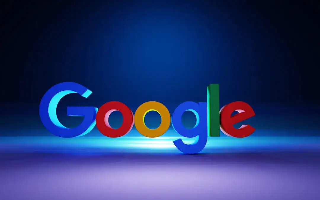
Google’s branding journey reflects a similar pursuit of clarity but with a focus on cross-platform unity. The shift to the “Product Sans” geometric font and the simplified “G” logo marked a departure from the serif fonts that mimicked print media. Google needed a logo redesign strategy that worked as well on a smartwatch as it did on a building.
Google didn’t go completely flat in the strictest sense; they adopted “Material Design.” This language uses flat colors but employs subtle hierarchy and physics-based movement. However, the core logo remains distinctly flat. This ensures that the colors—Blue, Red, Yellow, Green—are the heroes, not the lighting effects.
Benefits of Google’s Minimalist Approach:
* Speed: Simple vector shapes require less code and data to render.
* Adaptability: The geometric forms can morph into voice assistant dots or loading bars seamlessly.
* Global Recognition: Simple shapes transcend language barriers better than complex illustrations.
According to Delivered Social, recent updates to Google’s branding in 2025 continue to prioritize clarity on ever-smaller screens, reinforcing that brand consistency is paramount in a fragmented digital landscape.
Actionable Suggestion:
Test your logo in a dynamic environment. Does it look good when it’s animating? Does it hold up when reduced to a browser favicon?
Summary:
If your logo isn’t legible on a smartwatch or a low-resolution screen, it is not ready for the future of digital interaction.
Why Flat Design is Non-Negotiable for Modern Startups
For a startup, resources are limited and speed is everything. Flat design is inherently more efficient. It is easier to print, easier to animate, and easier for web developers to implement. Complex, skeuomorphic logos often require large PNG files with transparency preservation. A flat logo can often be an SVG code snippet—tiny and infinitely scalable.
Moreover, a minimalist UI conveys trust. In the modern tech landscape, clean lines are associated with efficiency and transparency. Cluttered, old-fashioned designs can subconsciously signal to users that your technology is also outdated or clunky.
Where Your Flat Logo Needs to Perform:
* Favicons: The tiny icon in a browser tab.
* App Icons: Competing for attention on mobile screens.
* Social Avatars: Circular crops on LinkedIn, Twitter, and TikTok.
* Merchandise: Embroidered shirts or simple screen prints.
Shopify’s design analysis suggests that flat design imagines a unique digital space where two-dimensional elements create definition through crisp edges and negative space, rather than relying on real-world physics.
Actionable Suggestion:
Conduct a “squint test” on your website. Squint your eyes until the details blur. If your logo disappears or turns into a smudge, it lacks the necessary contrast and simplicity of effective flat design.
Summary:
Efficiency in design leads to efficiency in brand communication; a clean visual identity signals a clean, modern product.
Leveraging Technology for Scalable Brand Identity
Historically, executing a perfect logo redesign strategy required expensive agencies to boil down a brand to its essence. However, technology has democratized this process. Startups can now leverage intelligent tools that understand the principles of flat design—balance, negative space, and color theory.
Advanced platforms like Ailogocreator are setting a new benchmark for efficiency. By utilizing algorithms trained on modern design trends, these tools can generate minimalist, scalable logos that adhere to the high standards set by companies like Google and Instagram. This allows founders to obtain agency-quality assets that are ready for social media, web, and print immediately.
Features of Modern Design Tools:
* Vector Output: Ensuring infinite scalability without pixelation.
* Trend Awareness: Automatically suggesting flat and minimalist styles over outdated 3D effects.
* Brand Consistency: Generating matching color palettes and font pairings automatically.
Adobe’s design resources highlight that simplicity allows logos to scale up and down effortlessly, making them perfectly suited for transfer between media of all sizes.
Actionable Suggestion:
Don’t rely on manual sketches alone. Use AI-driven tools to generate hundreds of variations of your core concept to see which “flat” version resonates most with your target demographic.
Summary:
Technology has bridged the gap, allowing startups to access the high-end, minimalist aesthetic that defines successful modern brands.
FAQ
Q: What is the main difference between Skeuomorphism and Flat Design?
A: Skeuomorphism uses shadows, gradients, and textures to mimic real-world objects (like a wooden bookshelf app). Flat design uses simple 2D shapes, solid colors, and clean typography, abandoning 3D realism for digital efficiency and clarity.
Q: Why did Instagram change its logo to a flat design?
A: Instagram shifted to a flat design to reflect its evolution from a simple photo app to a diverse multimedia platform. The simplified glyph allows for better consistency across the app and scales better on various devices, from large monitors to tiny notification icons.
Q: Does flat design make a brand look “cheap” or “boring”?
A: Not if done correctly. While it removes clutter, it relies on strong color theory, typography, and balance. Brands like Apple, Google, and Nike use minimalist design to convey premium quality and confidence.
Q: How does a flat logo impact website performance?
A: Flat logos are typically vector-based (SVG) or simple images with few colors. This results in significantly smaller file sizes compared to complex, textured images, leading to faster website load times and better SEO performance.
Q: Can I switch to flat design if my brand is vintage or heritage-based?
A: Yes. You can retain a vintage feel through typography and color choices while stripping away unnecessary bevels and shadows. This “modern retro” approach keeps the heritage vibe but ensures the logo works in a digital-first world.
Conclusion and Actionable Suggestions
The transition from Skeuomorphism to Flat design is not just a trend; it is a response to a multi-screen, high-speed digital reality. By analyzing the Instagram logo evolution and Google’s strategies, startups can learn that subtraction is often the most powerful form of addition. A clean, minimalist UI builds trust, improves performance, and ensures your brand is ready for whatever platform comes next.
- Audit Your Assets: Remove gradients, drop shadows, and complex textures. Ensure your logo works in single-color black and white.
- Focus on Scalability: Test your logo at 16px, 64px, and huge banner sizes. It must remain crisp and recognizable at all scales.
- Embrace Tools: Utilize efficient solutions like Ailogocreator to rapidly prototype and finalize a professional, flat brand identity.
- Prioritize Load Speed: Use SVG formats for your web logos to ensure instant loading and perfect crispness on Retina displays.
- Be Consistent: Apply your new flat aesthetic across all touchpoints, from your app icon to your email signature, to build a cohesive brand image.

CommentsTake the first comment