A well-crafted visual identity is the fastest way to establish trust in the high-stakes property market, often communicating competence before a single word is read. If you are a real estate professional or brand strategist looking to modernize your image, understanding the design shifts of industry giants is essential. We will look at how major players like Zillow and RE/MAX use color psychology, flat design, and typography to dominate the market. These insights into real estate logo design and branding trends will help you build a stronger, more converting visual presence.
- Simplicity Wins: Why Zillow and RE/MAX stripped away complex details for flat, mobile-friendly designs.
- Color is Strategy: How blue builds digital trust while red creates urgency in real estate branding.
- Symbol Recognition: The power of standalone icons like Zillow’s “Z-house” and the RE/MAX balloon.
- Typography Shifts: The industry-wide move toward bold sans-serif fonts for better readability.
The Evolution of Digital Trust: Zillow’s Minimalist Journey
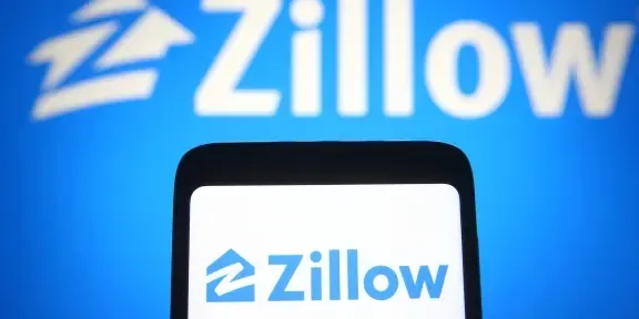
I have watched Zillow’s branding evolve from a startup experiment to a definitive market leader, and their visual choices tell a clear story of maturity. Early on, their logo was busy, trying to say too much at once. But as they grew, they realized that confidence comes from subtraction, not addition. The current logo, unveiled in 2019, is a masterclass in digital-first design.
They removed the unnecessary square container and focused entirely on the house symbol with the “Z” inside. This wasn’t just an aesthetic choice; it was a functional one. In an app-dominated world, your icon needs to look sharp on a screen the size of a fingernail. By reversing the colors—placing a white “Z” inside a blue house—they increased contrast and visibility. The result is a logo that feels approachable yet authoritative. For any modern brand, the lesson is clear: if your logo looks messy on an iPhone home screen, you are losing customers.

Legacy Meets Modernity: The RE/MAX Visual Overhaul
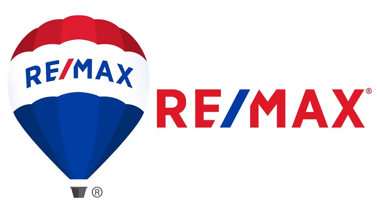
Changing a logo that has existed for 44 years is risky, but RE/MAX proved it is sometimes necessary to stay relevant. For decades, the RE/MAX hot air balloon was a detailed, almost cartoonish illustration. While iconic, it struggled to translate well onto social media profiles and mobile apps. In their 2017 refresh, they didn’t abandon their heritage; they refined it.
They flattened the balloon, removing the heavy 3D shading and “shine” effects that were popular in the early 2000s. The lines became cleaner, and the typography shifted to a more legible style. I find this move particularly smart because it retained the brand equity—everyone still recognizes the balloon—but it signaled that the company was ready for the digital age. This balance between legacy and modernization is a tightrope walk that many traditional brokerages fail to navigate. They kept the patriotic red, white, and blue but made the blue brighter and the red more vibrant to catch the eye in a crowded news feed.
Decoding Color Psychology in Real Estate Branding
Color is never an accident in top-tier real estate platform logos. It is a psychological trigger. When I analyze the market, I see a distinct split in color strategy based on the brand’s core promise. Zillow uses a specific shade of bright blue. According to color psychology experts, blue elicits feelings of trust, stability, and intelligence. For a tech platform asking users to make the biggest financial decision of their lives online, projecting stability is non-negotiable.
On the other hand, traditional heavyweights like RE/MAX lean heavily on red. Red is the color of passion, energy, and urgency. It stimulates action. In a sales environment, red says, “Let’s get this deal done now.” Meanwhile, newer eco-conscious or investment-focused platforms often adopt green to signal growth and wealth. If you are building a brand, do not pick your favorite color. Pick the color that triggers the emotion you want your client to feel. A mismatch here—like using a chaotic neon yellow for a luxury estate brand—can subconsciously drive high-end clients away.

Typography Trends: Why Sans-Serif Dominates the Market
If you look closely at the typography of successful real estate platforms, you will notice the serifs are disappearing. Zillow’s 2019 update introduced a custom serif-free font that is thicker and friendlier than its predecessor. This aligns with a broader “humanist” trend in tech. They want to appear accessible, not cold or institutional.
Sans-serif fonts (fonts without the little feet at the ends of letters) scale better across devices. Whether a client is viewing a listing on a 4K monitor or a budget smartphone, the text remains crisp. I often see smaller agencies clinging to complex script fonts to look “fancy,” but these often become unreadable at small sizes. In the visual language of modern real estate, clarity equals luxury. If a client has to squint to read your name, you have already created friction in the transaction process.

The Role of Consistency Across Touchpoints
A logo does not live in a vacuum. The success of Zillow and RE/MAX comes from how their visual identity stretches across every customer touchpoint. From the “For Sale” sign on a lawn to the favicon on a browser tab, the visual language remains consistent. This repetition builds memory structures in the consumer’s brain.
For independent agents or smaller platforms, achieving this level of consistency used to require expensive design agencies. However, technology has democratized high-end branding. Tools like Ailogocreator allow users to generate professional-grade logos that adhere to these modern design principles—clean lines, scalable icons, and psychological color matching—without the corporate price tag. It is proof that you don’t need a Zillow-sized budget to look like a Zillow-sized competitor.
FAQ
Why do most real estate companies use blue in their logos?
Blue is associated with trust, security, and reliability. Since buying a home is a major financial commitment, brands use blue to subconsciously reassure clients that their money and data are safe.
What is the difference between flat design and skeuomorphic design?
Skeuomorphic design mimics real-world textures (like drop shadows or 3D bubbles), while flat design uses two-dimensional elements and solid colors. Flat design is the current standard because it loads faster and looks better on mobile screens.
How often should a real estate brand update its logo?
There is no set rule, but major brands often refresh their look every 7-10 years. You should consider a update if your logo looks pixelated on high-resolution screens or feels disconnected from modern design trends.
Does font choice really matter for real estate logos?
Yes. A hard-to-read font can make a brand seem unprofessional or outdated. Modern sans-serif fonts are preferred for their readability and clean aesthetic, which conveys efficiency.
Can I use red for a luxury real estate brand?
You can, but it must be used carefully. Bright red can feel aggressive or discount-oriented. Darker shades like burgundy or maroon often convey sophistication and heritage better than bright primary red.
Conclusion and Actionable Suggestions
The visual strategies of Zillow and RE/MAX prove that effective design is about clarity, not complexity. Whether you are a solo agent or running a platform, your visual identity is a working asset that should facilitate trust and recognition.
Here are actionable steps to refine your brand’s visual language:
1. Audit your scalability: Shrink your current logo to the size of an Instagram profile picture. If the details blur or the text is unreadable, it is time to simplify.
2. Align color with intent: If your value proposition is speed and energy, consider warm accents like red or orange. If your focus is security and data, lean into deep blues or teals.
3. Flatten your assets: Remove gradients, shadows, and complex illustrations. Aim for a “flat” design that looks crisp on digital interfaces.
4. Prioritize typography: Switch to a bold, legible sans-serif font for your brand name to ensure it is readable on mobile devices.
5. Standardize usage: Ensure your logo looks exactly the same on your business card as it does on your website. Consistency builds authority.
References
- Industry analysis of Zillow’s 2019 brand refresh and logo evolution.
- Historical data on RE/MAX corporate identity changes and the 2017 balloon redesign.
- Research on color psychology in marketing and its specific application in real estate trust-building.
- Design reports on the shift from skeuomorphism to flat design in digital product branding.
- Market studies on typography trends in successful property technology platforms.

CommentsTake the first comment