Understanding the trajectory of NFL visual identity offers a masterclass in balancing heritage with modernization for maximum brand equity. If you are a sports marketer, graphic designer, or brand manager, this analysis reveals how visual consistency and strategic pivots directly influence fan loyalty and revenue streams. From the immutable classicism of the Kansas City Chiefs to the radical transformation of the New England Patriots, the history of NFL logos provides a roadmap for building high-value commercial assets in a digital-first world.
- Consistency Builds Trust: Why the Chiefs’ refusal to drastically change created a timeless legacy.
- Strategic Modernization: How the Patriots’ shift to “Flying Elvis” coincided with a dynasty.
- Digital Adaptation: The necessity of simplifying retro football logos for mobile screens and social media.
- Economic Impact: The direct correlation between logo refreshes and merchandise revenue spikes.
The Power of Static Identity: The Kansas City Chiefs Model
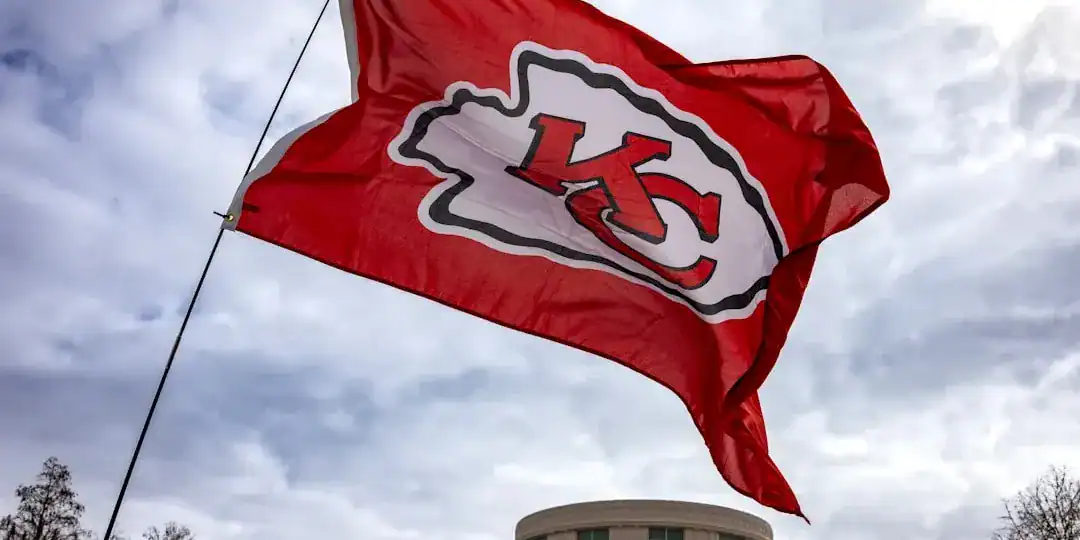
I find the Kansas City Chiefs’ approach to visual identity fascinating because it defies the modern urge to constantly “refresh.” While other franchises chase trends, the Chiefs have maintained an almost rigid adherence to their interlocking “KC” arrowhead design since moving from Dallas in 1963. This is not laziness; it is a calculated strategy of heritage preservation. In sports visual identity, consistency breeds a specific type of multi-generational loyalty that volatile brands struggle to replicate.
The design relies on bold, high-contrast elements that require zero explanation. The arrowhead shape immediately contextualizes the team name, while the thick black outlines ensure the logo remains visible even on muddy broadcasts from the 1970s or 4K streams today. Unlike the complex illustrations of the 1950s, this design prioritized immediate recognition.
Key Design Elements of the Chiefs’ Longevity:
* Minimalist Geometry: The use of a simple arrowhead container.
* Interlocking Typography: A classic monogram style that signals prestige.
* High Contrast Colors: Red and gold separated by white and black for maximum legibility.
* Cultural Inertia: Resisting the 90s trend of adding “aggressive” mascots.
According to historical design analysis, teams that maintain visual consistency over decades often enjoy higher “brand trust” scores among legacy fans. The Chiefs prove that you do not need to change your face to stay relevant; you just need to keep winning while wearing the same face.
Actionable Suggestion:
If your brand has deep historical roots, audit your assets before considering a rebrand. Often, cleaning up the existing geometry (evolution) is far more profitable than a total redesign (revolution).
The Art of the Pivot: New England Patriots’ Visual Overhaul
On the other end of the spectrum, the New England Patriots represent the most successful “revolutionary” rebranding in NFL logo history. For decades, “Pat Patriot”—a detailed illustration of a minuteman snapping a football—defined the team. It was charming but visually cluttered and difficult to reproduce on modern merchandise. The shift in 1993 to the “Flying Elvis,” a sleek, aerodynamic profile of a face, marked a turning point.
I view this transition as the gold standard for NFL rebranding. It moved the franchise from a “lovable loser” aesthetic to a sharp, aggressive, corporate-friendly identity. This change wasn’t just aesthetic; it signaled a new era of management and on-field philosophy. The streamlined profile was built for the TV age, scaling perfectly from a helmet decal to a Twitter avatar.
Comparison of Eras:
* Pat Patriot (1960-1992): Illustrative, complex, difficult to embroider, nostalgic.
* Flying Elvis (1993-Present): Vector-based, dynamic, scalable, aggressive.
* Color Palette Shift: From a lighter red/blue to a darker “Nautical Blue” and silver, conveying seriousness.
Research from Concordia University indicates that while “revolutionary” rebranding can initially alienate traditionalists, it is often necessary to break negative associations with past failures. The Patriots’ timing—launching a new look just before their era of dominance—cemented the new logo as a symbol of victory rather than corporate meddling.
Actionable Suggestion:
Align major visual rebrands with operational shifts. A new logo cannot fix a broken product, but it can amplify a new strategic direction.
The Economics of Retro Football Logos and Modern Merchandising
There is a distinct cycle in sports branding where “outdated” becomes “retro” and eventually becomes highly profitable. We are currently seeing a resurgence of retro football logos, not as primary identities, but as secondary revenue streams. Teams like the Philadelphia Eagles and Tampa Bay Buccaneers have reintroduced “throwback” uniforms, leveraging the nostalgia economy.
However, from a primary branding perspective, the trend is undeniably toward simplification. Modern NFL logo history shows a mass extinction of detailed mascots in favor of symbolic representations. This is driven by commerce. A simplified logo is cheaper to print, easier to stitch, and clearer on a smartphone screen. The economic reality is that a logo must now function as an app icon first and a helmet decal second.
Revenue Drivers in Logo Design:
* Merchandise Versatility: Simple shapes fit better on caps, sneakers, and casual wear.
* Digital Legibility: Logos must be recognizable at 16×16 pixels.
* Global Appeal: Abstract symbols often travel better across borders than culturally specific illustrations.
Market analysis suggests that logo redesigns are frequently motivated by a desire to spike short-term merchandise sales. Licensed product sales in professional leagues have seen significant growth following league-wide modernization efforts, proving that a visual refresh is a valid financial lever.
Actionable Suggestion:
Maintain a “heritage asset” library. Even if you modernize your main logo, keep your vintage designs available for limited-edition product runs to capture the nostalgia market.

Modernization Risks: When Rebranding Fails
Not every update is a success. I recall the Tampa Bay Buccaneers’ 2014 rebrand (the “alarm clock” numbers era) as a cautionary tale. While the goal was modernization, the result was a visual identity that felt forced and disconnected from the team’s winning history. It alienated fans because it prioritized “edginess” over readability and tradition.
The lesson here is that sports visual identity is emotional, not just functional. Fans wear these logos on their bodies; they are tribal markers. A rebrand that feels like a cynical marketing ploy can damage the relationship between the club and its supporters. The “Buccaneer” example highlights that change for the sake of change is dangerous.
Common Rebranding Pitfalls:
* Over-complication: Adding too many colors or bevels (a common 2000s mistake).
* Ignoring Fan Sentiment: Failing to test designs with the core audience.
* Disconnect from History: Removing all ties to the previous identity.
Industry reports on team rebranding initiatives emphasize that successful changes usually retain core color schemes or thematic elements to bridge the gap between old and new. Radical departures often require massive marketing spend to re-educate the consumer base.
Actionable Suggestion:
Before executing a rebrand, conduct sentiment analysis on your current visual assets to understand what elements are “sacred” to your audience and must be preserved.
The Digital Future: AI and Scalability in Sports Design
As we look toward the future of NFL logo evolution, the influence of digital tools and AI is undeniable. The speed at which content is consumed demands logos that are modular. We are seeing a shift toward “responsive logos”—identities that can shed details as they get smaller.
For creators and small businesses looking to emulate the professional polish of NFL branding without the million-dollar agency fees, technology has democratized high-end design. Platforms like Ailogocreator allow users to generate scalable, vector-based logos that adhere to these modern principles of minimalism and adaptability. This shift means that the gap between a startup’s visual identity and a pro franchise’s look is narrowing.
Future Design Trends:
* Flat Design: Removal of shadows and gradients for cleaner digital display.
* Monochromatic Options: Logos designed to work effectively in single-color formats.
* Motion Identity: Logos built with animation in mind for broadcast and social reels.
Actionable Suggestion:
Ensure your logo has a “vector-first” strategy. If your primary design relies on raster effects (shadows, complex gradients), create a simplified flat version immediately for digital use.
FAQ
1. Why do NFL teams change their logos?
Teams primarily change logos to modernize their brand for digital platforms, stimulate merchandise sales, or signal a new era of ownership and management. A fresh look can reignite fan interest and separate a franchise from a period of poor performance.
2. What is the difference between evolutionary and revolutionary rebranding?
Evolutionary rebranding involves minor tweaks—cleaning up lines or adjusting colors—to modernize a look without losing history (e.g., Green Bay Packers). Revolutionary rebranding is a complete overhaul of the name, logo, and colors (e.g., the shift from the Oilers to the Titans).
3. Which NFL team has the oldest logo?
The Dallas Cowboys’ star logo is widely considered one of the oldest primary logos still in use without major alteration. The Kansas City Chiefs’ interlocking “KC” has also remained virtually unchanged since the early 1960s.
4. How does a logo affect team revenue?
A well-designed logo directly impacts merchandise sales, which is a massive revenue stream for the NFL. New logos create a reason for fans to buy new jerseys and hats. Additionally, a strong visual identity increases brand equity, making sponsorships more valuable.
Conclusion and Actionable Suggestions
The visual history of the NFL demonstrates that a logo is never just a drawing; it is a financial vessel for culture and loyalty. Whether it is the unwavering tradition of the Chiefs or the calculated modernization of the Patriots, the most successful brands understand their identity’s purpose.
To apply these lessons to your own brand strategy:
- Audit for Scalability: Test your logo at 20 pixels wide. If it is unrecognizable, simplify it immediately.
- Respect Heritage: If you rebrand, keep a visual thread (color or shape) that connects to your past to avoid alienating loyalists.
- Monetize Nostalgia: Do not discard old assets; repurpose them for “vintage” product lines or special anniversaries.
- Align with Strategy: Only undertake a major rebrand if it accompanies a significant operational or strategic pivot.
- Prioritize Vector Formats: Ensure all master files are vector-based to future-proof your visual identity against changing screen resolutions.
参考与来源
- [PDF] Exploring the Effects of a Sports Team’s Rebranding on its Supporters(spectrum.library.concordia.ca)
- [PDF] A Content Analysis of NFL Team Online Branding(eloncdn.blob.core.windows.net)
- [PDF] Uncovering the Motives and Process of Team Rebranding Initiatives(trace.tennessee.edu)
- [PDF] Sport Fans and Their Teams’ Redesigned Logos(westga.edu)
- [PDF] How Social Media Has Redefined the National Football League(poetcommons.whittier.edu)

CommentsTake the first comment