Mastering the art of timeless branding requires decoding the visual secrets of the world’s most profitable fashion houses. If you are a creative director, brand strategist, or luxury aficionado, understanding the architecture behind these iconic patterns offers invaluable lessons for modern design. This analysis explores the history and psychology of the Louis Vuitton Monogram, Gucci GG Supreme, and Chanel interlocking CC, revealing how the Logomania trend continues to shape global aesthetics.
- Historical Necessity: How anti-counterfeiting measures birthed the world’s most recognizable prints.
- Design Psychology: The visual impact of symmetry, interlocking letters, and geometric harmony.
- Cultural Evolution: Tracing the journey from elite travel gear to street-style Logomania.
- Modern Application: How today’s brands can leverage heritage aesthetics using advanced digital tools.
The Louis Vuitton Monogram: From Anti-Counterfeiting to Global Icon
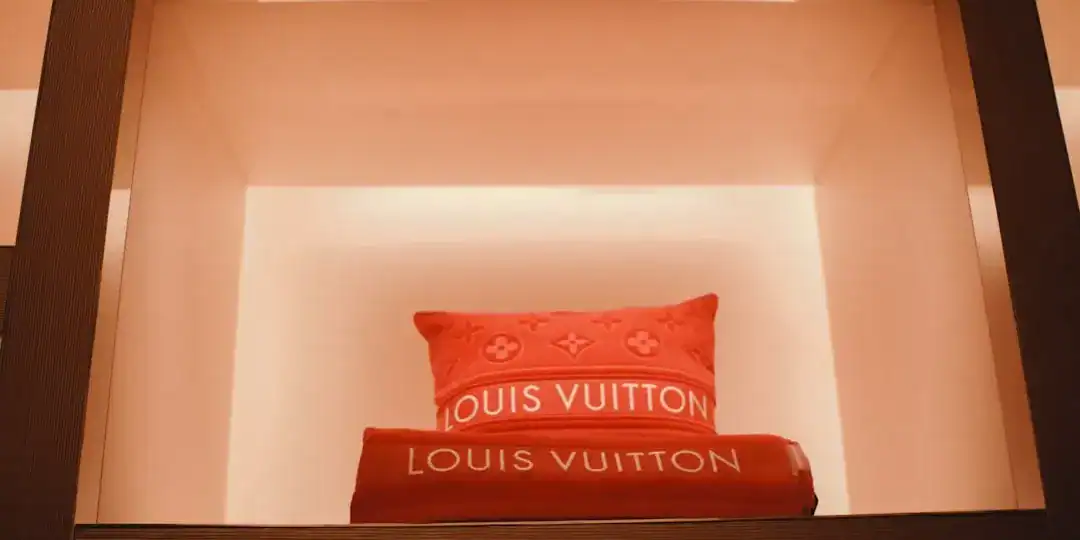
It is fascinating to realize that one of the world’s most copied designs was originally created to stop copyists. In 1896, Georges Vuitton designed the Louis Vuitton Monogram canvas to honor his father and, crucially, to deter counterfeiting of the brand’s luggage. The design features the interlocking “LV” initials surrounded by quatrefoils and flowers.
Historical records indicate that this pattern was heavily inspired by the Neo-Gothic era and the popularity of Japanese “Mon” (family crests) in the late 19th century. The choice of warm, earthy tones on a dark background created a look that was both distinctive and dignified. Unlike the simple stripes that preceded it, this complex arrangement of symbols created a visual rhythm that became synonymous with the “Art of Travel.”
Today, the monogram has transcended its functional roots. Through collaborations with artists like Takashi Murakami and Yayoi Kusama, the canvas has been reinvented constantly. It proves that a rigid grid system can still be fluid and expressive.
Summary: The Louis Vuitton Monogram established the template for Luxury monogram patterns, proving that complex, rhythmic repetition can build an unshakeable brand identity over 130 years.
Gucci’s GG Supreme: The Harmony of Balance and Reinvention
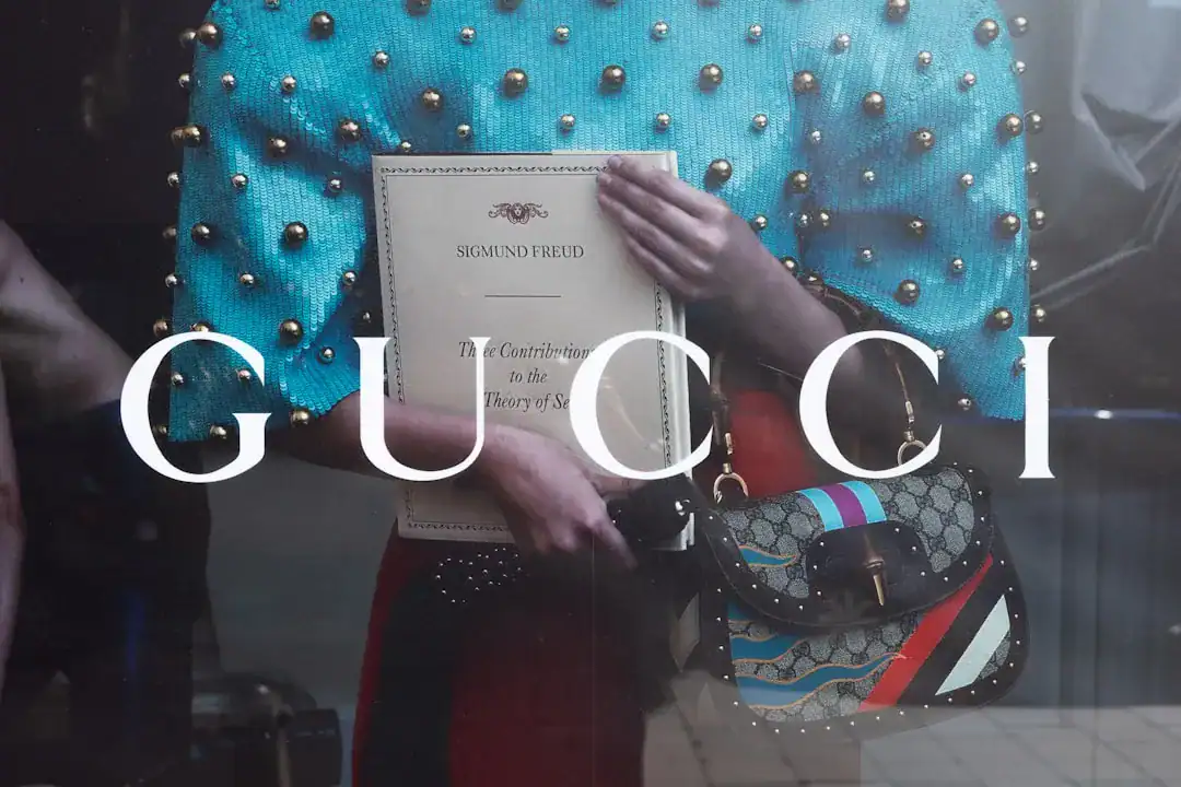
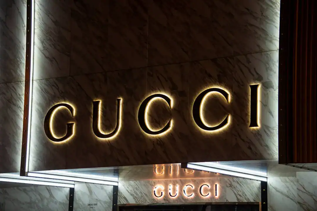
While LV focuses on floral complexity, Gucci’s approach to the monogram is a masterclass in bold symmetry. The Gucci GG Supreme canvas traces its roots back to the shortage of materials during World War II, which forced the house to innovate with canvas instead of leather. However, the iconic interlocking “G” logo—representing the founder Guccio Gucci—truly solidified the brand’s visual language in the 1960s.
The design relies on the “Double G.” Sometimes facing each other, sometimes inverted. This reflection creates a sense of stability and balance. It is visually satisfying. According to fashion historians, this logo became a status symbol that bridged the gap between aristocratic heritage and the jet-set lifestyle of the 1970s.
In recent years, the Logomania trend has seen Gucci apply this pattern to everything from sneakers to tracksuits. It is a louder, more maximalist approach compared to other houses. The brand effectively uses the monogram not just as a signature, but as the main texture of the garment itself.
Summary: The Gucci GG Supreme demonstrates how a logo can evolve into a fabric texture, turning the brand name itself into a raw material for design.
Chanel’s Interlocking CC: The Philosophy of “Less is More”
If Gucci and LV represent the maximalist side of the spectrum, the Chanel interlocking CC stands as a monument to minimalism. Designed by Gabrielle “Coco” Chanel herself around 1925, this logo has remained virtually unchanged for a century.
The design is stark. Two interlocking Cs, usually black on white or gold on black. There are no floral distractions. No complex grids. It embodies Chanel’s famous philosophy: “Simplicity is the keynote of all true elegance.” The geometry is perfect—the width of the Cs often matches the spacing between them, creating a harmonious negative space.
This logo functions differently than the others. It is rarely used as an all-over print in the same way as the Louis Vuitton Monogram. Instead, it acts as a seal of approval. A clasp on a bag. A stud on an earring. It whispers luxury rather than shouting it. This restraint makes it one of the most powerful Iconic designer logos in history.
Summary: Chanel proves that consistency is key; by keeping the Chanel interlocking CC unchanged and uncluttered, the brand maintains an aura of exclusive, timeless sophistication.
The Psychology of Logomania: Why We Wear Letters
Why do we wear other people’s initials on our bodies? The psychology behind the Logomania trend is complex. In the 1980s and 2000s, it was about signaling wealth. The bigger the logo, the higher the status.
However, the modern resurgence is different. It is often ironic, nostalgic, or a celebration of belonging to a “tribe.” Industry analysis suggests that in a digital age, logos act as instant communicators. They cut through the noise of social media feeds. A pattern like the Gucci GG Supreme is instantly recognizable on a small smartphone screen, whereas a subtle cut or fabric quality might be lost.
This cycle of “Quiet Luxury” versus “Loud Logos” is a constant dance. Yet, the persistence of these monograms proves that consumers crave connection to heritage. They want to wear the story.
Summary: Logomania is not just about showing off; it is a visual language that allows consumers to signal identity and belonging in an increasingly digital and visual culture.

Modern Branding Lessons: Creating Timeless Visual Identities
What can modern entrepreneurs learn from these giants? The common thread is the balance between distinctiveness and scalability. These logos look good on a giant billboard and a tiny zipper pull.
Creating such a balanced design used to require months of manual drafting and historical research. Today, technology has democratized this process. For new brands looking to establish their own visual legacy, tools like Ailogocreator offer an efficient way to experiment with monogram aesthetics. By analyzing millions of design patterns, these modern solutions allow creators to find that “golden ratio” of interlocking letters and negative space, much like Georges Vuitton did manually over a century ago.
Whether you are designing for a tech startup or a fashion label, the principles remain the same. Simplicity, adaptability, and emotional resonance are the pillars of a lasting identity.
Summary: Leveraging modern tools to apply historical design principles allows new brands to create Luxury monogram patterns that stand the test of time.
FAQ
Q: Which luxury monogram is the oldest?
A: The Louis Vuitton Monogram is widely considered the first designer monogram intended for branding, introduced in 1896. It set the standard for using a logo as a repeated pattern on products.
Q: What is the meaning behind the Chanel CC logo?
A: The Chanel interlocking CC stands for the brand’s founder, Coco Chanel. It was designed by her in 1925 and symbolizes her philosophy of elegance through simplicity and symmetry.
Q: Why has the Logomania trend returned?
A: The resurgence is driven by nostalgia for 2000s fashion and the “Instagrammability” of bold logos. Iconic designer logos create high-impact visuals that perform well on social media platforms.
Q: What is the difference between a logo and a monogram?
A: A monogram is a specific type of logo made by overlapping or combining two or more letters (usually initials). While all monograms are logos, not all logos are monograms (e.g., Apple’s apple).
Conclusion and Actionable Suggestions
The enduring appeal of the Louis Vuitton Monogram, Gucci GG Supreme, and Chanel interlocking CC lies in their ability to tell a story without words. These designs are not just commercial trademarks; they are cultural artifacts that have survived wars, economic shifts, and changing trends.
For those looking to build a brand with similar staying power, consider these steps:
* Prioritize Scalability: Ensure your logo or monogram is legible at 16 pixels and 16 meters.
* Balance Heritage and Innovation: Use classic typefaces but apply them in modern, adaptable grids.
* Create a Pattern: Don’t just design a logo; design a “system” or pattern that can be used across different textures and backgrounds.
* Embrace Consistency: Once you define your visual identity, stick to it. Repetition builds recognition.
* Leverage Technology: Use intelligent design tools to iterate quickly and find the perfect geometric balance for your brand’s initials.

CommentsTake the first comment