
How to design a logo that feels human, works globally, and grows with your brand.
What Will Future Logo Design Look Like in 2026?
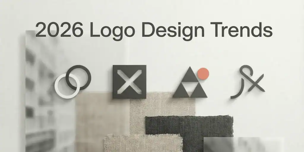
2026’s “Imperfect Era”: tactile textures meet clean, scalable logo forms.
| Quick Start If you only do one thing: generate 20–30 variations in two styles, then refine the best one into a responsive logo set.Use the ‘Survival Test’ below before committing to any trend. Pick a 2026-ready style: Logo Style Trends 2026 Read the data report: Logo Design Trends 2026 Generate a logo now: AI Logo Generator |
Definition: What are “logo design trends” in 2026?
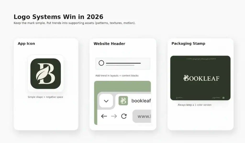
Logo design trends in 2026 are less about one visual “look” and more about balancing clarity and expression: the core logo gets simpler and scales better, while the brand system carries richer texture, motion, patterns, and layouts.
In practice, that means:
- Keep the mark recognizable at 24px and in 1 color first.
- Use trend elements (texture, surreal visuals, collage, UI aesthetics) in the brand world, not inside the mark.
- Build a responsive set: icon-only, wordmark, horizontal/stacked, avatar crop.
Why 2026 feels different: the Imperfect Era
The 2026 Logo Survival Test (do this first)
Before you chase trends, pressure-test your logo concept with five non-negotiables:
- Can it be recognized at 24px (favicon / app icon)?
- Does it work in one color (black/white) without gradients?
- Is it still recognizable in a circular avatar crop?
- Can someone sketch it from memory in 10 seconds?
- Can it expand into a system (patterns, layouts, motion, merch) without losing identity?
If your concept fails any of these, the trend is not the problem — the mark is. Fix the mark first. Then apply the trend.
How to use this guide
Each trend section below includes: what it looks like, where it works best, what to do and avoid in the logo itself, and copy/paste prompts to generate usable directions quickly. When you’re ready to generate, start from the style hub and pick a style bucket that matches your brand voice.
Start here: Logo Style Trends 2026
Cheat Sheet: 10 trends → logo-safe moves
| 2026 Trend | What it looks like | Best for | Logo-safe move |
| Reality Warp | Surreal distortion + uncanny imagery | AI / culture / tech | Keep logo clean; put surrealism into brand world |
| Prompt Playground | UI fragments, grids, system shapes | SaaS / dev tools | Use a bold frame + simple icon + strong type |
| Explorecore | Calm editorial layouts, serif clarity | Creators / media / education | Serif wordmark + generous spacing |
| Texture Check | Glass, wax, tactile surfaces | DTC / premium packaging | Flat logo + texture library (system-led) |
| Notes App Chic | Collage, tape, doodles | Lifestyle / personal brands | Hand-drawn accent + readable wordmark |
| Opt-Out Era | Quiet minimalism, clean hierarchy | Finance / wellness / B2B | Typographic strength + monochrome version |
| Drama Club | Cinematic contrast, bold type | Entertainment / events | Bold wordmark + high-contrast lockups |
| GrannyWave | Heritage maximal patterns | Culture / fashion | Simplified symbol + heritage pattern pack |
| Zinegeist | DIY zine collage, brutal type | Music / art / youth | Heavy type + controlled ‘roughness’ |
| Block Party | Warm nostalgia + local charm | Food / local brands | Badge mark + warm palette system |
Translating UIaesthetics into logo-safe structures.
1. Reality Warp: Surreal brand worlds, simple marks
What it looks like
- Dreamlike distortion, uncanny realism, liminal environments
- Warped photography, soft glow, “almost-real” composition
- Cinematic color grading and subtle motion cues
Best for
AI products, culture brands, creative tech, experimental campaigns.
Logo translation (how to apply it safely)
Reality Warp should live primarily in your brand world (imagery, motion, backgrounds). For the logo, keep a clean, vector-friendly mark that anchors the system. Your job is contrast: the world can be weird — the logo must be reliable.
Do / Don’t
- Do:
- Design a simple symbol that can be drawn in one stroke or built from 1–2 geometric shapes
- Ship a monochrome version first, then add color only if it improves recognition
- Use Reality Warp for hero imagery, social templates, or product art — not for micro-size logo details
- Don’t:
- Don’t bake distortion, heavy textures, or micro gradients into the core mark
- Don’t rely on thin lines or fragile details that collapse at 24px
- Don’t let the logo compete with surreal imagery—use negative space intentionally
Copy/paste prompts
| Create a modern icon logo for a brand named “{{BRAND}}” in the {{INDUSTRY}} space. Constraints: vector-friendly, readable at 24px, 1–2 shapes max, strong negative space, works in monochrome. Avoid: gradients, tiny details, complex textures. Deliver: icon-only + icon-with-wordmark + stacked lockup. |
| Generate 6 surreal brand background visuals for “{{BRAND}}” with subtle distortion and cinematic lighting. Leave clean negative space for logo placement. Avoid: readable text, faces, brand names. |
| Create a responsive logo family for “{{BRAND}}”: 24px icon, app icon, horizontal lockup, stacked lockup. Keep all versions consistent and recognizable. |
Try it on AILogoCreator
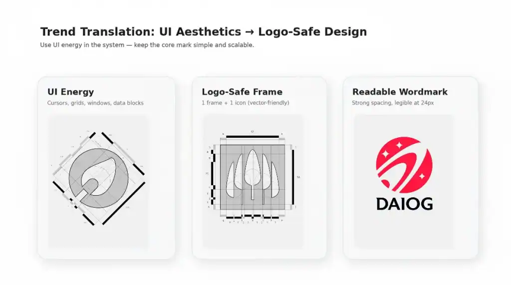
2. Prompt Playground: UI energy, system shapes, productivity aesthetics
What it looks like
- Grids, windows, cursor motifs, “system UI” geometry
- Spreadsheet blocks, tabs, modular containers, minimal icons
- Clean utility typography with strong spacing
Best for
SaaS, developer tools, productivity apps, fintech, analytics products.
Logo translation (how to apply it safely)
The logo-safe move is to convert UI complexity into a bold, simple container: a rounded rectangle, a grid frame, or a window outline. Inside, keep a single icon or monogram. Use UI-style layouts in your templates and marketing, not inside the mark.
Do / Don’t
- Do:
- Use a frame + a single icon to create a strong silhouette
- Prioritize spacing and legibility; test at 16px and 24px early
- Create a layout system: header bars, cards, and grid templates for brand consistency
- Don’t:
- Don’t include tiny UI details (dropdown arrows, micro text, small icons) in the core logo
- Don’t use thin lines that disappear on mobile
- Don’t make the mark depend on gradients or blur to look ‘tech’
Copy/paste prompts
| Design a geometric logo for “{{BRAND}}” inspired by modern productivity software UI. Use: a rounded-rectangle frame + one simple icon inside. Constraints: 1–2 shapes, vector-friendly, readable at 24px, high contrast. Deliver: monochrome + 1 muted accent color option. |
| Create a clean wordmark for “{{BRAND}}” with a modern tech feel. Typography: simple sans-serif, optimized spacing, strong readability. Deliver: wide + condensed variants for responsive usage. |
| Generate 10 brand layout templates for “{{BRAND}}”: hero header, feature card grid, pricing table, testimonial card. Style: clean UI blocks, lots of white space, one accent color. |
Try it on AILogoCreator
3. Explorecore: Calm editorial minimalism + serif clarity
What it looks like
- Editorial grids, breathing room, calm contrast
- Serif resurgence: readable, premium, human
- Quiet brand confidence: less noise, more intention
Best for
Creators, education, publishing, wellness, premium B2B with a human voice.
Logo translation (how to apply it safely)
Explorecore is logo-friendly. Use a serif wordmark with generous spacing and a simple symbol (optional). The real power comes from a system: editorial layouts, consistent spacing rules, and clean typography pairings.
Do / Don’t
- Do:
- Start with monochrome; add color only after the logo works in black/white
- Tune spacing (kerning + tracking) as a primary design lever
- Create a ‘typesetting’ system: headline, subhead, body, caption styles
- Don’t:
- Don’t over-decorate serifs with noise or distress
- Don’t compress spacing so much that it loses the editorial calm
- Don’t use ultra-thin strokes that fail in small sizes or print
Copy/paste prompts
| Create a serif wordmark logo for “{{BRAND}}”. Mood: calm, editorial, premium. Constraints: readable at 24px, monochrome-first, balanced letter spacing. Deliver: 3 spacing variants + icon-only monogram option. |
| Design a minimal symbol for “{{BRAND}}” that pairs with an editorial serif wordmark. Use one motif: arc, star, leaf, or monogram. Constraints: vector-only, no textures, strong silhouette. |
| Generate an editorial brand kit for “{{BRAND}}”: 5 layout templates, 2 font pairings, spacing rules, and a muted palette. |
Try it on AILogoCreator
4. Texture Check: Tactile surfaces (glass, wax, paper, fabric)
What it looks like
- Frosted glass, translucent gel, waxy highlights
- Soft paper grain, fabric weave, brushed finishes
- Material-led visuals that feel ‘touchable’
Best for
DTC, beauty, food, premium packaging, lifestyle products.
Logo translation (how to apply it safely)
This is the biggest trap trend: textures rarely belong inside the core logo. Instead, build a ‘texture library’ for backgrounds and packaging while keeping the mark flat, bold, and scalable. Your logo should print cleanly on a label even if your campaigns look hyper-tactile.
Do / Don’t
- Do:
- Create a clean 1‑color logo first (stamp-ready)
- Use textures as brand assets: backgrounds, photography overlays, packaging panels
- Define rules: where texture is allowed (and where it isn’t)
- Don’t:
- Don’t embed heavy grain, blur, or glossy effects into the mark
- Don’t use complex gradients as the primary identity cue
- Don’t sacrifice contrast—logos must survive low-quality printing and small sizes
Copy/paste prompts
| Create a minimalist logo for “{{BRAND}}” that works in one color. Constraints: bold silhouette, high contrast, vector-friendly, readable at 24px. Deliver: icon-only + wordmark + stacked lockup. |
| Generate 8 tactile background textures for “{{BRAND}}”: frosted glass, wax, soft paper grain, translucent gel, brushed metal, warm fabric, recycled paper, matte stone. Avoid: readable text, logos, faces. |
| Create a packaging label mock style guide for “{{BRAND}}” showing logo placement on textured backgrounds. Rules: logo always sits on a clean area with sufficient negative space. |
Try it on AILogoCreator
5. Notes App Chic: Collage imperfection, tape, doodles, personal energy
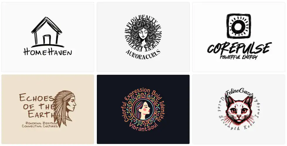
What it looks like
- Ripped paper edges, tape strips, sticker-like elements
- Handwritten scribbles, imperfect circles, marker strokes
- Camera-roll realism: candid and unpolished (on purpose)
Best for
Personal brands, creators, lifestyle, boutique services, community-driven products.
Logo translation (how to apply it safely)
Bring the human touch into the identity with one controlled imperfection. Use a clean wordmark for legibility, then add a hand-drawn accent (underline, doodle, imperfect ring) as a signature. Put collage chaos into brand assets, not into the core mark.
Do / Don’t
- Do:
- Keep the wordmark readable; let the doodle be the personality layer
- Create a collage asset pack: tape, shapes, scribbles, stamps
- Design a simplified icon for app/social usage
- Don’t:
- Don’t turn the logo into a messy collage that can’t scale down
- Don’t rely on thin hand-drawn lines that disappear at 24px
- Don’t use too many colors; one accent color is usually enough
Copy/paste prompts
| Design a logo for “{{BRAND}}” with a clean wordmark plus one hand-drawn accent. Accent options: imperfect circle, underline stroke, doodle star. Constraints: readable at 24px, vector-friendly, monochrome-first. Deliver: icon-only + lockup + simplified social avatar version. |
| Create a collage asset kit for “{{BRAND}}”: ripped paper shapes, tape strips, sticky notes, doodles, stamps. Palette: neutral base + 1 accent color. Avoid: readable text, brand names. |
| Generate 12 social post templates for “{{BRAND}}” using collage frames and clean typography. Keep the logo area clear and consistent. |
Try it on AILogoCreator
6. Opt-Out Era: Quiet minimalism, clean hierarchy, ‘anti-noise’ branding
What it looks like
- Clean layouts, restrained palettes, typography-led identity
- Simple forms designed for digital clarity
- Calm, confident, ‘less but better’ presence
Best for
Fintech, B2B, wellness, professional services, products that need trust fast.
Logo translation (how to apply it safely)
This is the safest commercial trend of 2026. Focus on typographic strength, spacing, and a logo family that works across app icons, headers, invoices, and watermarks. The win is not being boring — it’s being unmistakably clear.
Do / Don’t
- Do:
- Ship a full responsive set: icon, wordmark, horizontal, stacked, 1‑color
- Use spacing rules as part of the identity system
- Test on real surfaces: avatar circles, mobile headers, invoices, slides
- Don’t:
- Don’t confuse minimal with generic—add a distinctive detail (shape, cut, spacing, monogram)
- Don’t overuse thin fonts or low-contrast palettes
- Don’t skip the 1‑color version (it’s non-negotiable)
Copy/paste prompts
| Create a minimalist logo for “{{BRAND}}” with quiet confidence. Constraints: strong typography, excellent spacing, monochrome-first, readable at 24px. Deliver: 5 lockups (horizontal, stacked, icon-left, icon-top, icon-only) + 1‑color version. |
| Generate 3 color palette options for “{{BRAND}}” optimized for minimal branding. Each palette: 1 primary, 1 accent, 2 neutrals. Avoid neon unless the brand is youth-focused. |
| Create a brand usage sheet for “{{BRAND}}” showing minimum clear space, safe sizes, and do/don’t examples. |
Try it on AILogoCreator
7. Drama Club: Cinematic contrast + bold typography
What it looks like
- Bold type, strong silhouettes, dramatic contrast
- Cinematic lighting in brand assets (posters, motion intros)
- Stage-like compositions: spotlight, curtain, reveal
Best for
Entertainment, events, podcasts, streaming, bold consumer brands.
Logo translation (how to apply it safely)
Drama is a system move. Use bold typography and high-contrast lockups for impact — then keep a simplified icon for small-size contexts. Motion (optional) can amplify memorability, but the static logo must still work.
Do / Don’t
- Do:
- Prioritize silhouette: the mark should be recognizable as a black shape
- Offer type variants (wide/condensed) for responsive design
- Use cinematic motion in intros, not inside the core mark
- Don’t:
- Don’t depend on shadows or glow for recognition
- Don’t sacrifice readability for theatrics
- Don’t overcomplicate the symbol—bold wins, not busy
Copy/paste prompts
| Create a bold wordmark logo for “{{BRAND}}” with cinematic presence. Deliver: ultra-bold, condensed, and wide variants. Constraints: high contrast, readable at 24px, works in monochrome. |
| Design a simple icon to pair with the wordmark for app/social usage. Constraints: 1–2 shapes, strong silhouette, vector-friendly. |
| Propose a 3‑second logo animation concept (optional): spotlight reveal, curtain opening, or cinematic fade. Keep it premium and minimal. |
Try it on AILogoCreator
8. GrannyWave: Heritage maximalism, patterns, layered color
What it looks like
- Ornamental patterns, textile vibes, heritage motifs
- Layered color and decorative rhythm
- Modernized tradition: bold, joyful, cultural
Best for
Fashion, culture-led brands, festivals, artisan products, community identity.
Logo translation (how to apply it safely)
Maximalism belongs in patterns and system assets. The logo should be a simplified symbol or monogram that can sit on top of rich backgrounds. Build a heritage pattern pack and define usage rules so the identity stays consistent—not chaotic.
Do / Don’t
- Do:
- Create a simplified symbol that stands alone in one color
- Build a seamless pattern set for backgrounds, borders, packaging
- Use a limited color palette with intentional contrast
- Don’t:
- Don’t cram multiple motifs into the core mark
- Don’t use patterns so dense they reduce legibility
- Don’t ignore reproduction constraints (embroidery, stamps, small screens)
Copy/paste prompts
| Create a vintage-inspired symbol for “{{BRAND}}” rooted in heritage but modern in execution. Constraints: clean outlines, vector-friendly, works in one color. Deliver: symbol + wordmark lockup. |
| Generate 8 seamless heritage pattern tiles for “{{BRAND}}”. Use bold shapes and layered color, but keep the pattern readable when scaled down. |
| Create 6 packaging and social templates showing consistent pattern usage and clear logo placement. |
Try it on AILogoCreator
9. Zinegeist: DIY zine collage, brutal type, intentional roughness
What it looks like
- Cut-and-paste layouts, poster energy, raw texture
- Heavy typography, misalignment, stamps, photocopy feel
- Rebellion against polished corporate sameness
Best for
Music, art, youth brands, indie products, creative collectives.
Logo translation (how to apply it safely)
Zinegeist works when it’s controlled. Use heavy type for legibility, then add one ‘rough’ gesture (stamp edge, grain) outside the core mark. Build a toolkit of stamps and collage frames for campaigns while keeping a clean base logo for daily use.
Do / Don’t
- Do:
- Use bold typography with strong shapes
- Keep roughness as an outer layer (frames, stamps, backgrounds)
- Create two modes: clean base logo + zine campaign kit
- Don’t:
- Don’t make the logo unreadable for the sake of ‘grunge’
- Don’t overuse random distortion—be deliberate
- Don’t skip the clean version (you’ll need it for product UI and invoices)
Copy/paste prompts
| Design a bold typography logo for “{{BRAND}}” inspired by zine posters. Constraints: high contrast, legible at 24px, vector-friendly. Allow: slight misalignment. Avoid: illegible grunge. |
| Create a stamp kit for “{{BRAND}}”: 6 stamp icons + 3 border frames. Texture can be rough, but shapes must remain bold and readable. |
| Generate 10 campaign poster templates using collage frames, tape, and big type. Keep a clear, consistent logo placement zone. |
Try it on AILogoCreator
10. Block Party: Warm nostalgia, local charm, cinematic color
What it looks like
- Warm palettes inspired by film photography
- Badge marks, local signage energy, everyday charm
- Simple illustrations as supporting elements
Best for
Restaurants, cafés, local services, community brands, product makers with story.
Logo translation (how to apply it safely)
This trend is perfect for badge systems: a stamp-ready logo plus a warm palette and a few simple illustration motifs. Keep the badge clean, prioritize 1‑color printing, then layer warmth through color and photography.
Do / Don’t
- Do:
- Design a badge mark that prints well as a stamp
- Build a warm palette with 2 neutrals for flexibility
- Create secondary icons (1–3) for menus, labels, signage
- Don’t:
- Don’t rely on intricate illustrations inside the core mark
- Don’t use too many colors in the logo itself
- Don’t skip accessibility: ensure contrast is sufficient for menus and mobile
Copy/paste prompts
| Create a vintage badge logo for “{{BRAND}}” with warm nostalgic color. Constraints: must work in one color as a stamp; readable at 24px. Deliver: badge + icon-only + horizontal lockup. |
| Generate 3 warm color palettes for “{{BRAND}}” inspired by vintage film photography. Each palette: 5 warm tones + 2 neutrals. |
| Create a set of 12 simple icons for “{{BRAND}}” (menu/labels/signage) that match the badge style. |
Try it on AILogoCreator
The 2026 playbook: simple mark + expressive system assets.
Choose the right 2026 logo direction in 60 seconds
If the 10 trends feel like a lot, use this decision shortcut:
- Need trust + clarity fast (B2B, fintech, wellness) → Opt-Out Era + Minimalist / Modern
- Building a product-first SaaS → Prompt Playground + Geometric / Modern
- Want premium editorial confidence → Explorecore + Serif wordmark (Minimalist/Vintage)
- Want handmade warmth → Notes App Chic + Hand-Drawn
- Want bold culture energy → Zinegeist / GrannyWave (system-led)
- Local nostalgia + hospitality → Block Party + Vintage badge
Browse all 2026 style buckets: Logo Style Trends 2026
Copy/Paste: The 2026 Logo Prompt Pack (12 prompts)
Replace {{BRAND}} and {{INDUSTRY}}. Keep constraints — constraints are what prevent generic results.
| 1) Scalable First Create a logo for “{{BRAND}}” in the {{INDUSTRY}} space. Constraints: vector-friendly, readable at 24px, high contrast, works in monochrome. Deliver: icon + wordmark + stacked lockup + 1-color version. |
| 2) Minimalist Negative Space Minimal icon logo using one geometric shape and smart negative space. Avoid tiny details. Provide 3 variations and a 16px simplified version. |
| 3) Editorial Serif Wordmark Serif wordmark logo: calm, premium, editorial. Deliver: 3 kerning/tracking options and a monogram icon option. |
| 4) Hand-Drawn Accent + Clean Type Clean wordmark plus one hand-drawn accent (underline stroke or imperfect circle). Readable at 24px. Vector-friendly. |
| 5) Geometric UI Frame Rounded-rectangle frame + a single icon inside. Modern tech feel. 1–2 shapes max. High contrast. |
| 6) Vintage Badge (Stamp-Ready) Vintage badge logo that works as a one-color stamp. Deliver: badge + icon-only + horizontal lockup. |
| 7) Bold Poster Type (Zine) Oversized typography logo inspired by zines. Slight misalignment allowed. Must stay legible at 24px. |
| 8) Cinematic Wordmark Bold wordmark with strong silhouette and cinematic contrast. Provide wide + condensed variants. |
| 9) Texture System (Not in the mark) Design a clean monochrome logo, then generate 6 tactile textures as brand backgrounds. Rule: textures never go inside the core mark. |
| 10) Responsive Logo Family Create a responsive logo family: icon-only, wordmark, stacked, avatar-crop, 16px simplified icon. |
| 11) Brand Kit Starter Deliver: logo, 5-color palette, 2 font pairings, 6 background patterns, and 10 social layout ideas. |
| 12) Usage Guide Create a one-page brand usage guide: clear space rules, minimum sizes, color rules, do/don’t examples. |
FAQ: Logo design trends in 2026
Are logo design trends worth following in 2026?
Yes — if you apply trends to the brand system (textures, patterns, layouts, motion) while keeping the core mark scalable and readable.
What’s the safest logo trend in 2026?
Quiet minimalism (Opt-Out Era): strong typography, clean hierarchy, and a responsive logo family. It’s easiest to keep timeless.
Are serif logos coming back?
Yes. Editorial serifs are rising because they feel human and premium. The key is spacing and small-size readability.
Should my logo include textures?
Usually no. Textures belong in the system, not inside the mark. Keep the logo stamp-ready first.
How do I make an AI-generated logo feel less generic?
Give constraints: monochrome-first, 24px readability, fewer shapes, negative space, and a distinct concept (not just “modern tech logo”).
How many logo versions should I ship?
At minimum: icon-only, horizontal lockup, stacked lockup, avatar version, and a one-color version.
What file formats should I export?
SVG for scalability, PNG for web assets, and PDF for print workflows.
How do I test a logo quickly?
Export at 24px and 16px. Drop it into a phone home screen mock, a favicon slot, and a monochrome print label. If it holds up, it’s ready.
What’s the fastest workflow to find the right direction?
Generate 20–30 variations across two style buckets, pick 3 finalists, then refine into a responsive set with consistent spacing rules.
Can I use trends without rebranding?
Yes. Keep your existing logo and refresh the system: textures, templates, motion intros, and a modernized color palette.
Ready to create a 2026-ready logo?
Start with a style that matches your brand voice, generate variations, then refine into a system.
• Pick a style: Logo Style Trends 2026
• Generate a minimalist logo: Minimalist Logo Maker
• Generate a modern logo: Modern Logo Maker
• Generate a geometric logo: Geometric Logo Maker
• Generate a hand-drawn logo: Hand-Drawn Logo Maker
• Generate a vintage logo: Vintage Logo Maker
CommentsTake the first comment