Understanding the psychological triggers behind brand colors can empower you to make smarter marketing decisions and influence consumer behavior effectively. If you are a business owner, a marketer, or simply a curious consumer wondering why you suddenly crave fries when seeing a golden arch, this analysis is tailored for you. We often overlook the subtle power of fast food color psychology, but industry giants have mastered the Ketchup and mustard theory to silently guide our dining choices. By exploring McDonald’s branding strategy and the science behind red and yellow logos, we will uncover how appetite stimulating colors fundamentally alter our perception of hunger.
- The science behind why the combination of red and yellow triggers immediate hunger.
- How the “Ketchup and Mustard Theory” influences speed of service and table turnover.
- The physiological effects of red on heart rate and impulse decision-making.
- Strategic differences between appetite-stimulating warm tones and health-signaling cool tones.
- Actionable steps to apply color theory in marketing to your own brand identity.
The Ketchup and Mustard Theory Explained
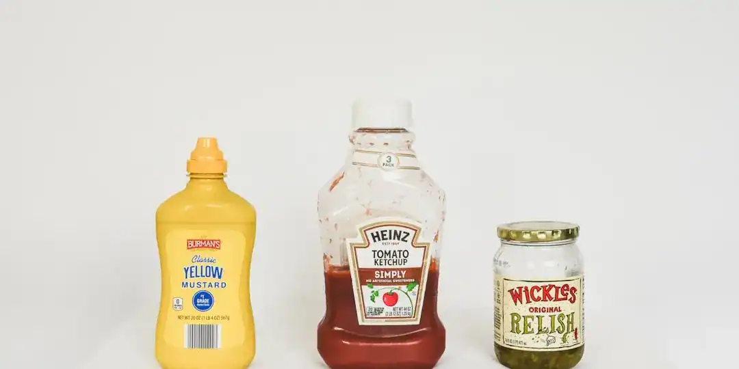
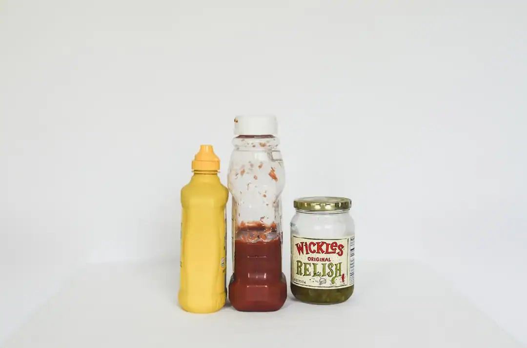
Have you ever stopped to think about why nearly every major fast food chain uses the same two colors? It is not a coincidence; it is a calculated psychological tactic known as the Ketchup and mustard theory. This theory suggests that the combination of red and yellow creates the perfect psychological storm to make us hungry and happy simultaneously.
Red represents heat, energy, and stimulation, much like the condiment ketchup, while yellow represents warmth, comfort, and happiness, similar to mustard. When our brains process these colors together, they don’t just see a logo; they perceive a biological signal to “stop and eat.” Research indicates that this specific pairing communicates value and speed, subconsciously telling customers that they can get a quick, satisfying meal right now. It triggers a primal response that overrides logic, making that burger seem like a necessity rather than a choice.
Summary: The Ketchup and mustard theory is the industry standard because it successfully combines the urgency of red with the comfort of yellow to trigger an immediate appetite response.
Red: The Engine of Urgency and Appetite
Red is the heavy lifter in fast food color psychology. It is physically stimulating and has been shown to increase heart rate and blood pressure. In the context of marketing, red creates a sense of urgency. It shouts, “Buy now!” and “Eat quickly!” This is crucial for the fast-food business model, which relies on high volume and fast turnover.
When you see a red logo, your brain becomes more alert. This heightened state makes you more impulsive, which is exactly what brands want when you are deciding whether to pull into a drive-thru. Furthermore, red is famously known as one of the most potent appetite stimulating colors. It excites the metabolism. I remember reading a study where participants in red rooms tended to eat more than those in blue rooms, simply because the environment felt more energetic and less restful.
For new businesses trying to capture this energy, designing a logo that balances these intense hues is critical. Advanced tools like Ailogocreator allow entrepreneurs to experiment with these psychological color triggers, ensuring their brand identity strikes the right chord without needing expensive design agencies.
Summary: Red is used to physically stimulate the body, increasing heart rate and creating a sense of urgency that encourages impulse buying and faster eating.
Yellow: The Beacon of Visibility and Comfort
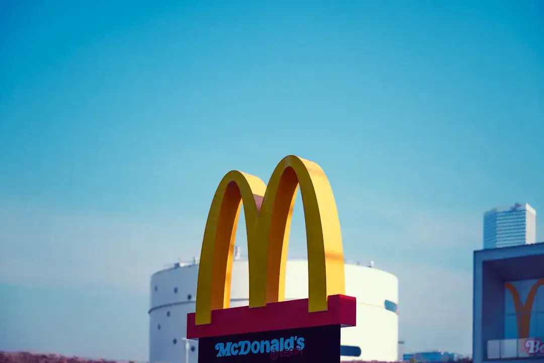
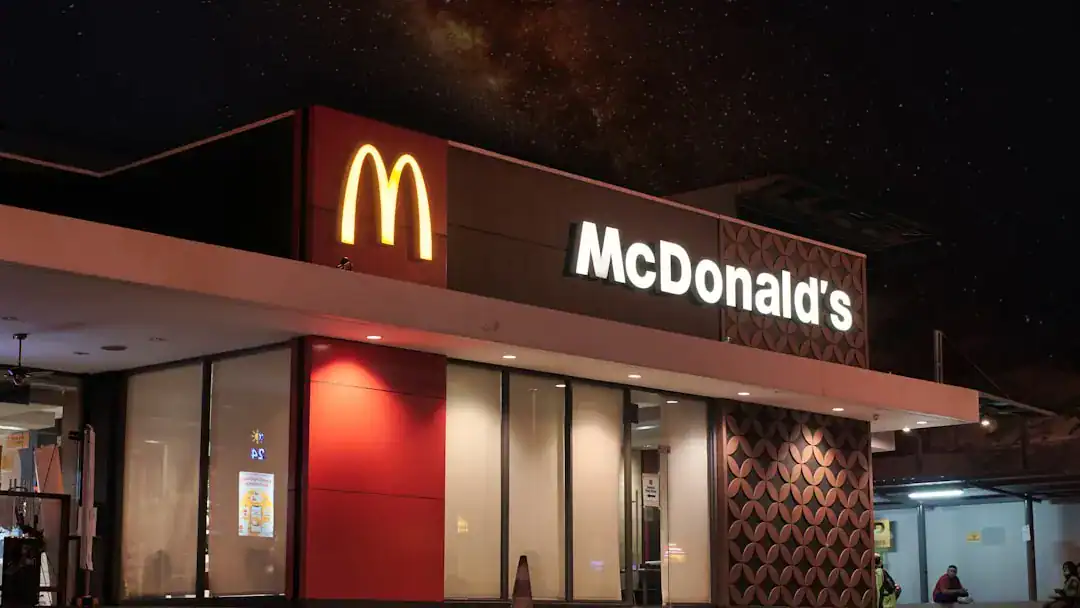
If red is the accelerator, yellow is the steering wheel that guides you in. Yellow is the most visible color in the daylight spectrum, which is why it is used for traffic signs and, strategically, for fast food signs meant to be seen from a moving car on a highway. The McDonald’s branding strategy relies heavily on this; the Golden Arches are visible long before you can smell the food.
Psychologically, yellow is associated with happiness, youth, and optimism. It creates a “halo effect” of friendliness around the brand. While red might feel aggressive on its own, yellow softens the blow, promising a warm and welcoming experience. It taps into our desire for comfort. When you pair the urgency of red with the happiness of yellow, you create an emotional promise: “Come here quickly, and you will feel good.” This combination is particularly effective on children, which helps cement brand loyalty from a very young age.
Summary: Yellow serves as a highly visible beacon that grabs attention from a distance while subconsciously evoking feelings of happiness and comfort to balance the aggression of red.
Beyond the Burger: Green, Blue, and Modern Shifts
While red and yellow logos dominate the traditional fast food landscape, there is a shifting trend toward green. As consumers become more health-conscious, brands are adapting color theory in marketing to signal freshness. Green is processed by the brain as “natural,” “healthy,” and “eco-friendly.” You might notice that brands offering salads or “clean” eating options avoid the aggressive red in favor of leafy greens and earth tones.
Conversely, blue is rarely used in food logos. In nature, blue food is rare (blueberries being an exception), and historically, blue often signaled spoilage or poison. Consequently, blue acts as an appetite suppressant. It is the color of relaxation and trust, which is great for banks or technology companies, but terrible for selling burgers. If you ever see a blue logo in the food industry, it is likely for a seafood restaurant (referencing the ocean) or a brand trying to position itself as a cold, refreshing beverage establishment rather than a place for a hot meal.
Summary: Green is increasingly used to signal health and freshness, while blue acts as an appetite suppressant and is generally avoided in the fast food sector unless selling cold products or seafood.
FAQ
Q: What is the Ketchup and Mustard theory in marketing?
A: The Ketchup and Mustard theory refers to the strategic use of red and yellow in fast food branding. Red triggers stimulation and hunger (ketchup), while yellow evokes feelings of happiness and comfort (mustard). Together, they encourage customers to stop, eat, and leave quickly.
Q: Why do so many fast food logos use the color red?
A: Red is used because it creates a sense of urgency and increases heart rate. It is an appetite stimulating color that encourages impulse purchases and subconsciously pushes customers to eat faster, which helps restaurants increase table turnover rates.
Q: Does the color blue really make you less hungry?
A: Yes, blue is considered an appetite suppressant. Since blue rarely occurs naturally in food (aside from berries), our ancestors often associated it with spoiled or poisonous items. Therefore, it has a calming effect rather than a stimulating one, making it less suitable for food marketing.
Q: How does color psychology affect consumer behavior in restaurants?
A: Color psychology sets the mood and pace of the dining experience. Warm colors like red and yellow stimulate energy and speed, leading to faster turnover. Cool colors like green and blue encourage relaxation and lingering, which is more common in fine dining or coffee shops.
Conclusion and Actionable Suggestions
The dominance of red and yellow logos in the fast food industry is a testament to the power of human psychology. By understanding how appetite stimulating colors work, these brands effectively control our hunger levels and purchasing decisions. Whether you are building a food brand or simply analyzing the market, acknowledging the “Ketchup and Mustard theory” is essential for understanding visual strategy.
Here are actionable steps to apply these insights:
- Analyze Your Goal: If you want high turnover and impulse buys, lean towards warm colors like red and orange. If you want customers to linger and relax, choose cool tones like green or muted blues.
- Test Your Visibility: Ensure your primary brand color contrasts well with the environment it will be seen in (e.g., yellow stands out against a gray concrete city background).
- Balance Emotion with Action: Use red to call for action (like “Order Now” buttons) and yellow or orange to convey the emotional benefit (happiness/satisfaction).
- Consider Health Signaling: If your product is healthy or organic, break the fast food mold by incorporating green to signal freshness immediately.
- Audit Your Competitors: Look at the color landscape of your specific niche. If everyone is using red, a bold yellow or orange might help you stand out while still triggering the right appetite cues.

CommentsTake the first comment