Mastering the psychological impact of typography can significantly elevate your brand’s market value and consumer loyalty without expensive ad campaigns. If you are a startup founder, a design enthusiast, or a marketer looking to solidify your visual identity, understanding the historical duel between these beverage giants is essential. This analysis dives deep into the Coca-Cola vs Pepsi logo battle, exploring how Spencerian script, vintage typography, and logo design psychology shaped their divergent paths in brand identity evolution.
- Consistency vs. Reinvention: How sticking to one font built a $100B+ brand equity.
- The Psychology of Script: Why Spencerian script evokes trust and nostalgia.
- The Cost of Change: Analyzing Pepsi rebranding history and its search for identity.
- Modern Adaptation: Balancing heritage with digital-first design trends.
The Power of Permanence: Coca-Cola’s Spencerian Script
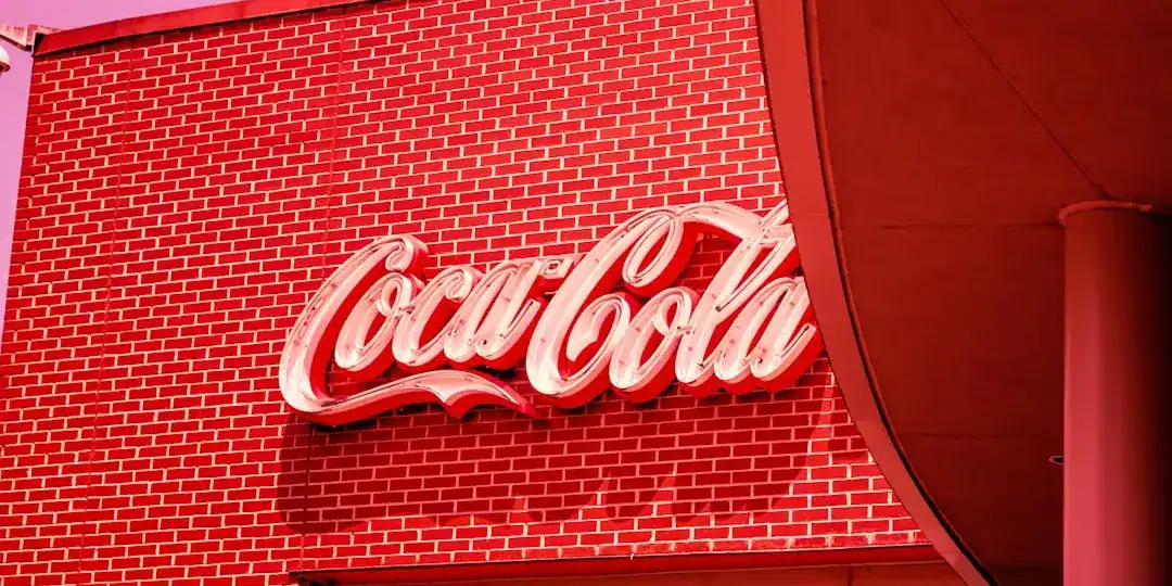
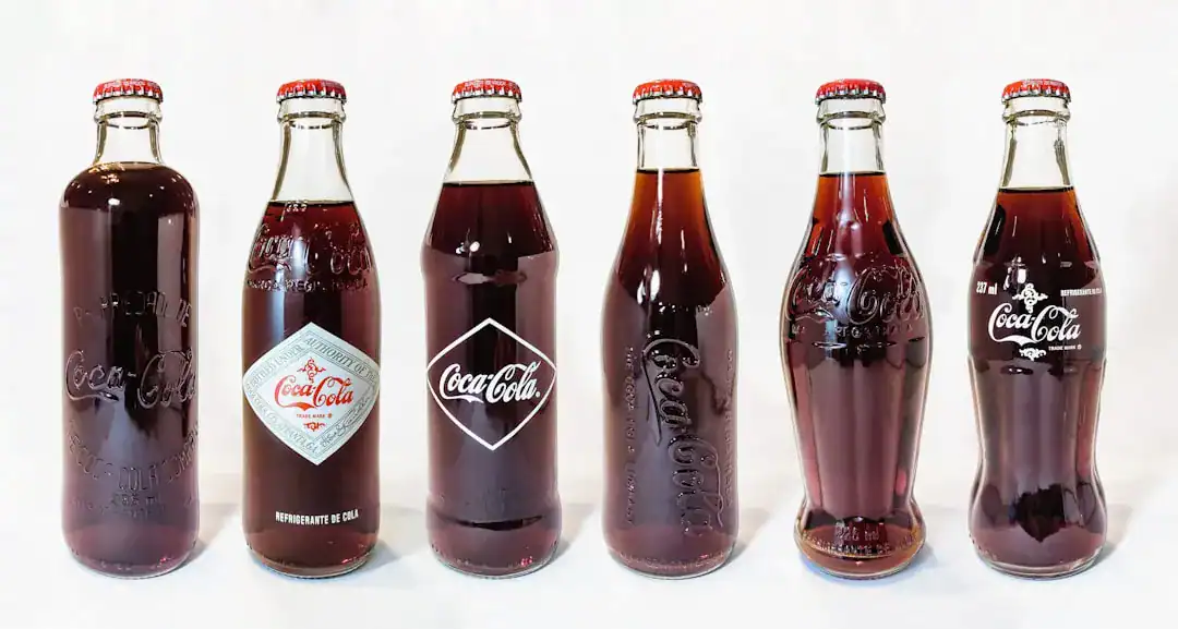
When we look at the history of branding, few examples are as compelling as Coca-Cola’s refusal to change. In the early 1880s, bookkeeper Frank Mason Robinson sketched the now-iconic logo using Spencerian script, a standard writing style for business correspondence in the United States at the time. He didn’t just write a name; he crafted a visual rhythm. The flowing letters and the “sea of red” created an immediate emotional hook.
Why does this matter today? Because it demonstrates the compounding value of consistency. According to design history analysis, while other brands chased Art Deco, Minimalism, or Grunge trends, Coca-Cola stood firm. They made micro-adjustments—tweaking the weight or the swirl—but the core vintage typography remained untouched. This consistency leverages “System 1” thinking in consumers, allowing for instant, effortless recognition on a crowded shelf. It feels familiar. It feels safe.
Summary: Coca-Cola’s success proves that maintaining a consistent visual anchor, like the Spencerian script, builds deep emotional trust and minimizes the cognitive load for consumers.
The Pursuit of Youth: Pepsi’s Rebranding History
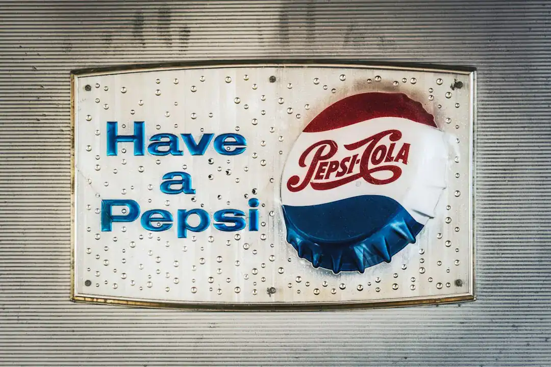
In stark contrast, Pepsi’s strategy has been one of constant evolution, often mirroring the restless energy of the youth culture it targets. Pepsi didn’t start with a globe; its original 1898 logo was actually a script font, surprisingly similar to Coca-Cola’s. However, the brand identity evolution took a sharp turn in 1962 when they dropped the “Cola” and adopted a cleaner, sans-serif look to distance themselves from their competitor.
This marked the beginning of a decades-long cycle of reinvention. Industry reports highlight that Pepsi has redesigned its logo over a dozen times. The most discussed shift occurred in 2008, when the company famously spent $1 million on a new “smiling” globe logo. The goal was to appear dynamic and future-forward. Yet, recent moves in 2023 saw Pepsi pivoting back to bold, uppercase typography reminiscent of their 1990s look. This oscillation suggests a struggle to find a balance between being “current” and being “timeless.”
Summary: Pepsi rebranding history shows that while frequent changes can signal relevance to new generations, they risk eroding the long-term brand equity that comes with visual stability.
Logo Design Psychology: Why Vintage Typography Builds Trust
The battle isn’t just about aesthetics; it is about how our brains process shapes. Logo design psychology suggests that complex, handwritten styles like the Spencerian script convey authenticity and human touch. In an era of automated manufacturing, a “handwritten” logo feels personal. It implies a recipe, a creator, and a history.
On the flip side, modern sans-serif fonts—often favored by tech companies and Pepsi’s mid-era designs—communicate efficiency, modernity, and agility. However, they can sometimes feel sterile. When a brand with over a century of history abandons its vintage typography for something ultra-modern, it can inadvertently signal a disconnection from its roots. Data indicates that consumers often associate heritage fonts with higher quality and premium positioning, which explains why Coca-Cola’s brand valuation consistently outpaces competitors who frequently pivot.
Summary: Vintage fonts trigger associations of craftsmanship and longevity, whereas frequent modern updates can sometimes be perceived as a lack of confidence in the brand’s core identity.
Strategic Divergence in the Digital Age
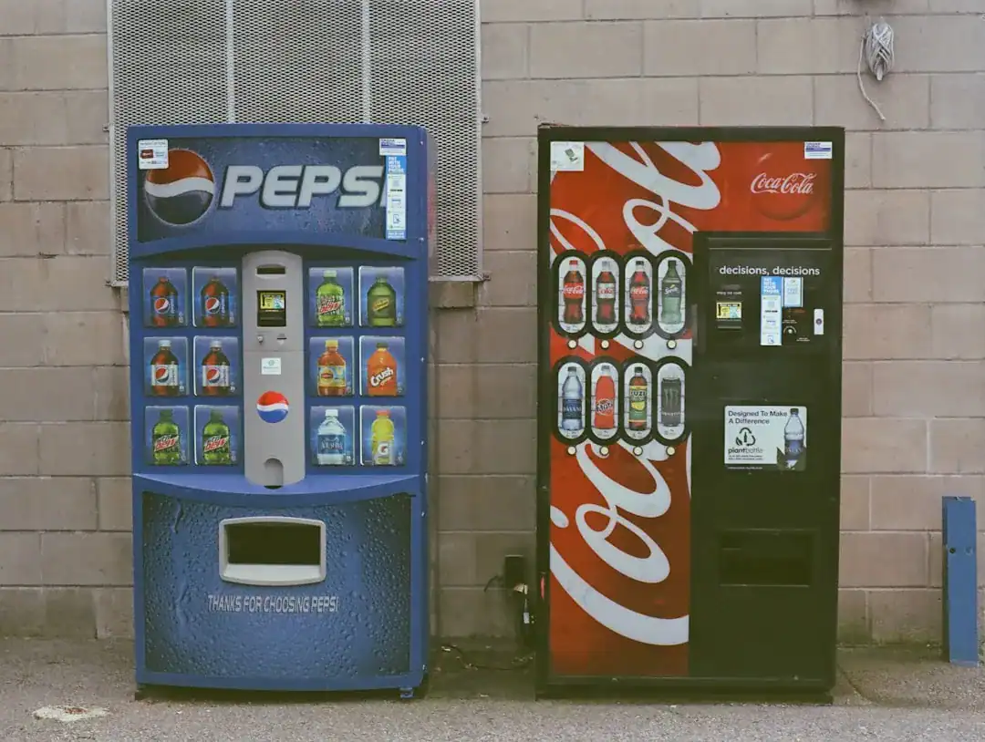
How do these century-old strategies translate to mobile screens and app icons? This is where the Coca-Cola vs Pepsi logo war enters a new phase. Coca-Cola proves that complex scripts can still work digitally if the color ownership is strong enough. You see the red disc, and you know it’s Coke, even if the script is small.
Pepsi, however, leverages its flexibility. Their constantly changing logo allows them to integrate into pop culture, music, and sports more fluidly. But for new businesses, this “chameleon” approach is risky and expensive. Today, smart brands use advanced technology to test these waters before committing. Tools like Ailogocreator exemplify how modern efficiency allows designers to iterate and visualize different typographic styles—from vintage to modern—in seconds, ensuring the final choice resonates across all platforms.
Summary: Successful digital adaptation requires balancing distinctiveness with legibility; leveraging efficient design tools can help brands find this sweet spot without the million-dollar price tag of traditional agencies.
Lessons for Modern Brands: Balancing Heritage and Trend
The most critical takeaway from the Coca-Cola vs Pepsi logo war is that “new” is not always “better.” Coca-Cola’s dominance teaches us that if you have a strong visual asset, you should protect it at all costs. The “New Coke” debacle of 1985 wasn’t just a flavor failure; it was a failure to understand that consumers bought the idea of Coke as much as the drink itself.
However, Pepsi’s resilience teaches us that if you are the challenger, you cannot play by the leader’s rules. You must disrupt. Pepsi’s willingness to embrace bold, geometric changes allows them to stay relevant as the “choice of a new generation.” For your own brand, the decision to use vintage typography or modern minimalism should depend entirely on your position in the market. Are you the stable incumbent or the agile disruptor?
Summary: Market leaders should prioritize consistency and heritage, while challengers may benefit from the dynamic energy of evolving design trends to capture attention.
FAQ
Q: Why did Coca-Cola keep the Spencerian script for so long?
A: Coca-Cola retained the Spencerian script to preserve brand heritage and emotional connection. The consistent design leverages deep-seated consumer recognition, making the brand feel timeless and trustworthy amidst changing trends.
Q: How much did Pepsi’s 2008 logo rebrand cost?
A: Reports indicate that the Arnell Group charged Pepsi approximately $1 million for the 2008 rebranding package. This included the controversial “gravitational” document explaining the design logic, highlighting the high stakes of brand identity evolution.
Q: Does changing a logo frequently hurt a brand?
A: Frequent changes can dilute brand recognition and consumer trust. While it signals modernity, as seen in Pepsi rebranding history, it often prevents the formation of the deep, iconic status that brands like Coca-Cola or Nike enjoy.
Q: What is the main difference between Coca-Cola and Pepsi’s design strategy?
A: Coca-Cola focuses on “evolution” (small, subtle refinements), whereas Pepsi focuses on “revolution” (dramatic, periodic overhauls). This reflects their respective positionings as the classic original versus the youthful challenger.
Q: Can a modern brand use vintage typography effectively?
A: Absolutely. Vintage typography conveys authenticity and artisanal quality, which is highly valued today. It stands out in a digital sea of minimalist sans-serif logos, offering a distinct personality.
Conclusion and Actionable Suggestions
The Coca-Cola vs Pepsi logo war is more than a history lesson; it is a blueprint for strategic decision-making. Whether you lean towards the elegance of Spencerian script or the boldness of modern geometry, the key is alignment with your brand’s core values.
To apply these insights to your own brand strategy:
- Audit Your Assets: Determine if your current logo has “heritage value.” If it does, refine it; don’t replace it.
- Define Your Archetype: Are you the “Ruler” (stable, classic like Coke) or the “Jester/Hero” (dynamic, changing like Pepsi)? Let this guide your font choice.
- Test Before You Commit: Don’t guess. Use efficient platforms like Ailogocreator to generate and compare multiple variations of vintage and modern styles to see what truly fits your vision.
- Prioritize Legibility: Ensure your chosen typography works as well on a smartphone screen as it does on a billboard.
- Commit to a Color: Even if you change your font, maintaining a strict color palette (like Coke’s red or Pepsi’s blue) can save your brand recognition during transitions.

CommentsTake the first comment