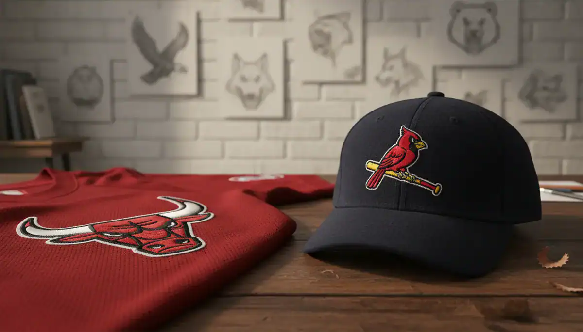
Mastering the emotional language of animal totems can transform a simple brand into a cultural icon. If you are a brand strategist, designer, or sports enthusiast looking to elevate your visual storytelling, this deep dive into professional sports branding offers crucial insights. We will explore the strategic psychology behind Animal sports logos, contrasting the high-energy NBA team branding with the heritage-rich MLB mascot design, while specifically analyzing the timeless Chicago Bulls logo and the historic St. Louis Cardinals logo within a cohesive Visual identity system.
- Totem Power: How animal instincts translate into brand authority and fan loyalty.
- Design Contrast: The difference between the NBA’s aggression and the MLB’s nostalgia.
- Iconic Case Studies: Decoding the success of the Chicago Bulls and St. Louis Cardinals.
- Systematic Branding: Creating a unified visual language from logo to mascot.
The Psychology Behind Animal Sports Logos
Why do sports teams overwhelmingly choose animals as their symbols? The answer lies in the primal connection humans have with nature. Animal sports logos act as modern totems. They encapsulate specific traits—speed, strength, agility, or precision—that the team wishes to embody.
When a fan wears a jersey featuring a fierce predator, they aren’t just supporting a team; they are adopting that creature’s attributes. According to branding research, anthropomorphic mascots (animals with human traits) create a bridge between the abstract entity of a “club” and the human need for connection. This psychological anchor creates a sense of belonging. It turns a passive viewer into an active tribe member.
Summary: Animal logos serve as psychological shortcuts, instantly communicating a team’s core values and fostering deep emotional connections through shared totem traits.

Aggression and Energy: Analyzing NBA Team Branding
The NBA is a league defined by star power, high-paced action, and individual flair. Consequently, NBA team branding often leans towards dynamic, aggressive, and character-driven designs. The logos are built to look good on a digital screen and a streetwear hoodie alike.
The Unchanging Power of the Chicago Bulls Logo
The Chicago Bulls logo is a masterclass in design consistency. Remarkably, it is the only logo in the NBA that has never changed since its inception in 1966. Why? Because it perfectly balances aggression with simplicity.
* Color Psychology: The use of red, black, and white isn’t accidental. Red signals passion and danger. Black adds weight and authority.
* Expression: The bull’s furrowed brows and blood-tipped horns convey a message of “ruthless competition.”
* The Mascot Factor: While the logo is serious, the mascot, Benny the Bull, adds a layer of entertainment. Industry reports highlight that Benny’s social media presence, distinct from the team’s official accounts, drives massive engagement through humor and hijinks. This duality allows the brand to be both feared on the court and loved on TikTok.
Summary: NBA branding, exemplified by the Bulls, uses high-contrast colors and aggressive animal imagery to assert dominance, while using live mascots to soften the image for broader entertainment value.
Heritage and Harmony: The St. Louis Cardinals and MLB Mascot Design
In contrast to the NBA’s focus on kinetic energy, Major League Baseball (MLB) often emphasizes history, continuity, and community. MLB mascot design frequently draws from folklore or local identity, creating a sense of timelessness.
The Legacy of the St. Louis Cardinals Logo
The St. Louis Cardinals logo, famously known as the “birds on the bat,” represents a different kind of totem. It speaks to agility, vitality, and grace rather than brute force.
* Origin Story: The concept dates back to 1922. It was inspired by a cardboard arrangement of cardinals seen at a church event, proving that great inspiration often comes from unexpected places.
* Visual Evolution: Over the decades, the birds have been refined—beaks adjusted, feathers smoothed—but the core concept remains untouched. This consistency builds a multi-generational bond. A grandfather and a grandson can wear the same symbol with the same pride.
* Symbolism: The cardinal is not a predator; it is a vibrant splash of color. It symbolizes the joy of the game and the spirit of spring, aligning perfectly with baseball’s seasonal rhythm.
Summary: MLB designs like the Cardinals focus on heritage and community connection, using animal totems to evoke nostalgia and a sense of enduring legacy rather than intimidation.

Visual Identity Systems: Bridging the Gap
A logo does not exist in a vacuum. It is part of a broader Visual identity system. This system dictates how the primary logo, secondary marks, typography, and the mascot character interact across different media.
Effective systems ensure that the “static” logo and the “living” mascot speak the same language. For the Bulls, the fierce logo and the funny mascot cover the entire emotional spectrum of the fan experience. For the Cardinals, the elegance of the script font matches the perched birds. Modern branding requires this level of cohesion.
Achieving this balance is challenging for new businesses. However, technology is democratizing high-level design. Advanced platforms like Ailogocreator are now analyzing successful design patterns, empowering entrepreneurs to generate logos that integrate these totemic elements and cohesive color theories instantly. This allows startups to establish a professional visual identity that rivals established sports franchises.
Summary: A strong visual identity system harmonizes the logo’s authority with the mascot’s personality, a strategy that modern AI tools are making accessible to brands of all sizes.

Future Trends: Minimalism and Digital Adaptation
As we look forward, the trend in both leagues is shifting towards minimalism. Detailed fur and complex shading are disappearing. They are being replaced by bold lines and flat colors.
- Mobile-First Design: Logos must be legible as a tiny app icon. Complex animal illustrations are being simplified into abstract geometric shapes.
- Dynamic Poses: Static profiles are giving way to animals in motion—lunging, flying, or running. This reflects the speed of modern content consumption.
- 3D Integration: With the rise of the metaverse, teams are exploring 3D-printed mascots and digital avatars, bridging the physical and virtual worlds.
Summary: The future of sports branding lies in simplified, adaptable designs that maintain the totemic power of the animal while functioning seamlessly across digital and physical realms.

Conclusion and Actionable Suggestions
The art of the mascot lies in the balance between heritage and evolution. Whether it is the aggression of the Chicago Bulls logo or the elegance of the St. Louis Cardinals logo, the most successful designs use Animal sports logos to tell a story that resonates on a primal level.
To apply these lessons to your own brand:
1. Identify Your Totem: Choose a symbol that embodies your brand’s core behavior, not just its industry.
2. Define the Emotion: Decide if you want to convey “aggression and power” (like the NBA) or “heritage and community” (like the MLB).
3. Ensure Consistency: Build a Visual identity system where your logo, fonts, and mascot character align perfectly.
4. Simplify for Screens: Ensure your animal design remains recognizable even when shrunk down to a social media icon.
5. Leverage Modern Tools: Don’t guess; use data-driven design tools to find the perfect color and shape combinations.

FAQ
Q: Why do sports teams prefer animal logos over other symbols?
A: Animals act as totems that instantly communicate specific traits like strength, speed, or loyalty. They allow fans to project these humanized qualities onto the team, deepening the emotional connection.
Q: What makes the Chicago Bulls logo so iconic?
A: It is unique because it has remained unchanged since 1966. Its bold red, black, and white color palette and the aggressive expression of the bull perfectly encapsulate the team’s competitive spirit.
Q: How has the St. Louis Cardinals logo evolved?
A: The “birds on the bat” concept has existed since 1922. While the artwork has been refined for modern printing and digital displays, the core imagery has remained consistent to honor the team’s rich history.
Q: What is a visual identity system in sports branding?
A: It is the comprehensive guide that ensures a team’s logo, colors, typography, and mascot usage remain consistent across all platforms, from jerseys to social media posts.
Q: Are sports logos becoming simpler?
A: Yes. The trend is moving toward minimalism. Teams are simplifying designs to ensure they look sharp and recognizable on small mobile screens and digital apps.


CommentsTake the first comment