
The Close Relationship Between the PEPSI Brand and Its Logo
Overview of PEPSI Brand and Market Position
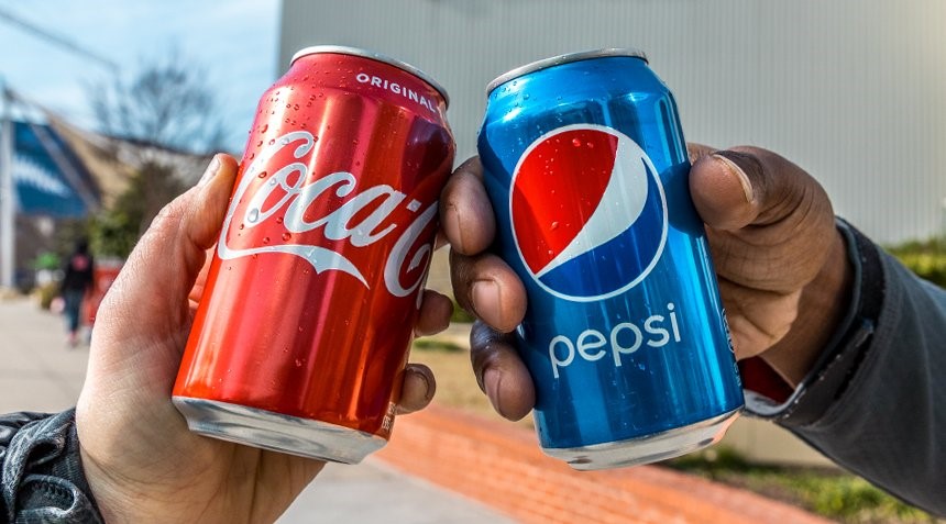
PEPSI is a significant brand in the global soft drink market, having maintained a strong presence in a highly competitive industry for many years. Alongside its competitor Coca-Cola, PEPSI has vied for market share in the soft drink sector, becoming a beloved choice for consumers worldwide. The PEPSI brand symbolizes quality, innovation, and a forward-thinking corporate spirit, playing a leadership role in the beverage industry.
The PEPSI logo is more than just design; it embodies the essence of the brand. It serves as a visual symbol that intuitively communicates the products and messages PEPSI offers to consumers. This has helped PEPSI build a strong emotional connection with consumers. For instance, each time PEPSI updates its logo, it symbolizes the brand’s evolution and refreshes the energy perceived by consumers.

In celebration of its 125th anniversary, PEPSI revamped its brand logo, marking a significant milestone in redefining brand identity in a contemporary manner, bridging PEPSI’s history and future.
Importance of the PEPSI Logo
The PEPSI logo has played a vital role in enhancing brand recognition. It communicates the fundamental values and vision of the brand to consumers. The message conveyed by the PEPSI logo reflects not just carbonated drinks but also vitality, innovation, and globalization — the spirit of the brand.
As the “face” of the brand, the logo allows consumers to feel its characteristics and values at a glance. Particularly when PEPSI revamps its logo design, it serves to remind consumers who have followed its evolution that it continues to be an ever-changing brand. Thus, the logo is a crucial tool for building a deep emotional connection between PEPSI and its consumers.
Founding of PEPSI and Initial Logo Design
History of PEPSI’s Founding and Growth
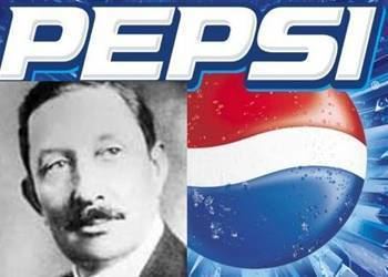
The story of PEPSI began in 1898. Founder Caleb Bradham developed a new beverage intended to aid digestion, which became the origin of PEPSI. While working in a pharmacy, he used various natural ingredients to create a refreshing drink that gradually gained market acceptance.
Early PEPSI set itself apart with a unique taste and refreshing quality, winning consumer support in a competitive market. It successfully spread its brand through aggressive advertising strategies despite facing many challenges, particularly raw material shortages and financial issues during World War I. Nonetheless, PEPSI leveraged its uniqueness and innovation to re-emerge in the market.
The First PEPSI Logo Design
The first PEPSI logo was very simple, featuring the hand-written cursive “PEPSI-COLA” in vibrant red and blue, reflecting the refreshment and vitality of the time, aiming to convey to consumers that PEPSI was an invigorating and strong beverage.
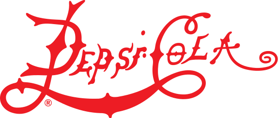
The initial logo succinctly expressed the brand’s message, emphasizing “energy” and “refreshment,” and portrayed PEPSI as a healthy and refreshing drink, forming a lasting impression on consumers.
Evolutionary History of the PEPSI Logo
Changes in the Logo: Early to Mid-20th Century
From the early to mid-20th century, PEPSI updated its logo design several times, moving to simpler designs with changes in color and font. These logos remained visually simple yet retained PEPSI’s energetic image.

In the 1950s, significant changes were made to the PEPSI logo. The design incorporated more graphical elements such as bottle caps and bubbles to create a more dynamic and energetic brand image. This change was an important step to cast PEPSI as a more approachable and energetic drink.
Modern Transformation of the Logo: 2008’s Three-dimensional and Dynamic Design
In 2008, PEPSI once again refreshed its logo by incorporating three-dimensional elements into an otherwise flat design, projecting a modern, dynamic impression and emphasizing the brand’s pursuit of innovation and evolution.
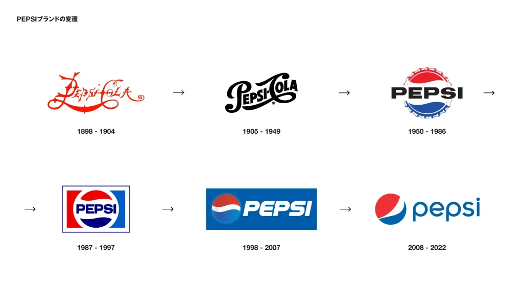
The change aimed to keep pace with the digital age, enhancing visual impact in digital media and advertising, appealing to younger generations and new consumer demographics.
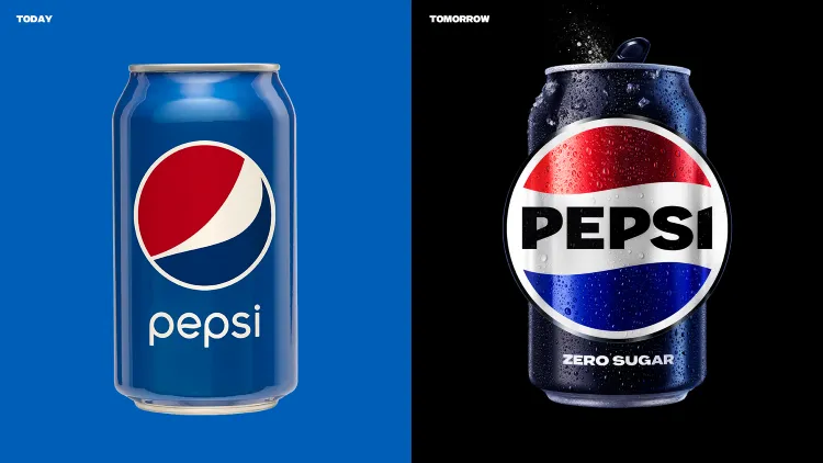
Background and Motivation for the 2024 Logo Update
Celebrating its 125th anniversary in 2024, PEPSI updated its logo again. This new logo serves an important role in linking the brand’s rich history to its future vision, especially in the context of growing digitalization and globalization, presenting a new brand strategy targeted at younger demographics.
The new logo is refreshed to be a simple yet powerful design, highlighting PEPSI’s global influence and forward-looking stance, making it a strategic design move to enhance brand recognition among youth cultures and digital media.
Analysis of the New 2024 PEPSI Logo Design
Design Style and Direction: Emblem Style
The new PEPSI logo incorporates emblem style, offering a sense of authority and consistency for the brand. This style is particularly effective for emphasizing a brand’s identity.
Characterized by symbolized design and strong symbolism, PEPSI successfully maximizes visual impact by blending tradition with modernity, leaving a strong impression on consumers. This new logo unequivocally communicates to consumers that PEPSI will continue to be a brand committed to innovation.
Analysis of Visual Elements in the Logo: Earth’s Shape and Bottle Cap
The 2024 new PEPSI logo features elements symbolizing the shape of the Earth, representing PEPSI’s global perspective and its status as a globally beloved brand. The Earth’s shape indicates PEPSI’s influence across numerous global consumers, aligning with the present era of globalization.
Additionally, the new logo includes designs reminiscent of bottle caps, taking inspiration from the 1950s logo designs, respecting PEPSI’s long history and functioning as symbolic elements connecting past and present.
Abstract and Simplification of the Logo: Adapting to Modern Propagation Needs
In modern design, visibility on digital platforms is crucial. The new PEPSI logo, with its simplified design, performs well visually in environments like smartphones and social media, effectively conveying brand characteristics.
For modern consumers, PEPSI aims to maintain brand recognition while appealing to younger generations by offering such a logo.
The New Visual Symbol and Brand Propagation of PEPSI
“Pulse graphic” Dynamic Design Element
The new PEPSI logo features the addition of dynamic elements known as “Pulse graphic,” expressing the brand’s vitality and passion. This dynamic symbol enhances expressive power in advertising and social media, fostering a strong emotional bond between consumers and PEPSI.
“Pulse graphic” underscores not only the brand’s strength and vitality but also visually illustrates PEPSI’s continuous pursuit of innovation.
“Can Silhouette”: Outline Design of the Can Shape
A notable design element in the new PEPSI logo is the “Can Silhouette,” symbolically representing PEPSI’s iconic canned packaging and leaving a strong brand identity impression. The outline of the can represents the essence of PEPSI’s products, ensuring consumers immediately associate the drink with the logo.
This “Can Silhouette” is crucial for distinguishing PEPSI from competitive brands like Coca-Cola, providing a robust design strategy to emphasize its uniqueness and enhancing brand recognition.
Left: 2008-2024 (February), Right: New logo released in March 2024
Incorporating such simple yet iconic shapes enhances visual impact, ensuring the design is deeply engraved in consumers’ minds.
Application of the PEPSI Logo: Cross-Platform and Full-Channel Integration
Innovative Application in Package Design
The new PEPSI logo is innovatively utilized in product package design, notably in the “WILD CHERRY” series, enhancing the product’s appeal. Integrating the new logo boosts visual consistency and leaves strong consumer impressions.
As packaging design is a crucial purchase decision factor, its seamless integration strengthens PEPSI’s brand image, ensuring visibility among competitors at the store level.
These packaging design innovations play an important role in PEPSI’s brand strategy and have become a powerful tool for motivating consumers to buy.
Cross-Platform and Multi-Channel Brand Consistency
PEPSI uniformly uses the new logo across advertising, social media, and digital platforms, delivering consistent messaging and visuals across all channels. In the digital age, unified use of the PEPSI logo enhances brand recognition and consumer connection.
Consistency across platforms is key to maintaining brand image in any media environment, increasing dissemination power and strengthening global consumer influence. Uniform design use is a powerful element supporting PEPSI’s brand, helping communicate its message to more consumers.
Enhancing Brand Design Using the Latest AI Technology
How AI Technology Contributes to the Future of Brand Visual Design
AI technology holds the potential to revolutionize brand design, significantly improving design efficiency and enabling rapid creation of creative, innovative logos. By analyzing consumer preferences and market trends, AI offers optimal design suggestions, allowing designers to strategically build the brand image.
Leveraging AI expedites design processes, facilitating swift market-suited design offerings. If major brands like PEPSI adopt this technology, design innovation will further be heightened. AI’s evolution predicts more companies easily creating high-quality brand designs.
AI’s Impact on Future Logo Design
AI technology allows for flexible, personalized approaches in logo design creation. AI logo creation tools, like AILOGOCREATOR, support companies in rapidly generating optimal logos, reducing design costs while efficiently creating high-quality logos.

By using AI, designers can analyze previous design data and consumer responses to complete logos efficiently aligned with brand directions, offering customization in response to brand personality and market needs.

Conclusion and Outlook
Future of Brand Design: Balancing Innovation and Tradition
The evolution of the PEPSI logo reflects a balance between innovation and tradition, adapting to changes in the market and consumer needs while maintaining brand identity and providing new value.
The 2024 logo update represents PEPSI’s innovative spirit, linking brand history with its future, presenting a new allure to consumers. Through its evolving logo design reflecting brand growth, PEPSI will maintain strong competitiveness in the global market.
FAQ
How does PEPSI balance its brand history with contemporary design needs?
PEPSI addresses changing consumer needs by valuing traditional brand values while incorporating modern design, successfully blending innovation with history amid digitalization and globalization.
Can AI accurately understand a brand’s core concept like a human designer?
AI is evolving to understand brand requirements and generate suitable designs. However, replicating human creativity is complex, requiring harmony with human creativity.
Why are dynamic visual elements important in brand dissemination?
Dynamic visual elements enhance interactivity, strengthening consumer connections and increasing brand awareness and interest, especially in advertising and social media.
How did PEPSI address digital dissemination challenges with the logo update?
PEPSI enhanced digital platform visibility and consistency with the new logo, ensuring brand appeal in the digital age.
How is AILOGOCREATOR beneficial for small and medium-sized enterprises?
AILOGOCREATOR offers affordable, high-quality logos, providing SMEs with design support equivalent to major brands, helping efficiently build brand identity.
CommentsTake the first comment