
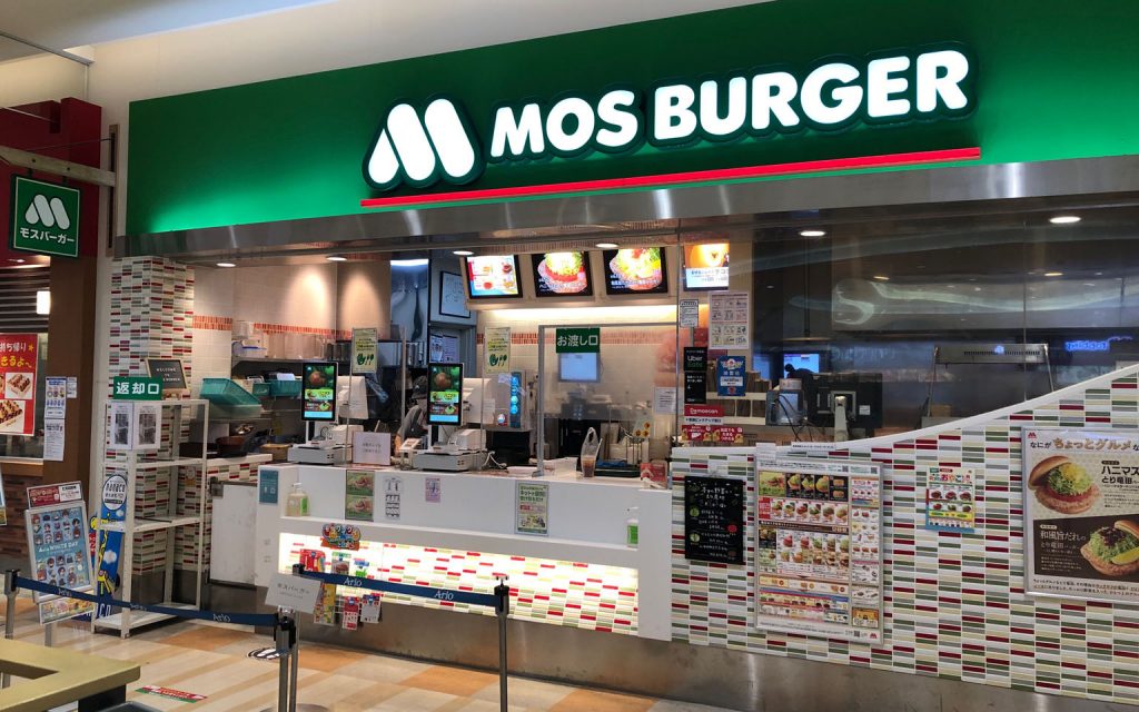
MOS Burger is one of Japan’s representative fast-food chains, loved by many consumers. It is highly regarded in the market for its rich flavors and high quality, and its recognition has spread both domestically and internationally. The iconic “M” logo is particularly notable, strongly impressing the brand’s identity. In this article, we explore how the MOS Burger logo conveys the brand’s philosophy and its role in the market.
Brand Background and Development of MOS Burger
MOS Burger was founded in Japan in 1972. Since its inception, it has distinguished itself from other chains by focusing on healthy and high-quality fast food. Overseas, cultural differences and fierce competition posed challenges, but it overcame these by offering services and products tailored to local preferences. As a result, it has gained support from many consumers and has expanded its brand primarily in Asia. The history of market recognition and evaluation is filled with the establishment of trust with consumers and brand growth.
Mos Burger’s brand name and philosophy
Origin and significance of the brand name “MOS”
The brand name “MOS” comes from the initials of “Mountain,” “Ocean,” and “Sun.” The mountain symbolizes stability and strength, the ocean represents vastness and richness, and the sun signifies energy and growth. These natural elements reflect MOS Burger’s commitment to environmental consideration and sustainable activities. Additionally, these elements foster consumer confidence and reliability, contributing to long-term relationship building.

Brand Vision and Mission of MOS Burger
The vision of MOS Burger is to propose a healthy and nature-friendly lifestyle. This is reflected not only in product development but also in eco-friendly packaging and store operation principles. The brand promotes initiatives considering a sustainable future for the Earth while coexisting with local communities. The global brand mission emphasizes fulfilling responsibilities toward health and the environment.
Principles Surrounding Health and Environmental Protection
MOS Burger prioritizes health, using fresh, natural ingredients in its menu. This aims to allow consumers to enjoy their meals with peace of mind. It also focuses on environmental protection by adopting resource-saving store operations and reusable packaging. Such initiatives reflect the company’s social responsibility and have gained strong consumer support.
Core Elements of the MOS Burger Logo Design
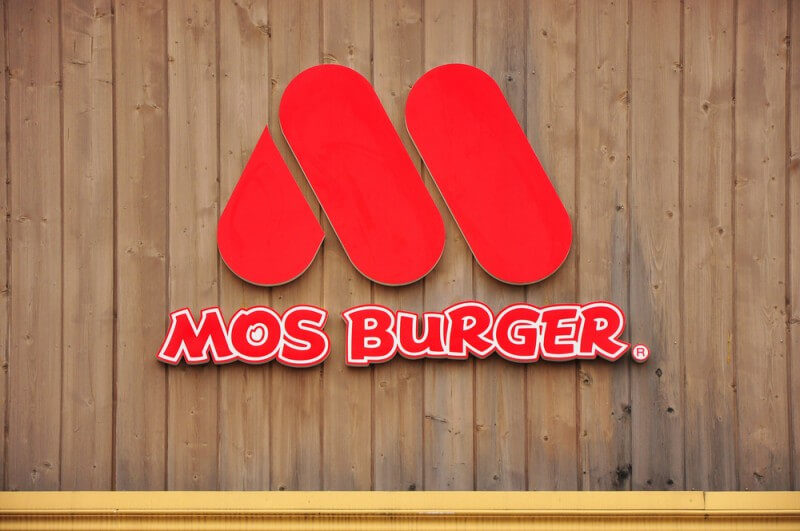
The Form and Symbolism of the “M” Shape
The “M” in MOS Burger’s logo is a key element symbolizing the brand image. This “M” is drawn with soft, natural curves, conveying a sense of warmth and meticulous handcraft. The logo design provides consumers with a sense of familiarity and reassurance, creating a strong connection with the brand. Its simplicity allows it to be a universal design cherished across generations.
Fusion of Modernity and Tradition
MOS Burger’s “M” is a unique style that fuses modern design with traditional values. The refined, simple design represents the brand’s innovation and flexibility, loved by consumers for many years. This fusion enhances brand reliability to consumers and promotes long-term relationship building.
Uniqueness of the Handwritten Font Style
The handwritten font style used in the logo expresses MOS Burger’s warmth and approachability. This font demonstrates a handmade feel, emphasizing a personal relationship with the brand. Consumers can feel the unique experience offered by the brand through the handwritten font, fostering a lasting attachment to the brand.
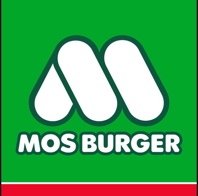
Harnessing and Symbolic Significance of Colors
Visual Impact and Emotional Resonance of Red
The red color used in the MOS Burger logo leaves a strong visual impact and stimulates consumers’ appetites and energy. This red symbolizes the passionate aspect of the brand, conveying energy and proactivity to consumers. Red has been consistently used as the brand’s symbolic color over the years, forming an emotional connection with consumers.
Luxury and Environmental Awareness of Green
The green color in the logo evokes luxury and environmental consciousness. Through green, MOS Burger communicates its awareness of nature and environmental consideration to consumers, providing reassurance. This color indicates the freshness of ingredients and respect for nature, being one of the factors trusted by consumers. Green is an essential means to visually convey invaluable brand messages.
Brand Image and Market Positioning
Building and Communicating Brand Image
MOS Burger values the consistency of its brand image centered on the logo. This consistency is widely communicated to consumers through store design, product promotion, and advertising strategies. It aims to provide high-quality, healthy fast food, playing a critical role in building trust with consumers.
Combining Fast Food and a High-End Feel
MOS Burger positions itself in the market by combining the convenience of fast food with a sense of luxury. The sophisticated logo design offers consumers a special experience, adding new value to everyday meals. Through this approach, consumers perceive MOS Burger as high-end fast food, establishing a distinct presence in the market.
History of Changes in the MOS Burger Logo
The MOS Burger logo has evolved over time. This evolution is in line with brand growth and market trends, a strategy to offer new value to consumers. For example, a logo renewal implemented in the 2000s involved a design change that respected tradition while being modern, successfully capturing the hearts of new consumer segments. Innovations in line with the times are key to refreshing brand image and maintaining sustainable brand strength.
Design Language and Brand Propagation
Logo Design and Brand Propagation Strategy
MOS Burger communicates a strong brand message through a brand propagation strategy centered on its logo. The logo is the core of visual brand communication, functioning as an essential element to enhance the effectiveness of advertising and promotion. The brand continues to promote activities that enhance recognition and leave a strong impression on consumers.
Integration of Advertising Strategy and Logo Design
In advertising, the logo design plays a role in providing consistency and a sense of connection. By effectively integrating the logo into marketing activities, the message and brand image to consumers are strengthened. This is a crucial strategy to build brand trust and improve consumer recognition.
Consumer Recognition and Emotional Connection
The power of the logo in strengthening the emotional connection with consumers is immeasurable. MOS Burger utilizes this emotional connection through its logo, contributing to the maintenance of long-term relationships with consumers. Emotional bonds with the brand enhance consumers’ value perception of the brand, enabling the lasting success of the brand.
Creating Better Logos Like the MOS Burger Logo Using AILogoCreator
New Approach to Logo Design
AILogoCreator is gaining attention as a tool supporting brand logo design by utilizing the latest AI technology. This tool has the ability to draw out a brand’s individuality, creating more professional logo designs in a short time. For brands like MOS Burger, it is especially effective, serving as a key to supporting design refreshment in line with the times.

Steps to Logo Design Using AILogoCreator
When using AILogoCreator, basic information such as brand name and tagline is input, followed by selecting styles and colors. Font and icon customization is possible, with the entire process being user-friendly. This operation process allows for efficient design of the optimal logo for the brand.
Efficient Logo Creation Process
Using this tool enables the creation of highly efficient logos in a short time. Especially, the speed of creating a professional logo in just 60 seconds is a significant advantage for busy companies. The preview feature allows for design verification and fine-tuning, achieving visuals that best meet the brand’s needs. This process will open new possibilities for future logo design.
Conclusion
Synthesizing Design Elements for Brand Success
MOS Burger successfully integrates brand philosophy, visual elements, and market positioning through logo design, building emotional connections with consumers. This has established its position as a brand loved by consumers for a long time. The key to this success is continually adapting to changes in the times, consistently offering new design forms and philosophies.
Future Outlook
In the future, MOS Burger will continue to adapt to market changes and adopt new design strategies. By incorporating innovative technologies, it aims to promote brand growth and further build relationships with consumers. This approach will likely contribute to sustained success and competitiveness.
FAQ
What does the MOS Burger logo mean?
The MOS Burger logo symbolizes the brand’s focus on health and environmental consciousness. Specifically, the shape of the “M” represents handmade warmth, while the use of red and green evokes appetite and environmental awareness.
Why is MOS Burger’s sign green?
The green sign symbolizes environmentally friendly initiatives, indicating that MOS Burger is conscious of the importance of nature. This choice aims to offer consumers a sense of reassurance and trust.
Is MOS Burger’s origin related to moss?
The name “MOS” is derived from the initials of “Mountain,” “Ocean,” and “Sun,” with no connection to “moss.” This name choice reflects MOS Burger’s environmental focus philosophy.
Who designed MOS Burger’s logo?
The MOS Burger logo was designed at the time of the brand’s founding, primarily by the brand’s founder, Satoshi Sakurada, in collaboration with a team. Since then, it has been widely cherished as the brand’s symbol.
Why did MOS Burger choose red and green for its logo colors?
Red symbolizes passion and energy, while green signifies nature and environmental protection. This combination effectively visualizes the multifaceted brand philosophy of MOS Burger.
What are the benefits of creating a logo with AILogoCreator.io?
AILogoCreator.io is a tool leveraging AI technology to achieve rapid, high-quality logo design. This platform offers high customization freedom, allowing for easy use even without design skills, thus enabling companies to save time and reduce costs.
CommentsTake the first comment