A strategic approach to visual identity is the single most effective way to build immediate trust and reduce friction in the user acquisition funnel. If you are a SaaS founder or product designer aiming to establish a lasting market presence, understanding the mechanics of digital-first branding is non-negotiable. In an increasingly crowded market, elements like SaaS branding, minimalist logo design, and responsive logos serve as the visual shorthand for your product’s reliability and innovation.
- Simplicity Wins: Minimalist designs significantly improve user recall and load times.
- Scalability is Critical: Logos must adapt flawlessly from 4k monitors to tiny mobile favicons.
- Typography Matters: A clean wordmark often outperforms complex icons in the B2B space.
- Consistency Builds Trust: Uniform brand identity across platforms increases perceived value.
The Strategic Power of Minimalist Logo Design
I have observed a massive shift in how software companies present themselves, and it is not just an aesthetic choice; it is a business imperative. Minimalist logo design has become the industry standard because it solves a fundamental problem: noise. When a potential user lands on your site, they are often scanning for solutions, not admiring art. A complex logo with intricate details creates cognitive load, whereas a simple, geometric design communicates clarity and efficiency immediately.
Industry data supports this move toward simplicity. Research indicates that consumers process simple visuals much faster than complex ones, leading to higher recall rates. In the fast-paced SaaS world, where you might only have seconds to capture attention, a stripped-back design ensures your brand is memorable. I often advise clients that if a logo cannot be drawn from memory after five seconds of viewing, it is too complicated.
Furthermore, minimalism drives technical performance. Complex graphics with shadows, gradients, and intricate lines can increase file sizes and visual clutter. By stripping away non-essential elements, you not only improve the aesthetic appeal but also align with the clean, flat UI trends that dominate modern software interfaces.

Ensuring Scalability with Responsive Logos
A logo that looks stunning on a pitch deck but becomes an unrecognizable smudge on a mobile screen is a liability. This is where responsive logos come into play. In my experience, the days of having a single, static logo file are over. Modern SaaS branding requires a system of assets that can scale up and down without losing integrity.
You need to think in tiers. The primary logo might include the full wordmark and an icon. A secondary version might stack these elements for square formats. The tertiary version—crucial for mobile interfaces and browser tabs—should be a simplified symbol or monogram. This adaptability ensures that your brand remains recognizable whether it is displayed on a massive conference billboard or a 16×16 pixel favicon.
Market analysis suggests that brands optimizing for mobile responsiveness see better engagement metrics. When users interact with your software on their phones, a responsive logo that fits naturally into the app header without cramping the UI reinforces the feeling that the product is native to the device. It is about respecting the user’s screen real estate.
Typography and the Rise of the Wordmark
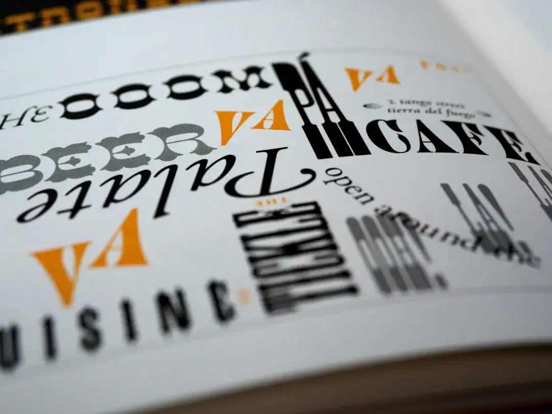
For many SaaS companies, the name itself is the primary identifier, making the wordmark the hero of the visual identity. Unlike consumer goods that rely heavily on mascots or abstract symbols, B2B software often leans on strong typography to convey professionalism. I have noticed that sans-serif fonts are the overwhelming favorite here, primarily due to their readability on screens.
However, choosing a font is not just about picking something “clean.” The typography must embody the brand identity. A cybersecurity firm might choose a bold, angular font to suggest strength and protection, while a collaboration tool might opt for rounder, softer letterforms to imply friendliness and ease of use. The nuance lies in the kerning (spacing between characters) and weight.
A common mistake I see is neglecting legibility at small sizes. A thin, elegant font might disappear on a dark background or low-resolution screen. Best practices dictate testing your wordmark in various contexts—dark mode, light mode, and low contrast environments—to ensure it remains legible. If the text becomes hard to read, the trust in the product diminishes.

From Browser to Home Screen: The App Icon Dilemma
The app icon is often the most undervalued asset in a SaaS company’s arsenal. It is distinct from the main logo, yet it must carry the same DNA. While your main logo might be a horizontal wordmark, your app icon lives in a square (or “squircle”) container on a user’s home screen or dock. It fights for attention alongside social media and utility giants.
Successful app icon design relies on a single, strong focal point. This is usually the logomark or the first letter of the brand name. I recommend avoiding text entirely in app icons unless it is a single character. Text is generally unreadable at icon size. Instead, focus on a unique shape or color combination that users can instantly associate with your tool.
Color plays a massive role here. Your icon needs to stand out against a variety of user wallpapers. High-contrast colors and distinctive gradients can help, but they must align with the overall palette. I always check how an icon looks in grayscale first; if the shape isn’t distinct without color, it is not strong enough.

Streamlining Design Workflows with Modern Tools
Speed of iteration is vital for SaaS startups. Spending months on a logo design process is often a luxury early-stage companies cannot afford. This is why I appreciate the emergence of intelligent design solutions that allow founders to generate high-quality assets quickly. Platforms like Ailogocreator have set a positive benchmark in this space, demonstrating how data-driven design principles can be applied to create professional, scalable logos without the traditional agency bottleneck.
These modern tools are particularly effective because they inherently understand the rules of minimalist logo design and responsiveness. They often generate asset packages that include favicons, social media kit files, and vector formats automatically. This allows teams to maintain brand consistency from day one, rather than scrambling to resize JPEGs manually.
Leveraging such efficiency allows product teams to focus on what really matters: the software itself. While a custom, hand-crafted brand is valuable at the enterprise level, the gap between automated, high-quality design and manual design has narrowed significantly, offering a viable path for agile SaaS companies.

Conclusion and Actionable Suggestions
Creating a robust visual identity for a SaaS product requires balancing aesthetics with strict functional requirements. Your logo is a tool, not just a decoration. It needs to work hard across every touchpoint of the user journey.
- Audit for Complexity: Review your current logo. If you remove the color and text, is the shape still recognizable? If not, simplify.
- Test Responsiveness: Create a favicon version (16x16px) of your logo. If it turns into an unrecognizable blob, you need a dedicated icon variant.
- Prioritize Legibility: Ensure your wordmark is readable in black and white and at 50% scale.
- Check Dark Mode: Modern SaaS interfaces often have dark modes. Your logo must look good on both white and dark gray backgrounds.
- Unify Assets: Ensure your app icon, website logo, and social media profiles use the exact same hex codes and shapes to build a cohesive brand identity.
FAQ
Q: Why is minimalist design preferred for SaaS companies?
A: Minimalist design reduces visual clutter, which helps with faster page loads and easier recognition on small mobile screens. It conveys efficiency and clarity, two highly valued traits in the software industry.
Q: What is the difference between a wordmark and a logomark?
A: A wordmark is a text-only logo that represents the brand name (like Google), while a logomark is a symbol or icon (like the Apple apple). SaaS brands often use a combination of both for versatility.
Q: How often should a SaaS company update its logo?
A: You should not update a logo frequently as it harms brand recognition. However, a “refresh” to simplify lines or adjust colors for modern screens is recommended every 5-7 years or when shifting strategic direction.
Q: Can I use AI tools for my final brand logo?
A: Yes, modern AI tools are capable of generating professional, vector-based logos that meet industry standards. They are excellent for speed and cost-efficiency, especially when they provide full brand kits.
Q: Why does my logo look blurry on some screens?
A: This usually happens when using raster files (like JPG or PNG) instead of vector files (SVG or EPS). Always use SVG formats for web to ensure your SaaS branding remains crisp at any resolution.

CommentsTake the first comment