A strong visual identity is the single most effective tool to instantly communicate trust and quality to your customers before they even try your product. If you are a founder of a new skincare line, a makeup artist launching a private label, or a boutique owner looking to refresh your image, you understand that the beauty market is fiercely competitive. Crafting a unique look that balances luxury cosmetic branding with minimalist makeup logo trends is essential to stand out in a crowded digital shelf.
- Clean and Minimalist: Why removing clutter creates a more premium feel for skincare brands.
- Typography Choices: How to choose between feminine scripts and bold sans-serifs for maximum impact.
- Color Psychology: Selecting palettes that evoke emotion, from soft pastels to authoritative blacks.
- Strategic Consistency: Ensuring your logo looks good on everything from tiny Instagram avatars to large packaging.
- Modern Tools: Leveraging smart design technology for efficient, high-end results.
The Shift Toward Minimalist Skincare Logos
I have noticed a massive shift in the industry away from complex, ornate crests toward clean, stripped-back designs. In the realm of skincare logo ideas, “less is more” is not just a cliché; it is a strategic necessity. Consumers today associate clutter with confusion and cheap ingredients. A simple, refined logo suggests purity and transparency—values that are critical for products people put on their faces.
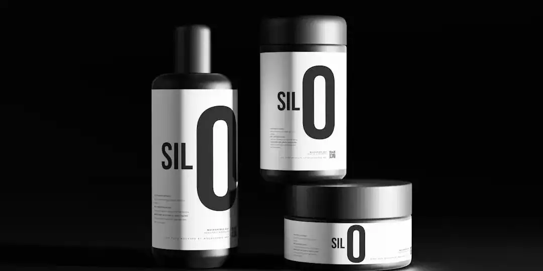
According to industry observations, premium beauty consumers are extremely selective. They expect high quality at every touchpoint. A minimalist makeup logo often utilizes thin, elegant lines or simple geometric shapes. This approach allows the product packaging to breathe. If you look at the top-performing organic brands, their logos often consist of a single line drawing or a very clean wordmark. This visual silence speaks volumes about confidence.
To implement this, focus on negative space. Do not fill every corner of your design canvas. Allow the letters to have room. This spacing, often called kerning in typography, is what separates a high-street brand from a luxury boutique.

Typography: The Voice of Your Brand
The font you choose is the voice in which your brand speaks. In aesthetic brand identity, typography often does the heavy lifting. I see many entrepreneurs struggle here because they pick fonts that are “pretty” but unreadable.
Feminine Scripts vs. Modern Sans-Serif
There is a strong trend toward feminine typography that uses elegant script fonts to evoke softness and personal care. These fonts, often resembling handwriting, are perfect for brands that want to feel accessible, artisanal, and organic. They work exceptionally well for spa products or boutique wellness brands.
However, if you are aiming for luxury cosmetic branding, consider the “all-caps” trend. Market analysis suggests that many high-end heritage brands are moving toward bold, monochrome, all-caps sans-serif fonts. This style screams authority and timelessness. It says, “We are established.” It solves legibility issues across digital platforms, ensuring your brand name is readable even on a small mobile screen.
Legibility is King
Never sacrifice readability for style. A logo that cannot be read in a split second is a failed logo. If you choose a script font, ensure the letters do not bleed into each other when printed on small labels. I always recommend testing your font choice on a mockup of a 10ml essential oil bottle. If it holds up there, it will work anywhere.
Color Palettes That Tell a Story
Color is the emotional hook of your brand. While black and white remain the gold standard for luxury cosmetic branding, 2024 and beyond are seeing a resurgence of specific, intentional colors.
The “Blue Beauty” Movement
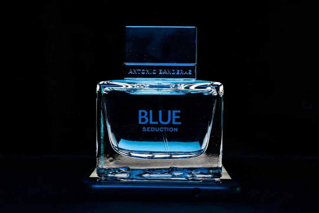
Beyond just “green” for organic, there is a rising interest in “Blue Beauty”—focusing on ocean conservation and water safety. Using deep ocean blues or soft aquamarines can signal sustainability and hydration. This is a fresh take for skincare logo ideas that want to break away from the predictable leaf-green clichés.

Soft Pastels and Earth Tones
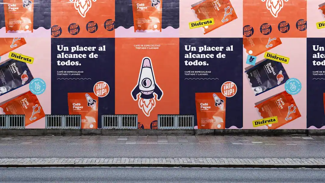
For a more aesthetic brand identity, warm neutrals are unbeatable. Palettes featuring dusty rose, terracotta, sage green, and creamy off-whites convey warmth and inclusivity. These colors mimic natural skin tones and organic ingredients, creating a subconscious link between the brand and the body. Industry experts note that these “soulful” palettes resonate deeply with consumers looking for holistic and wellness-focused products.
Leveraging Technology for Premium Branding
In the past, achieving a polished, agency-level visual identity required a budget that most startups simply didn’t have. You had to hire a typographer, a graphic designer, and a brand strategist. Today, the barrier to entry has lowered significantly.
I believe that for many emerging brands, speed and iteration are key. This is where advanced tools come into play. Platforms like Ailogocreator have set a new benchmark for efficiency. By analyzing thousands of successful design patterns, these smart solutions can generate beauty logo design concepts that align with current aesthetic trends—such as feminine typography or minimalist layouts—in seconds.
Using such a tool allows you to experiment with hundreds of variations of luxury cosmetic branding without the back-and-forth friction of traditional workflows. It empowers you to visualize how a serif font looks against a pastel background instantly. For a modern beauty entrepreneur, accessing this kind of high-level design logic without the agency price tag is a significant competitive advantage.

Integrating Organic and Botanical Elements
If your selling point is “natural,” your logo needs to reflect that without looking generic. The challenge with organic brands is that the “leaf icon” has been overused to the point of invisibility.
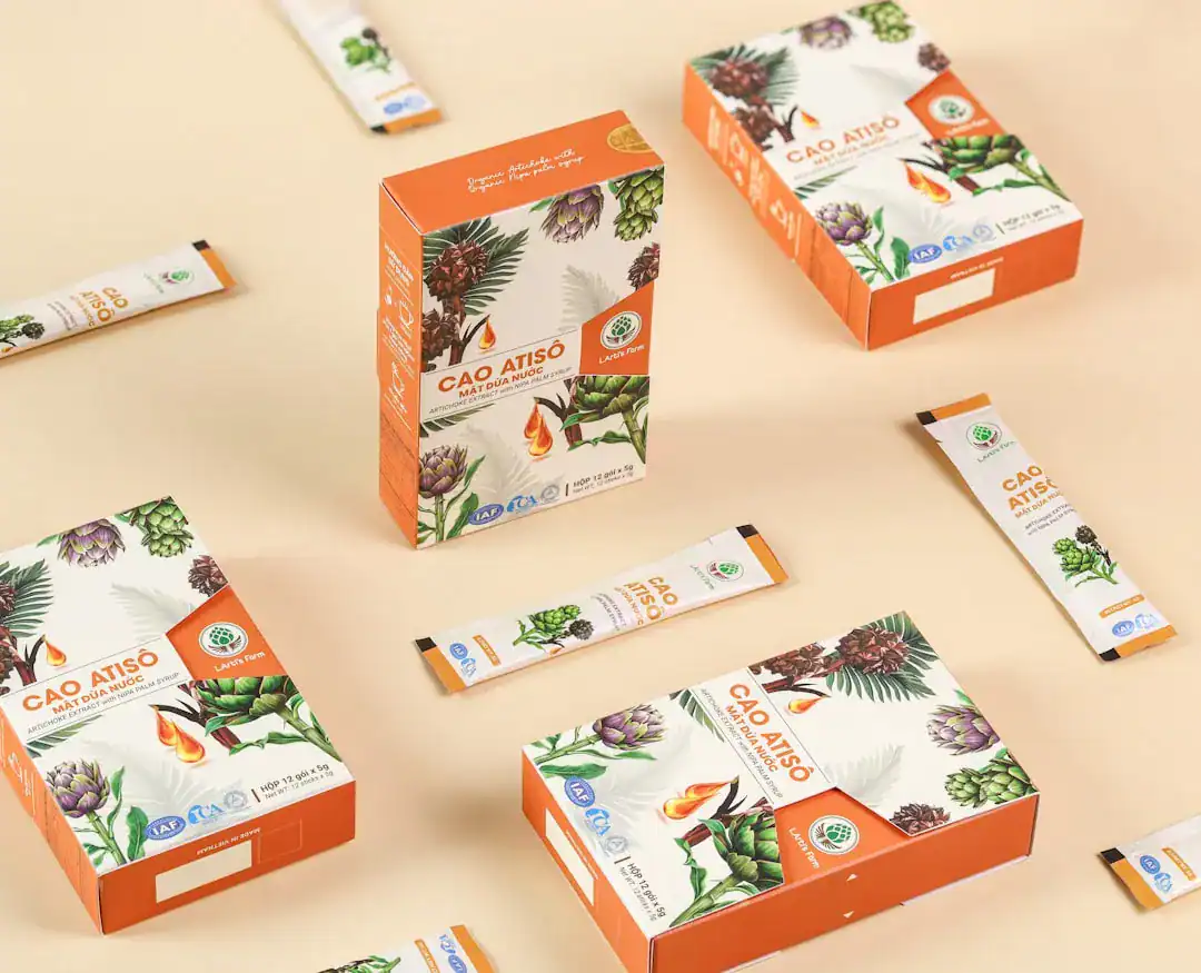
To stand out, look for abstract organic shapes. Instead of a literal leaf, consider fluid lines that suggest water, oil drops, or the curve of a flower petal. Line art is particularly effective here. A continuous line drawing of a botanical element paired with a modern serif font creates a sophisticated, “apothecary” vibe that is very popular right now.
Remember, the goal is to signal “nature” without screaming it. Subtlety is a hallmark of premium design. A slight irregularity in a circle can suggest “hand-made” or “organic” far better than a clip-art tree.

Conclusion and Actionable Suggestions
Building a beauty brand is about selling a feeling. Your logo is the anchor of that feeling. Whether you choose a bold, all-caps typographic approach or a soft, pastel-infused symbol, consistency is your best friend.
Here are my specific recommendations to move forward:
- Audit Your Competitors: Look at the top 5 brands in your specific niche. Note their font styles and color usage. Do the opposite or refine their approach to carve your own space.
- Test for Scalability: Your logo must look sharp on a giant billboard and a tiny favicons. Simpler designs usually win here.
- Prioritize Legibility: If customers cannot read your brand name on a small serum bottle, they won’t buy it. Avoid overly swirly scripts for the main brand name.
- Define Your Palette: Stick to 2-3 core colors. A primary color (often black or a deep neutral), a secondary color (a soft pastel), and an accent metallic (gold or rose gold) works wonders for beauty brands.
- Use Efficient Tools: Don’t get stuck in “design paralysis.” Use smart generators to visualize ideas quickly and refine from there.
FAQ
Q: Should I use a symbol or just text for my beauty logo?
A: It depends on your brand strategy. A “wordmark” (text only) is excellent for luxury and recognition (think of major fashion houses). A symbol is useful if you have a long name or need a distinct icon for social media avatars. A combination of both is the safest bet for versatility.
Q: What colors are best for anti-aging skincare?
A: Anti-aging brands often lean towards metallic golds, silvers, deep blues, and stark black. These colors signify premium value, science, and efficacy. Avoid overly bright or neon colors, which can feel cheap or juvenile.
Q: How important is font pairing?
A: Extremely important. A common rule of thumb is to pair a character-rich “display” font (like a script or a unique serif) for headings with a clean, simple sans-serif for body text and secondary information. This creates hierarchy and keeps the design from looking messy.
Q: Can I change my logo later?
A: You can, but it is risky. Rebranding confuses customers. It is much better to invest time now to create a timeless beauty logo design that can grow with your brand for at least 5-10 years.
Q: What is the trend for eco-friendly packaging logos?
A: The trend is “naked” design. Minimal ink usage, embossed logos (raised texture without ink), and simple typography that suggests transparency and low environmental impact.

CommentsTake the first comment