A powerful logo acts as your silent salesperson, building credibility with potential clients before you even hand them a business card. If you are a solo agent or a brokerage owner aiming to refresh your image, understanding the mechanics of visual identity is non-negotiable for standing out in a crowded market. Effective realtor branding goes beyond just picking a house icon; it involves mastering color psychology, selecting the right serif typography, and ensuring technical scalability.
Here are the core elements you need to master:
- Leveraging color theory to evoke specific client emotions.
- Using typography to signal luxury or modernity.
- incorporating negative space for memorable visual hooks.
- Ensuring technical precision with vector formats.
- Balancing personal identity with market expectations.
The Psychology of Color: Move Beyond Standard Blue
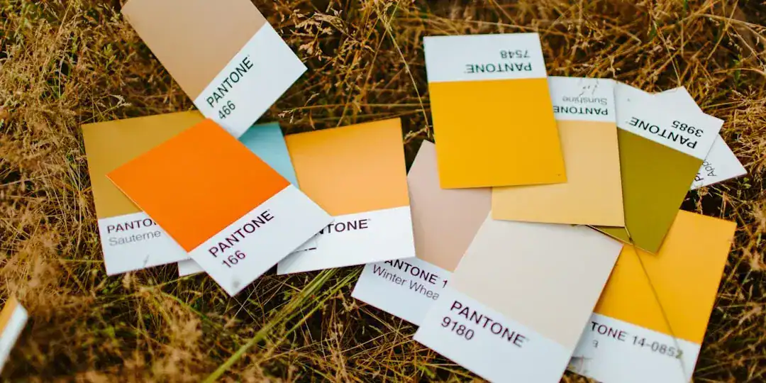
I have noticed a massive redundancy in the industry: almost everyone uses blue. While industry analysis suggests blue represents trust and stability, it also makes your brand blend into the background. To truly capture attention, you need to apply color psychology more strategically.
Understanding Emotional Triggers
Colors are not just decoration; they are emotional cues. Industry data indicates that while blue is safe, colors like purple and black often signal high-end exclusivity, making them perfect for luxury real estate logos. On the other hand, if you are targeting first-time homebuyers or a younger demographic, softer colors like pink or energetic orange can make you appear more approachable and modern.
The 60-30-10 Rule
Don’t just slap a color on a background. Use the 60-30-10 rule:
* 60% Primary color (usually a neutral like white, charcoal, or beige).
* 30% Secondary color (your main brand color, e.g., navy or forest green).
* 10% Accent color (a pop of gold, teal, or terra cotta for buttons and icons).

Typography Sets the Tone: Serif vs. Sans Serif
Your font choice tells the client how much you charge before they even ask. I often see agents mixing too many font styles, which dilutes the message. The choice between serif typography and sans-serif fonts should depend entirely on your target market.
When to Use Serif Fonts
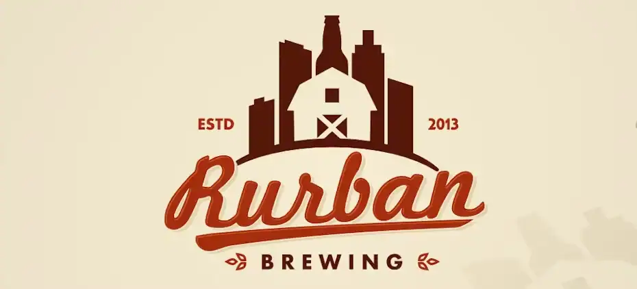
If you deal in historic homes, estates, or the luxury market, serif typography (fonts with little feet at the ends of letters) is your best friend. It conveys tradition, reliability, and high value. Think of banks and fashion houses; they use serifs to establish authority.
When to Use Sans Serif
For modern condos, city rentals, or tech-forward brokerages, clean sans-serif fonts are superior. They look crisp on mobile screens and suggest efficiency and innovation. A sleek, geometric font says, “I am fast, digital, and hassle-free.”
The Magic of Negative Space
The most clever logos often hide a second meaning inside the design. This is called negative space, and it is a brilliant way to make your logo stick in a client’s memory.
Creating the “Aha!” Moment
You have likely seen the FedEx arrow. In real estate, you can achieve this by using the space between letters or shapes to form a key, a roofline, or an open door. For example, the hole in a physical key could be shaped like a house.
Why It Works
Market observations show that logos with a visual puzzle or “hidden” element engage the brain longer than simple icons. It makes the viewer feel smart for spotting it, creating a subconscious positive connection with your brand. It turns a generic house icon into a unique brand asset.

Technical Execution: Why Vectors Are Mandatory
You might have a great idea sketched on a napkin, but if you cannot scale it, it is useless. Professional logos must be created in vector formats (like SVG or EPS).
The Adobe Illustrator Standard
Industry pros rely on Adobe Illustrator because it uses mathematical formulas to create lines (vectors) rather than pixels. This means your logo will look just as sharp on a giant billboard as it does on a business card. If you design in Photoshop or Canva using standard settings, you risk pixelation when you try to print large yard signs.
Efficient Alternatives
Not everyone has the time to learn complex software like Illustrator. For agents who need professional vector files without the steep learning curve, tools like Ailogocreator offer an efficient middle ground. These platforms allow you to generate clean, scalable designs that adhere to design principles without requiring you to be a graphic artist.

Simplicity is the Ultimate Sophistication
The biggest mistake I see in realtor branding is overcrowding. Agents try to fit a roof, a tree, a key, their name, their slogan, and a license number all into one graphic.
Stop doing this.
The Billboard Test
Imagine your logo on a yard sign as you drive by at 40 mph. Can you recognize it instantly? If not, it is too complex. The best brands—Nike, Apple, Compass—are incredibly simple.
- Remove the clutter: Strip away shadows, gradients, and intricate details.
- Focus on one element: Choose either a strong wordmark or a strong icon. Rarely do both need to be dominant.
- Flat design wins: Flat colors print better and load faster on websites.
FAQ
Q: Can I use multiple colors in my real estate logo?
A: You should limit your palette to 2-3 colors max. Too many colors increase printing costs and confuse the visual identity. Stick to a primary, secondary, and accent color.
Q: Do I really need a vector file?
A: Yes. Without a vector file (AI, EPS, SVG), your logo will look blurry on large signage and vehicle wraps. JPEGs and PNGs are only good for the web.
Q: Is it okay to use my initials for a logo?
A: Absolutely. Monograms are a classic choice for luxury real estate logos. They are personal and imply that you are the brand, which builds trust in high-stakes transactions.
Q: How do I know if my logo is good?
A: Test it in black and white. If the design loses its meaning or legibility without color, it is not strong enough. A great logo works in a single color first.
Conclusion and Actionable Suggestions
Your logo is the anchor of your entire business identity. It needs to communicate trust, expertise, and your specific niche instantly. Don’t settle for generic clip art.
Here is your action plan:
1. Audit your competitors: Look at the top 5 agents in your area and note their colors. Pick something different to stand out.
2. Define your niche: If you sell luxury, lean into serif typography and black/gold/purple palettes.
3. Sketch with negative space: Try to combine your initials with a building element using negative space.
4. Prioritize vectors: Ensure your final deliverable is a vector file, whether you hire a designer or use a smart tool.
5. Test scalability: Shrink your design to the size of a favicon (16×16 pixels) and see if it is still recognizable.

CommentsTake the first comment