A strong logo is not just a static image; it is the first rep in building a lasting relationship with your clients. If you are a gym owner, personal trainer, or launching a new sportswear line, you need a visual identity that speaks louder than a shout across the weight room floor. I often see fitness entrepreneurs struggle to balance aggression with accessibility, missing the mark on essential elements like minimalist fitness design or distinct CrossFit logo inspiration.
Here is what you need to know to build a brand that lifts heavy:
- How to distinguish between high-intensity and holistic wellness aesthetics.
- Why versatility is the most critical factor for athletic apparel logos.
- Real-world examples of personal trainer branding that build immediate trust.
- Smart ways to generate professional concepts without breaking the bank.
Modern Gym Logo Ideas: Beyond the Barbell
In my years observing the tech and design space, I have noticed a massive shift away from the literal. Ten years ago, almost every gym logo idea featured a bent barbell or a flexing bicep. Today, that approach feels dated. Modern fitness facilities are moving toward abstract, clean, and versatile identifiers.
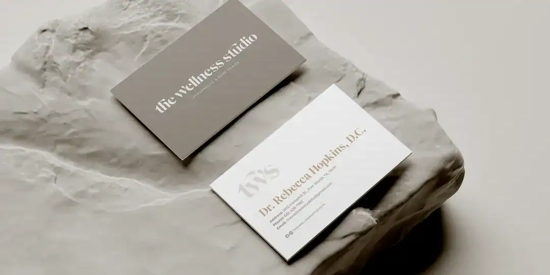
Take the case of “The Wellness Studio” from a recent Dallas-based design project. Instead of aggressive iron imagery, they opted for an organic, friendly atmosphere. The design focuses on holistic health, using overlapping circles and softer lines to represent community and preventive care. This aligns with a broader trend where the gym is no longer just a “grimy weight room” but a lifestyle hub.

Cracking the Code for CrossFit Logo Inspiration
CrossFit logo inspiration sits on the opposite end of the spectrum from the wellness studios. Here, the culture demands grit, intensity, and a raw sense of power. However, “gritty” does not have to mean “messy.”
Industry galleries showcase a preference for heavy, bold typography—often mimicking stencils or graffiti art. This connects with the urban, street-level roots of functional fitness. I have seen effective designs that incorporate subtle elements like kettlebells or Spartan helmets, but the typography always does the heavy lifting.
If you are branding a box, think about high contrast. Black and yellow or black and red are staples for a reason: they signal caution and danger, triggering an adrenaline response before the client even walks through the door. A “VIP” style logo I reviewed recently combined a star and a sash with a kettlebell. It sounds busy, but because it used sharp lines and a monochrome palette, it communicated “elite strength” rather than “cluttered mess.”
Personal Trainer Branding: Selling Trust and Results
For independent coaches, the brand is you. Personal trainer branding faces a unique challenge: you must look professional enough to be trusted with someone’s health, but approachable enough to be hired.
I believe the most successful personal trainer logos avoid the “superhero” tropes. Instead, they often use monograms or stylized initials. This signals that the business is built on a personal reputation. A case study regarding a “fitness gadget” brand caught my eye—it used a simple, athletic figure in a minimal style. It didn’t scream; it stated.
When defining your identity, ask yourself:
- Do I focus on rehabilitation? (Use blues, greens, and fluid shapes).
- Do I focus on hypertrophy and strength? (Use bold fonts and sharper angles).
Your logo is your signature. It needs to look legitimate on a business card and a digital invoice.

Wellness Brand Identity: The Art of Subtlety
The wellness brand identity sector is exploding, covering everything from yoga studios to holistic naturopathy. The design language here is distinct. You aren’t selling sweat; you are selling peace.
Market analysis of health logos shows a dominance of lotus flowers, leaves, and water elements. While these are classics, they are also at risk of becoming clichés. A more sophisticated approach I’ve seen involves using color psychology to disrupt the norm. One holistic practice used a deep navy contrasted with an energetic red. It was unexpected. Most competitors were drowning in pastel greens. By using high-contrast colors, they communicated “energy” and “vitality” rather than just “calm.”
If you are entering this space, consider wellness brand identity elements that imply movement and balance without being literal. Overlapping shapes often symbolize the connection between mind and body, a core tenet of the industry.

Athletic Apparel Logos: Versatility is King
If you plan to print your logo on fabric, simplicity is your only option. Athletic apparel logos suffer the most from over-designing. A complex illustration will turn into an unrecognizable blob when embroidered on a moisture-wicking shirt or printed on a small tag.
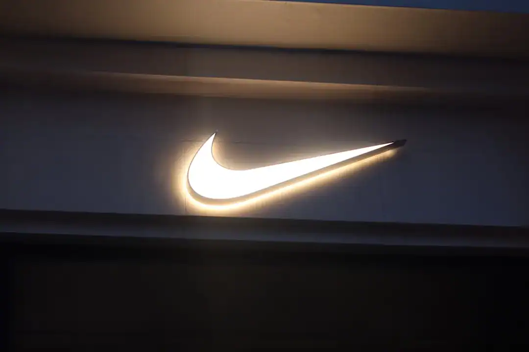
Industry experts constantly point to the “solid block” or “icon-only” approach. Think about the big players; they can be identified by a single “swoosh” or three stripes. You might not be at that level yet, but the principle holds. You need a symbol that works in one color. If your logo relies on a gradient to make sense, it will fail on apparel.
I recommend testing your design in black and white immediately. If it loses its impact, scrap it and start over. The best athletic apparel logos are those that people want to wear even when they aren’t working out.

Streamlining Design with Technology
Creating these variations used to require a five-figure budget and an agency retainer. Today, the landscape has changed. Speed and iteration are key. You need to see how your gym logo ideas look on a mock-up shirt or a digital banner instantly.
This is where advanced tools come into play. I’ve found that platforms like Ailogocreator represent a significant leap forward in this space. Unlike older, template-based generators that churn out generic clip art, modern AI-driven solutions can analyze the specific semantic needs of fitness niches—whether it’s the aggression of CrossFit or the serenity of yoga—and generate concepts that actually feel bespoke. It allows you to iterate through hundreds of minimalist fitness design variations in the time it takes to explain a brief to a human designer.
For entrepreneurs who need to move fast but refuse to compromise on professional aesthetics, leveraging this kind of technology is no longer a shortcut; it’s a competitive advantage.
FAQ
Q: How do I choose the right color for my fitness brand?
A: It depends on the emotion you want to evoke. Red and black trigger excitement and are great for high-intensity gyms. Blue and green promote trust and calm, making them ideal for wellness and rehabilitation brands.
Q: Should I use a mascot in my gym logo?
A: Generally, mascots are becoming less common in modern branding as they can limit your audience. However, for sports teams or very specific “hardcore” gyms, a stylized mascot can still work if it is simplified and not overly cartoonish.
Q: What is the biggest mistake in personal trainer branding?
A: The biggest mistake is using a logo that is too busy. If you try to include a dumbbell, a heart, a running shoe, and your name all in one graphic, it becomes unreadable. Stick to one core concept.
Q: How often should I update my fitness logo?
A: You shouldn’t need to change it often if the foundation is solid. However, if your logo looks like it was made in 2005 (think shiny, 3D effects), it’s time for a refresh to a flatter, cleaner modern style.
Conclusion and Actionable Suggestions
Building a fitness brand is about consistency. Your visual identity is the anchor that holds your marketing, facility atmosphere, and merchandise together. Whether you are running a box or a boutique studio, the rules of clarity and emotion apply.
- Audit your competitors: Look at the gyms in your 5-mile radius. If they all use blue, go black or red. distinctive.
- Test for scale: Shrink your logo down to the size of an Instagram profile picture. If you can’t tell what it is, it’s too complex.
- Prioritize typography: For CrossFit logo inspiration and athletic apparel logos, the font often matters more than the icon. Choose a typeface that carries weight.
- Use efficient tools: Don’t get bogged down in weeks of back-and-forth. Use intelligent platforms to generate and test ideas rapidly.
- Match the vibe: Ensure your minimalist fitness design actually matches the service you provide. Don’t use a delicate yoga font for a powerlifting club.

CommentsTake the first comment