
Why Minimalist Logo Color Design Still Matters in 2026
Minimalist logo design has evolved from a visual trend into a core branding standard. In 2026, brands operate in digital-first environments—apps, social media, video platforms, and dark mode interfaces—where clarity and adaptability matter more than decoration.
Minimalist logo color design is no longer about using fewer colors for aesthetic reasons. It’s about reducing cognitive load, improving recognition, and building scalable brand systems.
This guide explores the key minimalist logo color trends for 2026, along with practical tips you can apply immediately.
What Is Modern Minimalist Logo Color Design?
Modern minimalist logo color design focuses on:
- Fewer colors with stronger contrast
- Purpose-driven color choices (not decorative)
- Extensive use of neutrals and whitespace
- Color systems that scale beyond the logo itself
Minimalism does not mean boring. It requires greater discipline and precision in color selection.
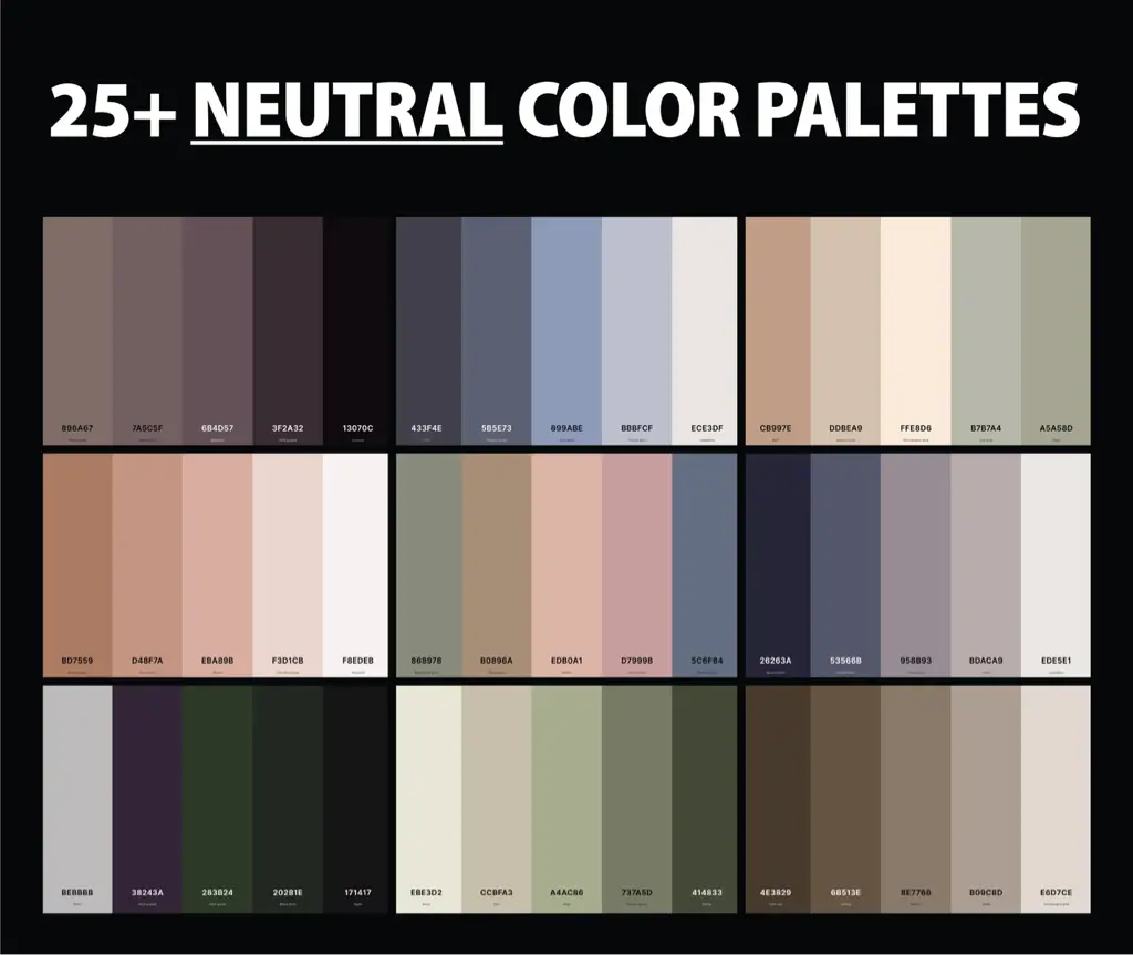
5 Key Minimalist Logo Color Trends for 2026
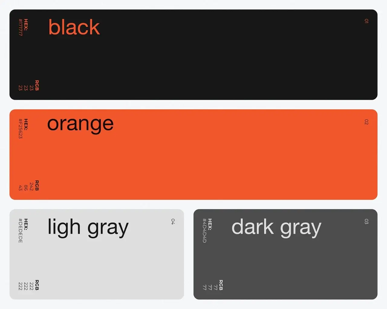
- Premium Neutral Palettes
(Gray, Off-White, Soft Black)
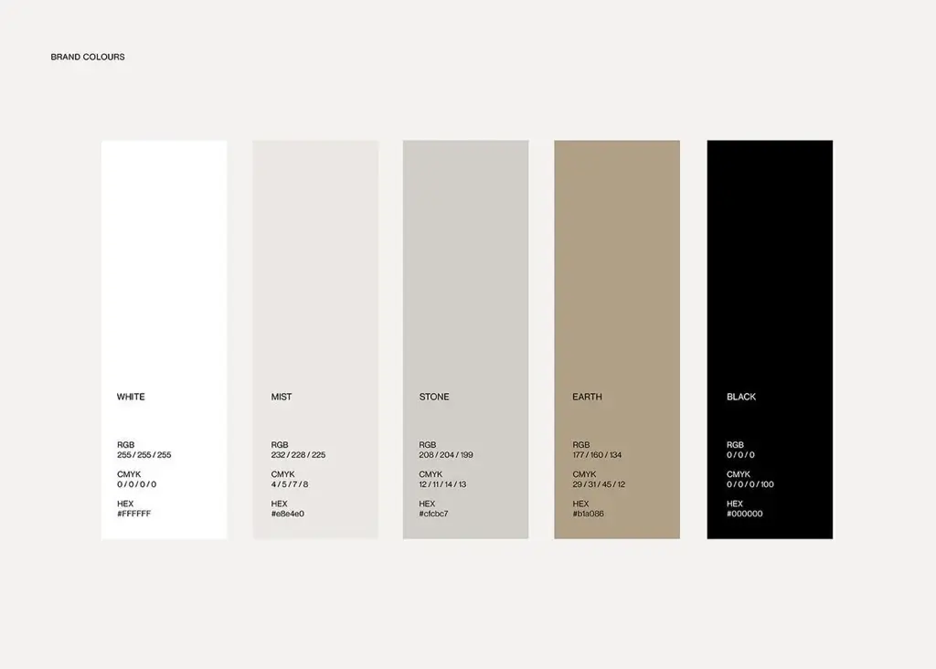
Neutral colors are dominating minimalist branding in 2026.
Why this trend works:
- Reduces visual noise
- Feels professional and timeless
- Pairs well with typography-led logos
Popular among:
- Tech companies
- SaaS products
- Consulting and B2B brands
- Monochrome with Subtle Contrast
(One Color, Multiple Shades)
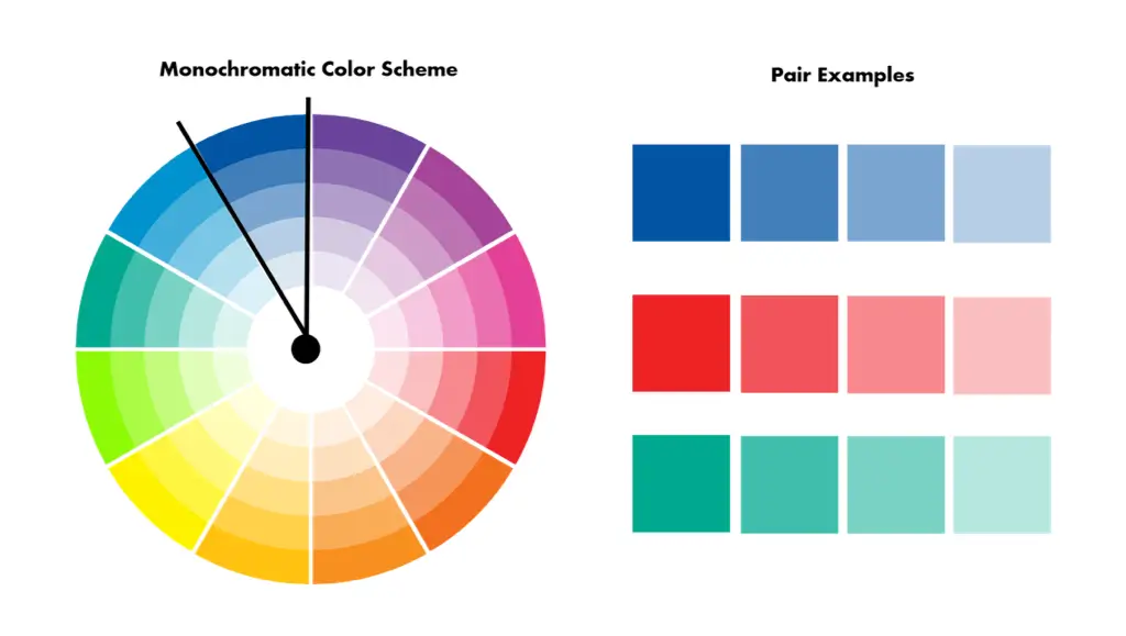
This approach uses a single base color with variations in brightness or saturation.
Benefits:
- Clean and cohesive look
- Excellent scalability for icons and apps
- Strong brand consistency
Ideal for:
- Mobile apps
- Social media avatars
- Digital-first brands
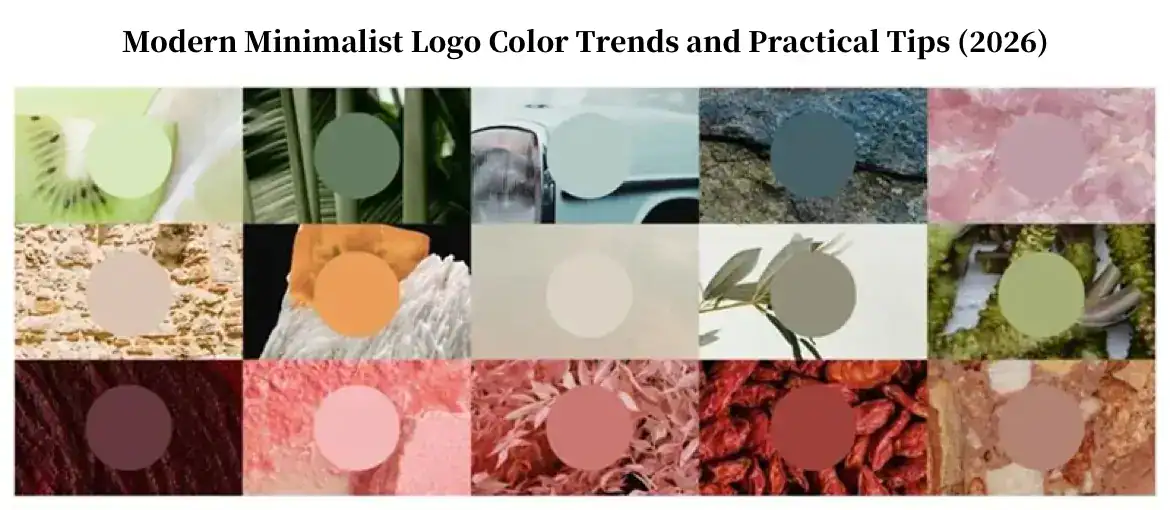
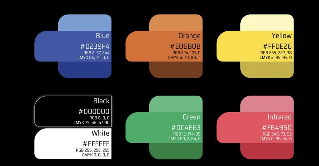
- Low-Saturation Natural Colors
(Muted Earth & Nature Tones)
Muted, low-saturation colors are increasingly popular as brands seek authenticity.
Common choices include:
- Soft greens
- Dusty blues
- Warm beige and clay tones
These colors communicate:
- Trust
- Sustainability
- Approachability
- Minimalist High-Contrast Schemes
(Black & White + One Accent Color)
High-contrast minimalist logos are designed for instant recognition.
Typical structure:
- Black or white base
- One bold accent color
Why brands love it:
- Extremely legible at small sizes
- Stands out in crowded content feeds
- Works well for motion and animation
- Digital-First & Dark-Mode-Friendly Colors
As dark mode becomes the default across platforms, logos must adapt.
Key characteristics:
- Strong contrast on dark backgrounds
- Avoid overly bright or neon tones
- Colors tested in both light and dark UI
Many modern brands now design dark-mode-first, then adapt to light backgrounds.
Common Mistakes in Minimalist Logo Color Design
Even minimal logos can fail if color choices are poorly executed.
Avoid these mistakes:
- Using too few colors without enough contrast
- Confusing minimalism with dullness
- Ignoring real-world usage (small sizes, video, dark mode)
- Designing colors for the logo only, not the full brand system
Minimalism works best when color decisions are intentional, not restrictive.
How AI Helps Create Minimalist Logo Color Schemes
AI-powered tools simplify color decisions by:
- Recommending palettes based on industry and style
- Generating multiple minimalist variations instantly
- Allowing quick comparison without design expertise
With platforms like ailogocreator.io, you can explore minimalist color systems, test them in real contexts, and export ready-to-use brand assets in minutes.
Minimalist Logo Colors Are a Long-Term Strategy
In 2026, minimalist logo color design is not about following trends—it’s about building brands that last.
Clear, restrained color systems reduce communication cost, improve recognition, and scale effortlessly across digital platforms.
With the help of AI tools, creating professional minimalist color palettes is now faster and more accessible than ever.
👉 Create your minimalist logo and color system with ailogocreator.io today.
F&Q
Q1: What are the main minimalist logo color trends for 2026? Minimalist logo color trends for 2026 focus on neutral palettes, monochrome schemes, muted natural colors, high-contrast accents, and dark-mode-friendly color systems.
Q2: Why are minimalist logo color schemes so popular? Minimalist logo color schemes improve clarity, scalability, and recognition, especially across digital platforms like apps, social media, and video.
Q3: How many colors should a minimalist logo use? Most minimalist logos use one primary color, one accent color, and neutral support colors to maintain clarity and flexibility.
Q4: Can AI help create logo color palettes? Yes. AI logo generators can suggest logo color combinations based on industry, style, and color psychology, helping brands make faster decisions.
CommentsTake the first comment