
From IBM Logo Evolution to AI-Powered Brand Design: Democratizing Professional Logos
Having spent 12 years in brand design, I’ve always believed that a great logo is the “visual soul” of a brand—it must embody the core values of the enterprise while maintaining timeless appeal. Among countless iconic brands, IBM’s logo evolution stands as a textbook case: from its traditional typography a century ago to the iconic blue stripes recognized worldwide today, each iteration perfectly aligned with the brand’s strategic transformation. What’s more noteworthy is that the design principles IBM has adhered to—”simplicity, professionalism, and adaptability”—are now accessible to small and medium-sized enterprises (SMEs) thanks to AI technology. Today, let’s explore IBM’s logo journey and see how AI Logo Creator is making professional brand design no longer exclusive to large corporations.
A Century of IBM Logo Evolution: The Visual Narrative of a Brand’s Growth
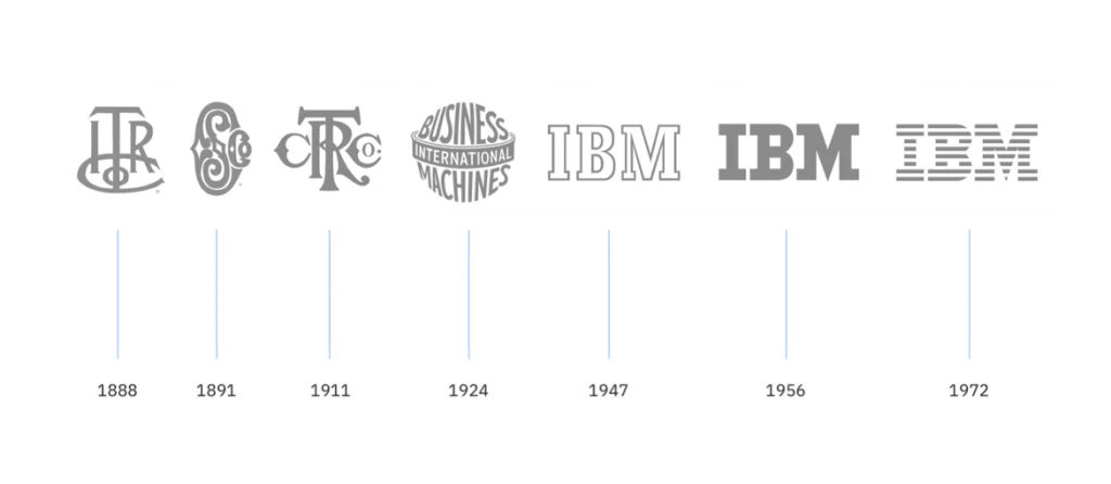
A brand’s logo is never an isolated visual symbol—it’s a reflection of the enterprise’s growth. From its origins as the Computing-Tabulating-Recording Company in 1911 to its status as a global tech giant, IBM’s three key logo iterations perfectly illustrate the core logic of brand design.
1.1 Early Exploration (1911-1947): A Clear “Foundational Identity”
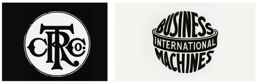
In 1911, IBM’s predecessor, the Computing-Tabulating-Recording Company (CTR), was founded. Its early logo featured serif typography—bold, structured, and steeped in the traditional industrial aesthetic of the era. This design was no coincidence: in a time dominated by mechanical manufacturing, the reliability conveyed by serif fonts helped establish the company’s credibility quickly. By emphasizing the full brand name, the logo ensured the new “CTR” identity gained rapid market recognition. The key takeaway from this phase? A logo’s primary mission is to “clearly state who you are”; redundant decorations only distract from core messaging.
1.2 Classic Reinvention (1947-1972): The “Breakthrough” of Minimalism
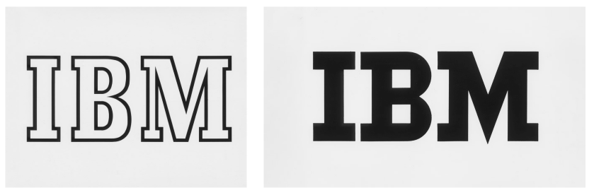
Two decades after its inception, IBM shifted from punched card tabulating machines to computers. To mark the shift, Watson decided to overhaul the brand image too. The familiar and more elaborate globe was replaced with something simple — “IBM” in a typeface called Beton Bold. It debuted on the masthead of the January 1, 1947, issue of the in-house publication Business Machines. The new look reflected the company’s product line and fit into the modernism movement, which focused on societal progress.
In 1956, Thomas J. Watson Jr. — who had taken over IBM from his father, coined the phrase “good design is good business” and created IBM’s first Design Program — hired noted graphic designer Paul Rand to create a logo that would herald a new era of IBM while also communicating continuity. The iteration was revolutionary: Rand eliminated serifs entirely, adopting clean sans-serif typography and increasing letter spacing to make “IBM” both distinct and cohesive. The color palette was simplified to black and white, stripping away all unnecessary ornamentation.
This design mirrored IBM’s strategic shift from a “mechanical manufacturer” to a “technology service provider.” The modernity of sans-serif fonts and the clarity of the minimalist structure accurately communicated the “professionalism and efficiency” inherent to its new tech-focused identity. By this point, the IBM logo had embraced the core principle of “form follows function”—it no longer pursued grandeur, but rather became a direct expression of the brand’s positioning.
1.3 Striped Finalization (1972-Present): The “Ultimate Form” for Communication Adaptability
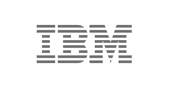
In 1972, Paul Rand added horizontal blue stripes to the sans-serif logo—a version that would become IBM’s most iconic symbol. Why stripes? From a practical design perspective, they not only enhanced visual impact but also solved a critical printing challenge of the era: on mediums like newspapers and brochures, the stripes ensured the “IBM” letters remained clear and legible, avoiding blurriness.
More importantly, the consistent use of blue stripes established “IBM Blue” as the brand’s signature color, conveying emotional values of “technology and trust.” With this, the IBM logo completed the cycle of “clear identity – positioning alignment – communication adaptability.” Its design logic—”simple yet sophisticated”—remains a core reference in my brand consulting work today.
Design Insights from IBM: 4 Core Qualities of a Great Logo
Analyzing IBM’s evolution reveals universal principles of brand design—principles that apply not only to century-old corporations but also to startups. These are precisely the underlying design logics of AI Logo Creator.
1. Consistency: Stay Anchored to Core Brand Positioning
Over a century, IBM’s logo evolved from serifs to sans-serif, and from solid colors to stripes—but its core positioning of “technology and reliability” never wavered. This reminds us: logo design should not chase fleeting trends, such as adding gradients blindly because they’re popular one year or abandoning established elements for minimalism the next. Truly great design binds visual language to brand positioning long-term, strengthening user memory.
2. Simplicity: Enable “Unobstructed” Information Transmission
Paul Rand once said, “Simple design is often the hardest, as it requires stripping away all non-essential elements.” IBM’s striped logo has transcended mediums and time precisely because of its simplicity—three letters, one color, and a few stripes. Whether printed on a billboard or scaled down to a mobile icon, it remains instantly recognizable. This is the perfect embodiment of the “less is more” design principle.
3. Adaptability: Meet the Needs of Omnichannel Communication
Modern brands communicate across far more than just print—websites, social media, product packaging, business cards, and more all require logo adaptability. IBM’s striped design addressed this as early as the last century, and today’s brand designs demand even more: logos must support multiple formats, from scalable vector files (SVG) to transparent PNGs. This is a fundamental requirement of professional design.
4. Emotional Resonance: Convey Brand Warmth Through Visuals

IBM Blue has become a symbol of trust precisely because color conveys emotional value. A logo’s typography, colors, and lines “speak” silently: rounded, playful fonts suit maternal and child brands; sharp geometric lines fit tech companies; warm tones work for the food and beverage industry. This “visual empathy” is key to building connections between brands and users.
The Design Dilemma for SMEs: Balancing Professionalism and Cost
Over my 12-year career, I’ve witnessed the frustrations of countless SMEs: they aspire to an IBM-level professional logo but face four major pain points:
- Budget Constraints: Professional design firms often charge tens of thousands of dollars, which is unaffordable for startups;
- Efficiency Bottlenecks: The traditional design process—from communication to first drafts, revisions, and finalization—often takes weeks, causing missed market windows;
- Professional Gaps: Business owners without design backgrounds struggle to articulate their needs clearly, leading to misalignment between expected and delivered designs;
- Adaptability Issues: After receiving the design, businesses often find incomplete file formats that don’t work for social media or product packaging—with additional fees for revisions.
These pain points force many businesses to settle for “free logo templates,” resulting in vague brand identities that fail to stand out in competition. AI technology, however, offers a perfect solution—and that’s why I’m a strong advocate for AI Logo Creator.
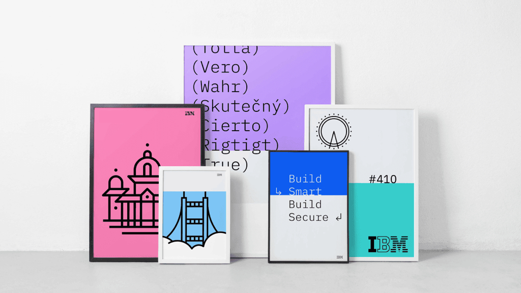
AI Logo Creator: Bringing IBM-Level Design to Every Business
As a professional AI-powered logo design platform, AI Logo Creator (official website: www.ailogocreator.io) is on a mission to break down the barriers to professional design. Modeled after the design logics of iconic brands like IBM, it leverages AI to deliver “low-cost, high-efficiency, and professional” brand design services—perfectly aligned with the core needs of SMEs.
1. 1-Minute Generation: An Efficiency Revolution to End Long Waits
The traditional design process that takes weeks can be completed in just 3 steps with AI Logo Creator: enter your brand name, industry, and slogan; select your style and colors; and AI generates multiple professional designs instantly. For example, when designing a logo for the tech startup “TechPulse,” relevant minimalist designs aligned with its “smart innovation” positioning are ready within 1 minute—boosting efficiency by dozens of times.
2. No Design Skills Required: AI Translates Your Vision Professionally
You don’t need to master Photoshop or Illustrator. AI Logo Creator’s intelligent engine has learned from hundreds of thousands of outstanding global design cases—including IBM’s logo logic. Even if you can’t articulate terms like “sans-serif typography” or “vector format,” simply select intuitive options like “tech style” or “minimalist,” and AI will accurately capture your needs to deliver aesthetically sound, professional results.
3. Omnichannel Adaptability: One Download for All Needs
To address adaptability pain points, AI Logo Creator supports 24/7 downloads of full-format files—PNG, JPG, PDF, SVG, and more. SVG vectors can be scaled infinitely for billboards; transparent PNGs work perfectly for social media; and PDFs are ready for printing. This means you get a “complete design asset package” in one go, with no extra fees for revisions.
4. High Cost-Efficiency: Get a “Brand Suite” on a Budget
No need to hire high-salary designers. AI Logo Creator provides logos, brand color palettes, typography guidelines, and even social media templates at a fraction of the cost—essentially giving you a “dedicated AI designer.” This “democratized” professional service allows SMEs to build brand identities on par with large corporations.
5. Flexible Customization: Classic Logic Meets Unique Identity
AI-generated designs aren’t “fixed templates.” You can freely adjust typography, colors, and icon details. For example, if you love IBM’s minimalist style but want to add a brand-specific “chip” element, just drag and drop to modify. This “AI generation + human refinement” model ensures professionalism while preserving your brand’s unique character.
To illustrate how effectively AI Logo Creator works, let’s walk through a real case that brought IBM-inspired professionalism to a small tech business.
AI Isn’t Replacing Design—It’s Democratizing It
IBM’s logo evolution teaches us that great design has never been a “luxury”—it’s a “necessity.” AI Logo Creator doesn’t replace designers; it uses technology to lower barriers, making professional brand design accessible to SMEs and individual entrepreneurs alike.
As a designer, I’ve always believed that the core of design is “solving problems”—and AI is the best tool for addressing SMEs’ design pain points. If you’re struggling with your brand logo, head to AI Logo Creator (www.ailogocreator.io) and spend just 1 minute letting AI craft your brand’s exclusive “visual soul.” After all, every brand deserves to be remembered.
FAQ
Q:What is the core logic behind IBM Logo’s century-long evolution?
A: It has always been adjusted around the upgrading of brand positioning—from “clearly conveying corporate identity” in the early stage (serif fonts reflecting the reliability of the industrial era), to “matching technological transformation” in the mid-term (sans-serif fonts highlighting professionalism and efficiency), and then to “adapting to full-scenario communication” in the later stage (blue stripes strengthening recognition and emotional value). The core is that “visuals serve the core needs of the brand”.
Q:What are the 4 core characteristics of a great logo?
A: Consistency (staying anchored to the core brand positioning), simplicity (unobstructed information transmission), adaptability (meeting the needs of all scenarios such as official websites and packaging), and emotional resonance (conveying brand warmth through colors/lines, e.g., “IBM Blue” represents trust).
Q:What core pain points do SMEs often face in logo design?
A: Four major pain points—limited budget (high fees from professional design firms), low efficiency (the traditional process takes weeks), professional gaps (business owners without design backgrounds struggle to articulate needs clearly), and insufficient adaptability (incomplete design file formats that cannot meet multi-scenario use).
Q:How does AI Logo Creator solve the design efficiency problem of SMEs?
A: It subverts the traditional process. With only 3 steps (enter brand information → select style and color → generate solutions), it can output multiple sets of professional designs within 1 minute. Compared with the traditional design cycle of several weeks, the efficiency is increased by dozens of times, and it also supports adjustment and download at any time 24/7.
Q:Can people with no design experience use AI Logo Creator easily?
A: Absolutely. The AI has learned hundreds of thousands of excellent global design cases (including IBM’s design logic). Users do not need to master professional terms; they only need to select needs through intuitive options such as “tech style” and “minimalist style”. The AI can accurately match and generate works that conform to design aesthetics, and also supports visual adjustments of fonts, colors, etc.
CommentsTake the first comment