
When it comes to iconic brand visuals, Disney’s movie posters immediately spring to mind. For decades, the studio has mastered the art of telling vivid stories with minimal elements— a skill that’s invaluable for small business brand posters. The secret lies in three core design principles: symbolic expression, emotional color coordination, and minimalist composition. Today, AI design tools like ailogocreator.io let small and medium-sized enterprises (SMEs) replicate this “Disney-level” visual magic without top-tier design agencies. Let’s dive into classic Disney poster analysis to uncover how AI empowers affordable brand poster design for your business.
Disney & Blockbuster Poster Analysis – Key Lessons for Brand Design
These posters discard redundant details and focus on the “trinity” of minimalism, color, and symbols— a formula that boosts brand poster visibility and cuts through information overload, perfect for SME marketing.
Snow White and the Seven Dwarfs
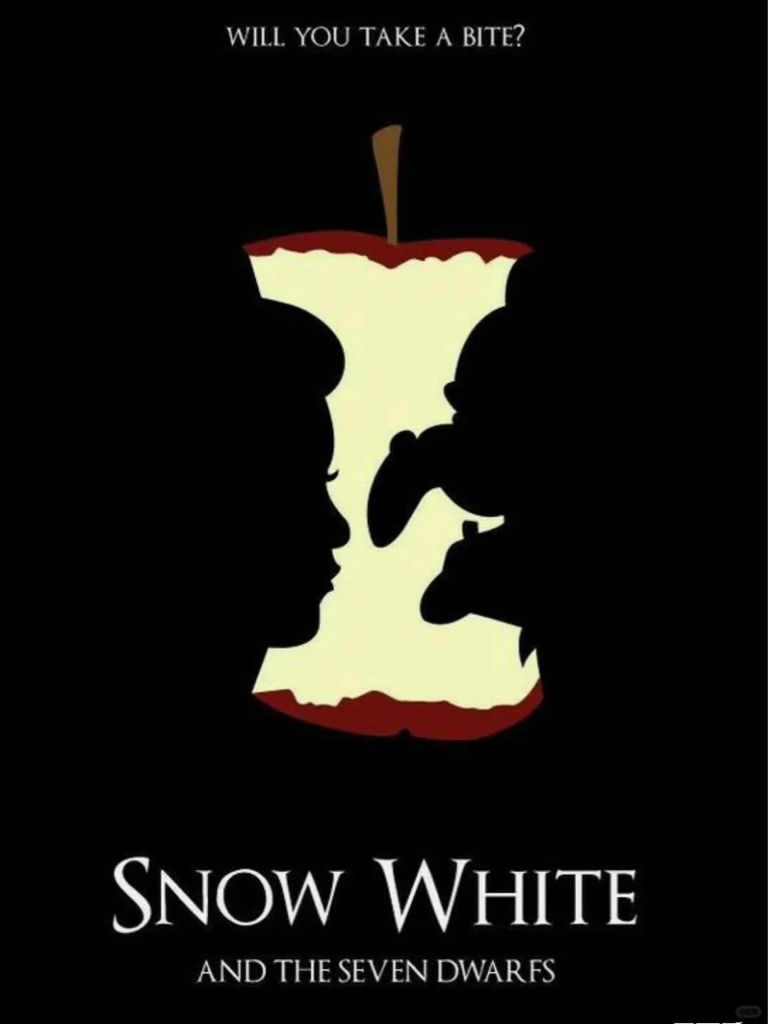
- Symbolism: The “bitten poisoned apple” serves as the core visual symbol, encapsulating the story’s central conflict between good and evil. More than just a prop, it acts as a metaphor for “temptation and peril” that instantly triggers audience recognition of the plot.
- Color Strategy for Brand Posters: It uses high-contrast hues—black (background), red (apple skin), and off-white (apple flesh)—a tactic SMEs can mirror for eye-catching business posters. The stark red-black contrast amplifies the “good vs. evil” drama, while the simplified palette ensures the apple (your brand symbol) stays the undisputed focal point.
- Minimalist Design for SMEs: Silhouettes of Snow White and the Evil Queen nest within the apple’s outline, merging “character, conflict, and core prop” into one visual unit. This “less is more” approach reduces audience memory load—critical for small business brand recognition.
Cinderella
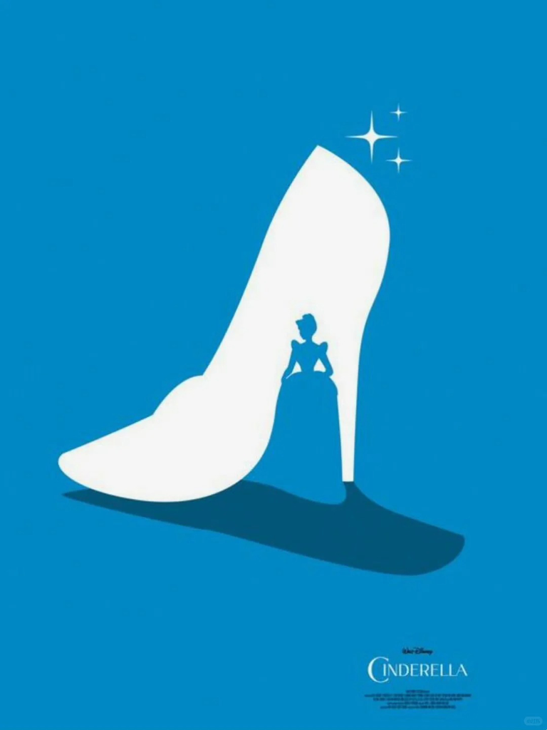
- Brand Symbolism for Posters: The “glass slipper” is enlarged as the central subject, acting as a visual anchor for “identity transformation”—a relatable theme for SMEs rebranding or scaling up. It directly conveys “rising from obscurity to glory,” making it a masterclass in memorable brand symbols for business posters.
- Color: Soft blue and white dominate the palette, creating an atmosphere of “dreaminess and purity.” This color scheme aligns perfectly with Cinderella’s gentle, noble demeanor, allowing audiences to sense the story’s romantic tone through color alone.
- Minimalism: Cinderella’s silhouette is embedded within the shoe, achieving a seamless blend of “character and symbol.” A handful of star accents enhance the fairy-tale charm without diverting attention from the main subject.
Alice in Wonderland
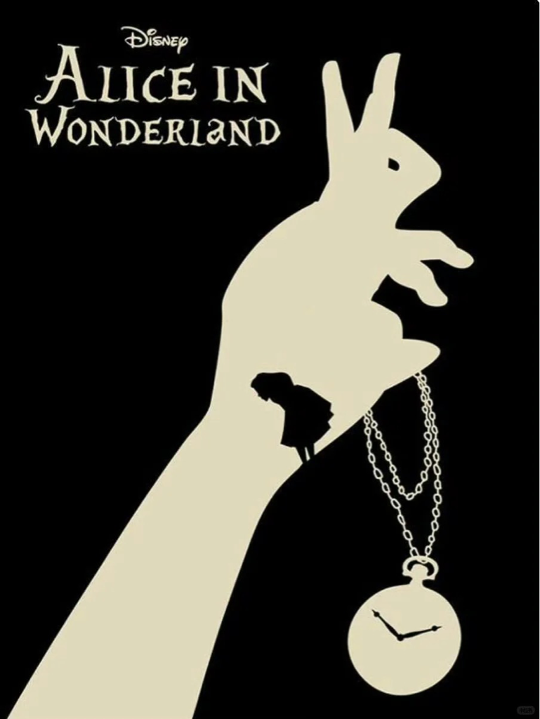
- Symbolism: It forms a symbolic trio: the White Rabbit’s paw, his pocket watch, and Alice’s tiny silhouette. The pocket watch signifies “urgency,” the rabbit’s paw hints at “adventure guidance,” and Alice’s small figure anchors the audience in the protagonist’s perspective—together, they tell the story of “fantastical adventure + time displacement.”
- Color: Retro black and yellow hues create a mood of mystery and whimsy, perfectly matching the story’s quirky, nostalgic narrative style.
- Minimalism: The three elements form a “triangular focal point,” with ample negative space surrounding them. This avoids information clutter and directs the audience’s gaze straight to the adventure’s core conflict.
The Lion King
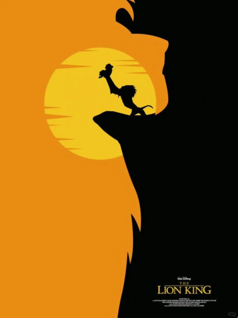
- Symbolism: Dual symbols overlap: the large “lion head outline” represents “royalty and responsibility,” while the small scene of “Rafiki holding Simba” inside symbolizes “life’s legacy.” Together, they distill the epic themes of “growth and destiny.”
- Color: Orange and black combine to convey raw power. The orange echoes the natural tones of the African savanna, while the black intensifies visual impact—perfectly capturing the story’s “wildness and glory.”
- Minimalism: The “large outline + small silhouette” nesting creates depth, allowing the image to feel both visually striking and narratively rich—no complex savanna backgrounds required.
Sherlock Holmes: A Game of Shadows
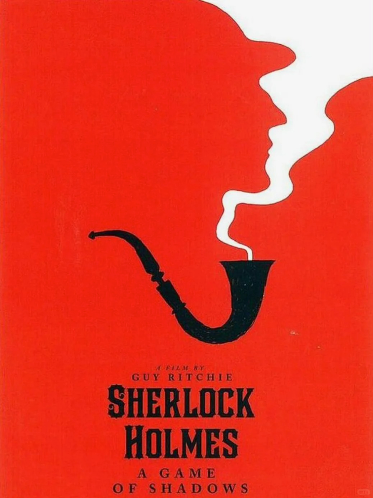
- Symbolism: The “pipe” is a classic symbol of Holmes’ “detective identity and rational mind.” Blending the smoke with his profile adds a “mysterious, suspenseful” edge—letting one element carry dual aspects of his character.
- Color: A bold red background conveys “tension and conflict,” fitting the movie’s “suspenseful showdown” tone. The contrast between black (pipe) and white (smoke) makes the symbol highly eye-catching.
- Minimalism: The curve of the pipe and the flow of smoke form an organic composition, centering the visual focus entirely on the character’s core symbol—no unnecessary plot hints distract from the message.
The Lord of the Rings: The Two Towers
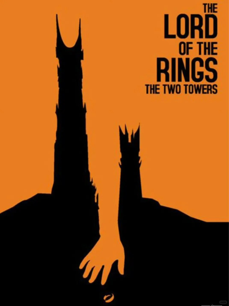
- Symbolism: Silhouettes of “Orthanc (evil power)” and “Minas Tirith (human resistance)” create a symbol of confrontation, while the “hand reaching for the One Ring” adds the core theme of “power struggle.” Together, they encapsulate the epic’s “good versus evil” conflict.
- Color: Orange and black balance “epic grandeur” with “a sense of urgency.” The warm orange evokes the “majesty of Middle-earth,” while the black underscores the danger of the One Ring’s temptation.
- Minimalism: The vertical height of the two towers contrasts with the horizontal reach of the hand, while the Ring’s small size offsets the towers’ immensity. Simple spatial relationships create intense tension.
Titanic
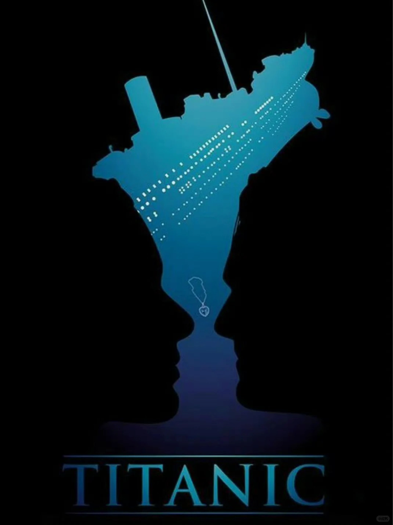
- Symbolism: A symbolic trio emerges: the Titanic’s hull (disaster and era), the lovers’ silhouettes (love), and the Heart of the Ocean necklace (a token of devotion). Together, they distill the “disaster-romance epic” into visual elements.
- Color: Gradient blue evokes “the ocean and fate.” The transition from light to dark blue not only mimics the ocean’s depth but also mirrors the emotional arc of “love from passion to tragedy.”
- Minimalism: The hull and character silhouettes are nested and integrated, with the necklace serving as the emotional focal point. No redundant disaster imagery is added—keeping the focus on the core emotion of “love amid catastrophe.”
The Adventures of Tintin
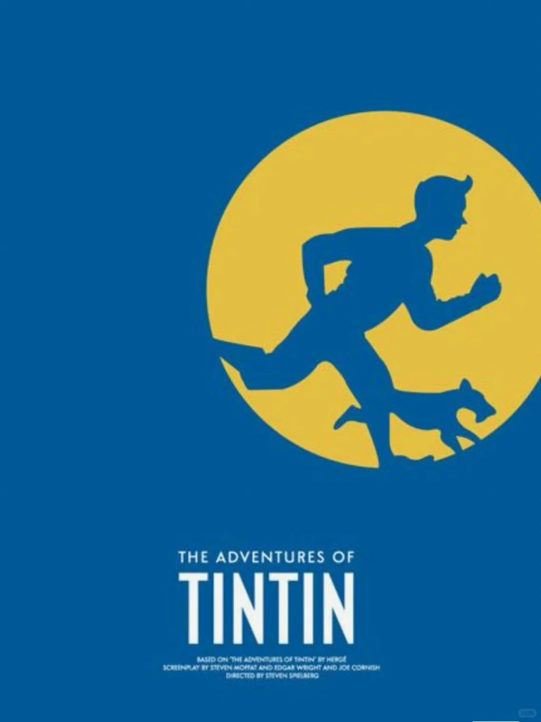
- Symbolism: The “running silhouettes of Tintin and Snowy the dog” are the core symbols, directly conveying the story’s “adventure and vitality.” Their dynamic posture becomes a visual signature for the “adventure partner” dynamic.
- Color: Bright blue and yellow create a “lively, playful” atmosphere, matching the adventure’s upbeat pace while remaining visually approachable.
- Minimalism: The dynamic silhouettes are framed in a yellow circle, which acts as a “visual anchor” to draw the audience’s eye. A simple background ensures the “adventure energy” takes center stage.
Disney Poster Design Secrets – Applied to SME Brand Posters
After analyzing these eight posters, we can distill three universal design secrets—secrets that are precisely the keys to creating high-impact brand posters. These principles are also the core logic that ailogocreator.io has integrated into its AI algorithms.
Symbolic Condensation: One Symbol = One SME Brand Memory Point
Disney consistently extracts the “most recognizable core element” from complex stories and transforms it into a symbol— a strategy SMEs can copy for cost-effective brand posters. This symbol independently represents the brand, drastically reducing memory load. For your business, this means ditching cluttered product details to find your “poisoned apple” or “glass slipper”— a visual shorthand tied directly to your core brand values, like “affordable organic food” or “reliable tech support.”
Emotional Color Binding: Colors = SME Brand Personality
Disney never chooses colors arbitrarily; every hue aligns with the story’s tone and the brand’s personality. Blue signifies dreams, red denotes conflict, and orange embodies strength—colors become a “silent language” for emotion. For SMEs, brand poster colors shouldn’t follow fleeting trends. Instead, they should match your positioning: think green for eco-brands, pink for beauty lines. This way, audiences can intuit your brand’s personality through color alone.
Minimalist Focus: Less Elements = Stronger SME Poster Impact
Whether through negative space, silhouette nesting, or cutting redundant details, Disney’s core goal is to “make core information stand out.” In the age of information overload, audiences only glance at a poster for 3 seconds. Only by doing “subtraction” can your brand’s key messages—symbols, core values—be quickly captured.
ailogocreator.io – Turn Disney’s Secrets into SME Poster Success
SMEs face three major pain points when creating brand posters: limited budgets, no in-house design team, and urgent turnaround demands. ailogocreator.io solves these challenges by embedding Disney’s design secrets into its AI algorithms—making professional poster design “low-threshold and high-efficiency.”
AI-Powered Symbol Generation: SME’s Unique Brand Visual Anchor
SMEs often struggle with: “How do I find my brand’s unique symbol?” ailogocreator.io demystifies this process with a straightforward workflow:
- Simple Input for SME Needs: In ailogocreator.io’s “Text to Logo” section, enter your brand name, slogan (e.g., “Harvest Fresh: Affordable Organic Produce”), and industry (food). The AI extracts core themes—farm, freshness, affordability—and generates symbolic combinations for your small business poster.
- Industry-Specific Examples: A local café gets a “mug + coffee bean” symbol; a startup tech repair service receives an “abstract chip + wrench” design. Following Disney’s “one symbol, one story” rule, this becomes the centerpiece of your affordable brand poster.
Intelligent Color Matching: Align Colors with SME Brand Emotions
SMEs often choose colors based on personal preference rather than brand emotion. ailogocreator.io’s color system fixes this with data-backed, professional logic:
- AI-Driven Industry Recommendations: In ailogocreator.io’s “Style & Color Selection” section, the tool suggests palettes tailored to SMEs: Beauty salons: High-saturation pink to convey “approachability and style”—mirroring *Cinderella*’s dreamy palette for salon marketing posters.
- Eco-friendly cleaners: Gradient green to evoke “trust and sustainability”—echoing *The Lion King*’s natural tones for green business posters.
- Brand Consistency for SMEs: If your bakery already uses warm brown as a brand color, input the hex code in “Customization.” ailogocreator.io expands a complementary palette, ensuring your poster aligns with your packaging and signage—critical for small business brand consistency.
Brand Consistency: If your business already has a brand color—like rich brown for a coffee shop—you can manually input the hex code in the “Customization” section. The AI then expands a complementary palette based on this color, ensuring your poster aligns seamlessly with your overall brand identity.
Minimalist Composition AI: Achieve Focus Without Design Skills
The biggest hurdle for SMEs in poster design is avoiding clutter. ailogocreator.io’s AI composition logic embraces Disney’s “subtraction” philosophy to simplify this:
- Automatic Negative Space Adjustment: The AI defaults to a “core symbol + minimal copy” layout—similar to the triangular focal point in *Alice in Wonderland*. This ensures the audience’s attention stays fixed on your brand symbol and key messages, like “20% Off New Arrivals.”
SME-Focused Features: Fast Output & Multi-Scenario Posters
In addition to design principles, ailogocreator.io also solves the “last mile” problem of poster application for SMEs:
- Silhouette Nesting for SME Stories: In ailogocreator.io’s “Customization” section, select the “silhouette nesting” template (inspired by *The Lion King*). A local gym could use “large dumbbell outline + fitness instructor silhouette” to tell the story of “personalized training”—perfect for local business promotional posters.
- Full-Format Download: Supports downloading in PNG (transparent background for online promotion), SVG/PDF (vector format for offline printing such as leaflets and billboards), solving the problem of “beautiful design but unable to be used for printing.”
- Serialized Poster Extension: After generating the main poster, use the “Brand Kit” function to generate holiday or promotional versions with one click (e.g., adding Christmas hats to the core symbol for Christmas, or adding discount labels for promotions), ensuring consistent brand visuals.
- Minute-Level Poster Creation: From input to final design, ailogocreator.io takes 1-5 minutes—ideal for SMEs needing last-minute holiday sale posters or grand opening visuals.
AI Makes Disney-Level Poster Design Accessible
Disney’s poster design wisdom is not exclusive to top teams; its core of “symbol, color, and minimalism” can be learned and applied by every enterprise. ailogocreator.io acts as a “bridge” to translate these professional design principles into simple and easy-to-use AI functions. For SMEs, this means that they no longer need to compromise on “cost, efficiency, and professionalism” — as long as they clarify their brand core, they can use AI to create brand posters that are both visually appealing and story-telling.
Ready to create your SME’s iconic brand poster? Visit ailogocreator.io (the #1 AI tool for Disney-inspired small business posters), input your brand details, and experience AI + Disney design wisdom in 60 seconds.
FAQ
Q: What are the core design principles behind the high impact of Disney movie posters?
A: The core lies in the “trinity” principle: symbolic condensation (extracting recognizable core elements like the poisoned apple), emotional color binding (using colors to convey tones such as blue for dreams and red for conflict), and minimalist focus (cutting redundant details to highlight key information).
Q: How can SMEs create memorable brand posters quickly without a professional design team?
A: AI design tools like ailogocreator.io can help. You only need to input basic information (brand name, slogan, industry), and the tool will automatically extract core elements to generate symbolic combinations, match suitable colors, and create minimalist compositions—completing the poster in 1-5 minutes.
Q: How to find a core visual symbol like the “poisoned apple” or “glass slipper” for my own brand?
A: First, clarify your brand’s core values (e.g., “freshness” for a food brand). Then use ailogocreator.io’s “Text to Logo” function: the AI will extract key themes from your input and generate symbolic combinations—for example, a café may get a “mug + coffee bean” symbol.
Q: What is the professional method for choosing colors for brand posters instead of relying on personal preference?
A: Colors should be aligned with brand personality and industry attributes. ailogocreator.io can recommend color schemes based on your industry—e.g., high-saturation pink for beauty brands and gradient green for eco-brands. If you have an existing brand color, input the color value to get a matching palette.
Q: Why is it said that “fewer elements mean stronger visual impact” for brand posters? What is the logic behind it?
A: In the information age, audiences only glance at a poster for about 3 seconds. Reducing redundant elements (like Disney’s use of negative space and silhouette nesting) can help focus the audience’s attention on core symbols and values, making the key information quickly captured.
CommentsTake the first comment