
A compelling visual identity is the secret ingredient that transforms a first-time diner into a loyal patron, directly influencing perceived food quality and price point. If you are a restaurateur, chef, or startup founder planning a new culinary venture, understanding the strategic elements of design is just as important as perfecting your menu. From leveraging color psychology to utilizing an advanced AI restaurant logo generator, this guide explores how to build a memorable brand that stands out in a crowded market.
- Mastering Color Psychology: How specific hues trigger hunger and trust.
- Typography Trends: Choosing fonts that speak your brand’s language.
- AI Efficiency: Streamlining creation with modern tools.
- Technical Essentials: The importance of vector graphics for scalability.
The Psychology of Color in Food Branding
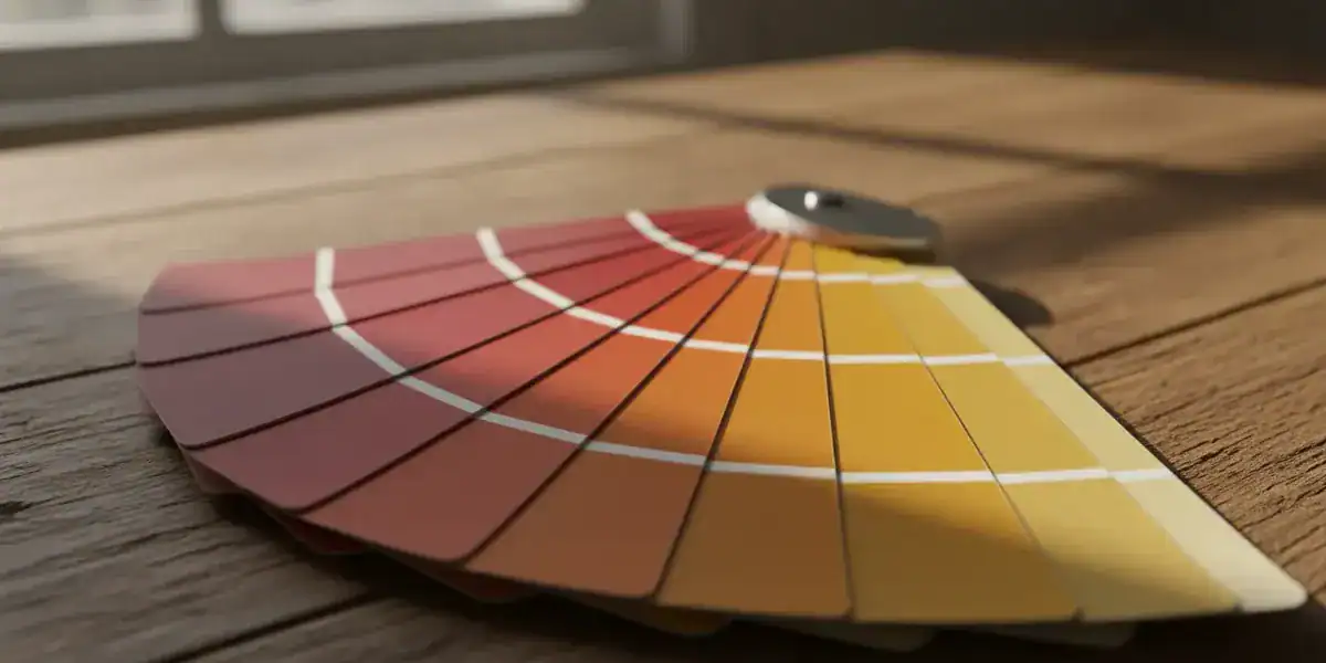
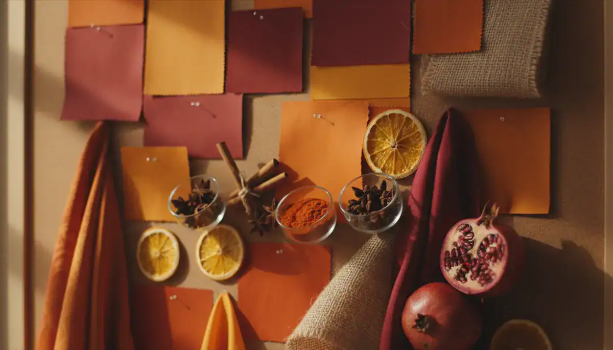
Color is never an accident in successful food branding. It acts as a silent signal to the customer’s subconscious, dictating how they should feel before they even step inside. Research indicates that warm colors like red and yellow are potent appetite stimulants, which is why they dominate the fast-food industry.
However, the trend is shifting for different niches. Green is increasingly used to signal health, freshness, and sustainability, essential for vegan or farm-to-table concepts. On the other end of the spectrum, high-end establishments often favor black or gold, which communicates luxury, sophistication, and exclusivity. When brainstorming restaurant logo design ideas, you must align your palette with the price point and dining atmosphere you intend to offer.
Summary: Colors trigger physiological responses; use warm tones for appetite and cool or neutral tones for sophistication and health-focused brand identity.
Modern Typography: Setting the Tone
Typography is often the most underrated element in restaurant logo design. The font style you choose acts as the voice of your brand. A whimsical, hand-written script might work perfectly for a cozy bakery or a cafe logo design, suggesting warmth and artisanal care. In contrast, a fine dining steakhouse requires strong, serif fonts that convey tradition, authority, and stability.
Legibility is paramount. A common mistake is choosing a font that looks artistic but is unreadable on a small smartphone screen or a distant signboard. Modern restaurant logos tend to favor clean sans-serif fonts that remain sharp and legible across all mediums, from digital apps to physical menus. It is a balancing act between personality and practicality.
Summary: Select typography that mirrors your restaurant’s vibe while prioritizing readability across both digital and physical platforms.
Beyond Clichés: Evolving Iconography
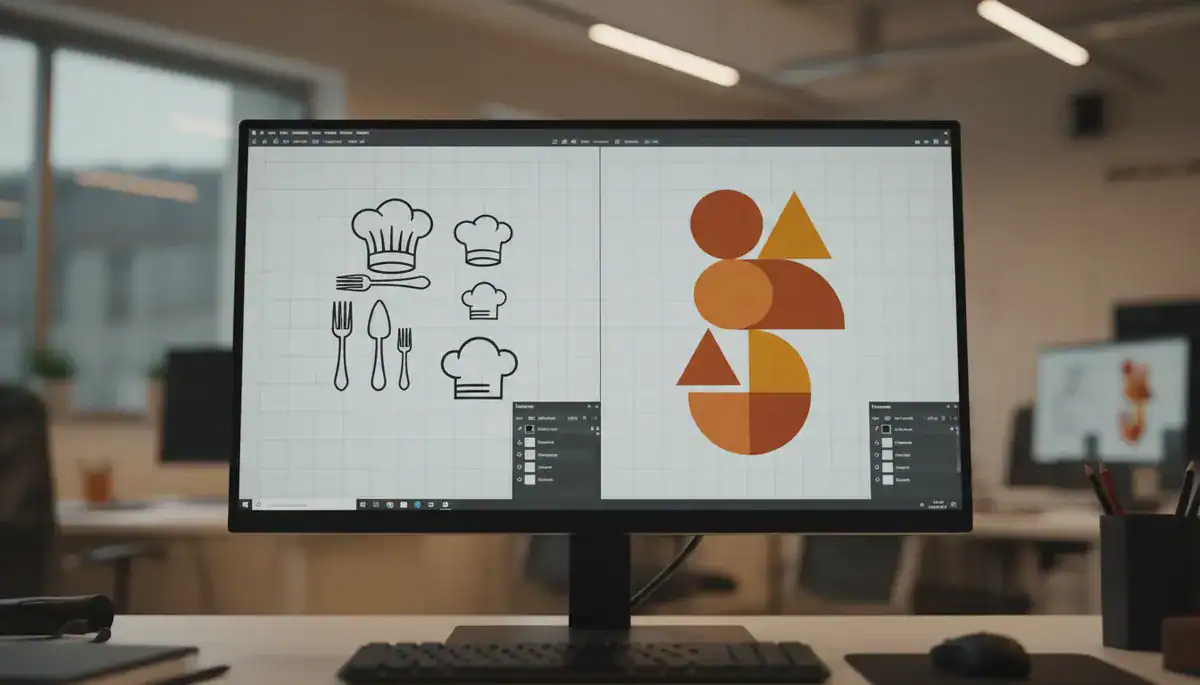
For decades, the industry was saturated with generic icons—chef hats, crossed forks, and steaming plates. While these communicate “food” instantly, they rarely help a brand stand out. Today’s most effective food logo maker strategies involve using abstract shapes or clever negative space to create a unique visual hook.
Consider creating a custom food logo that tells a story. Instead of a literal burger, a burger joint might use a stylized mascot or a geometric abstraction that suggests layers and flavor. This approach to iconography builds a deeper connection. It invites the customer to look twice. Distinctive visual assets are harder to copy and easier for customers to recall when they are deciding where to eat.
Summary: Move away from generic clip art; invest in unique, abstract, or mascot-based iconography to establish a distinct market presence.
Leveraging AI for Rapid Prototyping
The design process has historically been slow and expensive, often creating a barrier for small startups. However, the emergence of AI-driven tools has democratized access to professional-grade branding. Using an AI restaurant logo generator allows owners to visualize hundreds of concepts in minutes rather than weeks.
These intelligent systems analyze vast databases of design trends to suggest combinations of icons, fonts, and colors that work harmoniously. For instance, platforms like Ailogocreator represent this shift towards efficiency, enabling users to generate high-quality, relevant logos without needing extensive technical design skills. This allows for rapid iteration, helping you refine your concept before committing to a final version.
Summary: AI tools drastically reduce design time and cost, providing a high-quality starting point for restaurant logo design ideas.
The Necessity of Vector Graphics
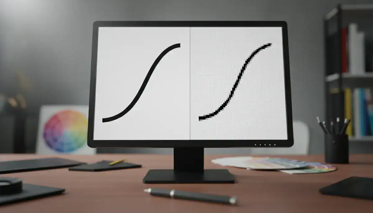
A beautiful logo is useless if it looks pixelated when enlarged. This is where the technical format becomes critical. Professional logos must be created as Vector Graphics (typically SVG or EPS files). Unlike standard images (JPEG or PNG) which are made of pixels, vectors are made of mathematical paths.
This means you can scale a vector logo from the size of a business card to the size of a billboard without losing a single ounce of clarity. Whether you are printing menus, embroidering staff uniforms, or creating large window decals, vector files ensure your brand looks crisp and professional. Ignoring this technical requirement is a costly mistake that often leads to re-branding later.
Summary: Always ensure your logo is available in Vector Graphics formats to guarantee perfect scalability for all marketing materials.
Tailoring Design to Your Niche
One size does not fit all in the culinary world. A logo that works for a grab-and-go juice bar will likely fail for a romantic Italian bistro. Fine dining branding usually relies on minimalism—less is more. Think of ample white space, monochromatic color schemes, and subtle monograms.
Conversely, a cafe logo design or a family diner can afford to be more playful, colorful, and illustrative. The goal is to set the correct expectation. If your logo looks expensive but your prices are cheap, you confuse customers. If your logo looks cheap but your food is expensive, you disappoint them. Alignment is key.
Summary: Analyze your specific culinary niche and ensure your logo’s aesthetic sets the correct price and atmosphere expectations for the guest.
FAQ
Q: What is the most appetizing color for a restaurant logo?
A: Red and orange are widely considered the most appetizing colors. They increase heart rate and metabolism, subconsciously triggering hunger, which is why many fast-food chains utilize them.
Q: Why do I need a vector file for my logo?
A: Vector files allow your logo to be resized infinitely without becoming blurry or pixelated. They are essential for high-quality printing on menus, signage, and uniforms.
Q: Can I use an AI generator for a professional restaurant brand?
A: Yes, modern AI tools are highly sophisticated and can generate professional-grade concepts. They are particularly useful for startups needing quick, high-quality visual identity solutions.
Q: How distinct should my logo be from competitors?
A: It should be distinct enough to avoid confusion but familiar enough to communicate the type of food you serve. Avoid copying local competitors’ color palettes to ensure you stand out.
Q: What is the trend for modern restaurant logos in 2026?
A: The current trend leans towards minimalism, clean typography, and versatile designs that look good on social media avatars as well as physical signage.
Conclusion and Actionable Suggestions
Creating a restaurant brand is an exciting journey that blends sensory appeal with visual strategy. Your logo is the visual anchor of your entire business. To ensure success, focus on a design that is not only beautiful but also functional and psychologically aligned with your food.
- Define Your Vibe: clearly decide if you are “fast-casual,” “fine dining,” or “cozy cafe” before starting design work.
- Audit Your Colors: Check if your chosen colors align with the emotions you want to evoke (e.g., orange for hunger, black for luxury).
- Test for Readability: Ensure your chosen font is legible at small sizes, especially for mobile ordering apps.
- Try AI Tools: Use platforms like Ailogocreator to generate diverse ideas quickly and cost-effectively.
- Secure Vectors: Never finalize a logo without obtaining the SVG or vector files for future scaling.
CommentsTake the first comment