Using warm tones strategically allows you to bypass the noise of trends and establish an immediate, subconscious connection of reliability with your audience. If you are a designer or brand owner struggling to make your seasonal visuals feel authentic rather than just “decorative,” understanding the psychology of warmth is your next necessary step. While most people default to icy blues for winter or generic neons for spring, integrating Color psychology, Warm earth tones, and specific seasonal nuances creates a sophisticated aesthetic that people actually want to engage with.
Here is where you should focus your attention:
* Why earth tones are the psychological equivalent of a firm handshake.
* How to replace cliché Christmas reds with “trustworthy” deep rusts and terracottas.
* The shift in Winter color palette trends toward “Chocolate Martini” and rich browns.
* How to execute Spring color trends that feel energetic but grounded.
The Psychology Behind Warm Earth Tones and Trust
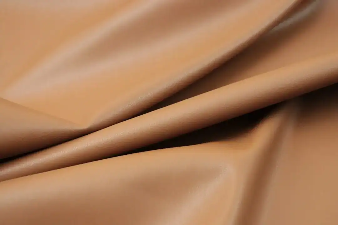
I have found that when clients ask for a design that feels “honest,” they are rarely looking for stark whites or clinical blues. They want grounding. Color psychology suggests that Warm earth tones—think beige, terracotta, caramel, and moss green—evoke feelings of stability and comfort.
According to design experts, these colors mirror the natural world, specifically elements like soil, wood, and clay. This connection creates a “no muss, no fuss” demeanor. When you use these tones, you aren’t just picking a color; you are signaling to the viewer that your brand or project has roots. It implies you aren’t going anywhere.
In my experience, the biggest mistake designers make is equating “warmth” with “bright orange.” That’s wrong. Trust comes from the muted side of warmth. A sandy beige or a deep ochre feels established, whereas a neon orange feels fleeting. If you want to build trust, you start with the colors of the ground, not the colors of a highlighter.

Rethinking the Christmas Color Palette
We need to talk about the standard Christmas color palette. The traditional fire-engine red and kelly green combination is nostalgic, sure, but does it build trust? To me, it often screams “discount sale.”
To create a trustworthy aesthetic for the holidays, I recommend pivoting toward “richness” rather than “brightness.”
* Swap Red for Rust or Cherry Cola: Current trends indicate a move toward deep, brownish-reds like “Cherry Cola.” This retains the festive spirit but adds a layer of sophistication and maturity.
* Swap White for Cream or Kraft Paper: Stark white feels cold. Using a “Cotton Ball” or “Kraft Paper” tone warms up the negative space, making the design feel inviting rather than sterile.
By grounding your Christmas visuals in these deeper, earthier shades, you maintain the festive cue without the chaotic energy of bright primary colors. It feels like a high-end heritage brand rather than a pop-up shop.
Winter Color Palette Trends: The “Rich Earthiness” Shift
Winter designs have historically been trapped in a “Frozen” aesthetic—lots of cool blues, silvers, and grays. However, recent Pantone trend reports for Autumn/Winter indicate a massive shift toward “richness and earthiness.”
The industry is moving toward practical, functional colors that signal conscious consumption. We are seeing a rise in “opulent mid-tones” that bridge the gap between elegance and practicality.
The Rise of Brown as the New Black
If there is one switch you make this winter, let it be this: replace black with brown. Specifically, deep, velvety browns like “Chocolate Martini.”
* Why it works: Black is authoritative, but it can be harsh and distancing. Deep brown commands the same respect but feels approachable. It invites the viewer in.
* The combination: Pair these deep browns with “milky” neutrals or “accessible neutrals” to keep the contrast high but the mood soft.
I believe this shift is driven by a collective desire for comfort. We don’t want to be shocked by cold colors in winter; we want to be enveloped in warmth.

Navigating Spring Color Trends Without Losing Ground
Spring is usually where “trust” falls apart in design. The market floods with pastels that often look weak or wash out the brand’s authority. The key to maintaining trust during this season is to adopt the “Warm Spring” approach.
A Warm Spring palette is light and bright, but it refuses to be cool or muddy. Think of a clear, sunny day rather than a foggy morning.
* The Colors: Focus on golden yellow, warm coral, peach, and bright turquoise.
* The Anchor: You must anchor these brights with warm neutrals like camel or golden khaki.
If you use a flimsy baby pink, you lose authority. If you use a saturated “Warm Coral” or “Daffodil,” you keep the energy high while maintaining presence. The Spring color trends for the upcoming cycles are mixing these lively tones with “grounding warmth” like soft taupe. This balance is non-negotiable. You can be fun (spring) and serious (trustworthy) at the same time, but only if your undertones remain consistently warm.

Practical Steps to Build Your Trust-Based Palette
Knowing the theory is one thing; mixing the paint is another. When you sit down to create your seasonal assets, follow this workflow to ensure you don’t veer off course.
- Start with the Neutral: Do not pick your accent color first. Pick your warm neutral (Camel, Cream, Taupe). This is your foundation of trust.
- Add the Seasonal Modifier:
- Christmas: Add Deep Rust/Burgundy.
- Winter: Add Chocolate Brown or Olive.
- Spring: Add Coral or Goldenrod.
- Test the Context: Colors look different in isolation versus application. When I am unsure if a combination feels “trustworthy” or just “muddy,” I use digital tools to visualize them immediately. Platforms like Ailogocreator are excellent for quickly applying these warm palettes to logo concepts or branding materials to see if they hold up against a white or dark background.
- The 60-30-10 Rule: Use your warm neutral for 60% of the design, your seasonal trust-builder (like brown or rust) for 30%, and your bright accent for 10%.

FAQ
Can I mix cool and warm tones and still build trust?
It is risky. While you can mix them (like a cool navy with a warm leather brown), the easiest path to subconscious trust is a harmonious, all-warm palette. Clashing temperatures can create visual tension, which is the opposite of comfort.
What is the single most trustworthy color for winter?
Deep, warm brown. It replaces the severity of black with the stability of earth. It says “luxury” and “reliability” simultaneously.
Are “Warm Spring” colors professional enough for corporate brands?
Yes, if you use them as accents. A full background of “bright peach” might be too much, but a “Cream” background with “Warm Coral” typography is incredibly professional and modern.
Why do earth tones sometimes look boring?
They look boring only if you lack contrast. If you use three shades of beige, it’s dull. If you pair a light oat beige with a deep mahogany, it becomes dynamic and sophisticated.
Conclusion and Actionable Suggestions
Building trust through color is not about picking the prettiest shade; it is about consistency and psychology. By shifting your seasonal palettes to include warm, earth-based foundations, you signal stability to your audience before they even read your text.
- Audit your neutrals: Replace stark white (#FFFFFF) with a warm cream or off-white in your winter and spring designs.
- Adopt the “Chocolate” trend: For your next winter campaign, swap all instances of pure black text/elements with a deep, rich brown.
- Ground your Spring: Don’t let your spring palette float away. Ensure every bright coral or yellow is paired with a solid camel or khaki anchor.
- Focus on clarity: especially for Spring, ensure your warm tones are clear (bright) rather than muted (dusty) to maintain energy.
- Test before launch: Always view your palette in a mock-up environment to ensure the “warmth” translates to “trust” and not “messy.”

CommentsTake the first comment