

Why BMW Logo Evolution Matters
BMW is one of the most recognizable automotive brands in the world, and its logo has become a timeless symbol of precision, engineering, and performance.
Unlike many car brands that have dramatically redesigned their logos, BMW has followed a more evolutionary design approach—refining its logo over time while preserving its core identity.
Understanding BMW logo evolution offers valuable insights into how strong brands maintain consistency while adapting to new design trends and technologies.
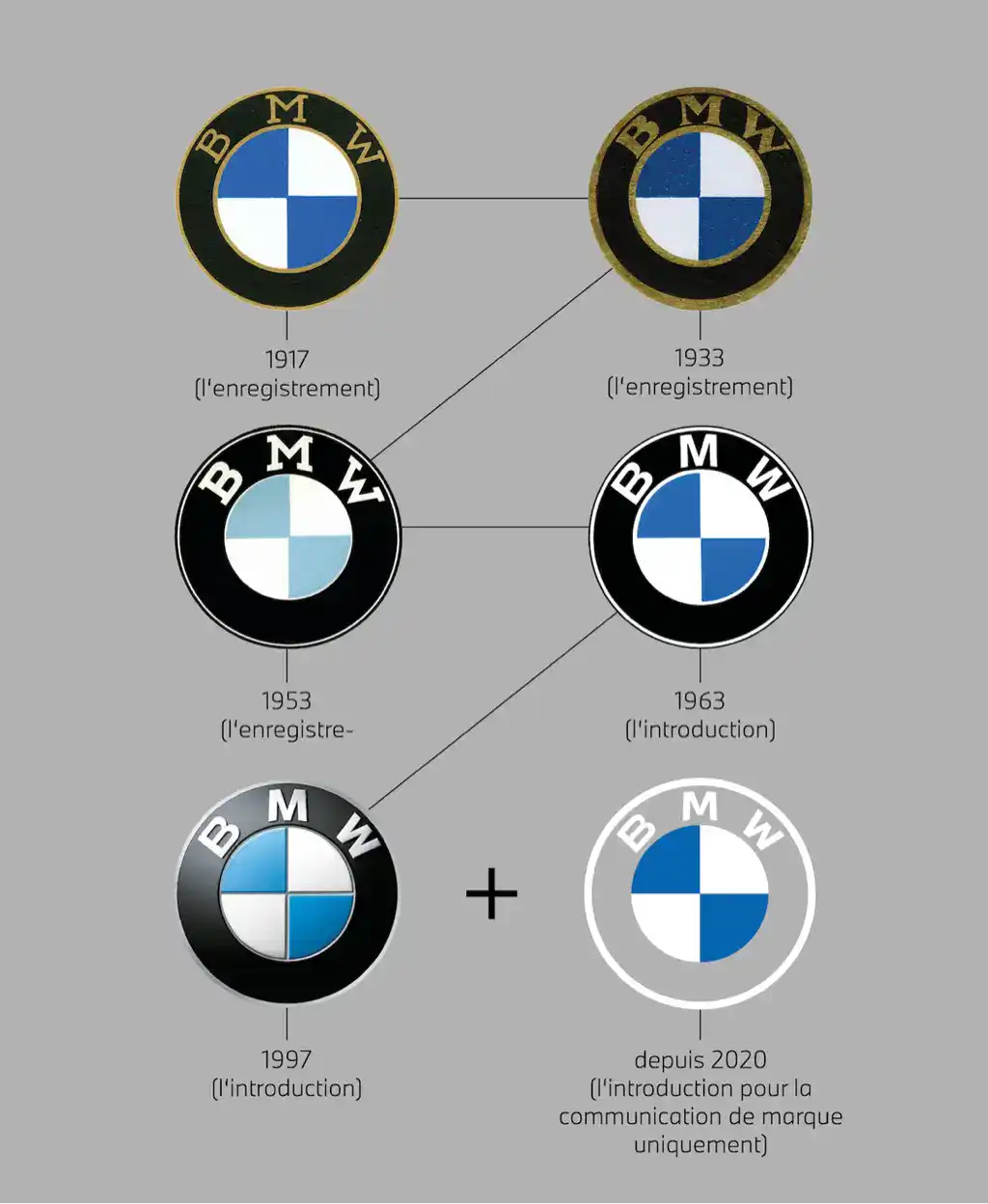
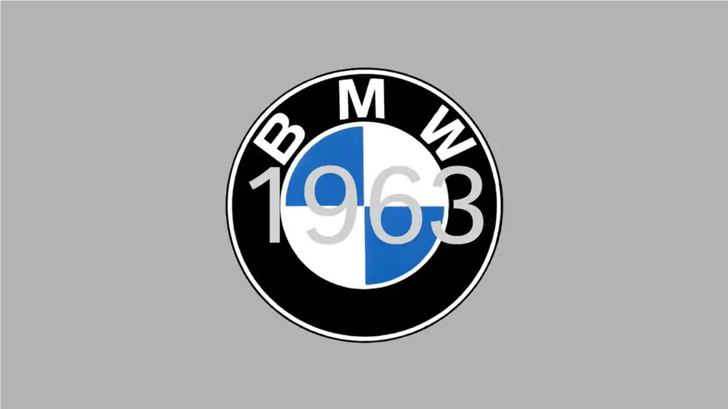
The Origins of the BMW Logo (1917–1933)
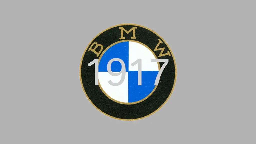
BMW was officially founded in 1917, and its earliest logo already featured the elements we recognize today.
Key Design Elements
- Circular shape inspired by aircraft engine emblems
- Black outer ring representing strength and authority
- Blue and white quadrants reflecting the colors of Bavaria

Contrary to a popular myth, the BMW logo was not originally designed to represent a spinning propeller. That interpretation emerged later through advertising imagery, not the original logo concept.
This early design laid the foundation for one of the most consistent brand logos in automotive history.
BMW Logo Refinement and Standardization (1930s–1960s)
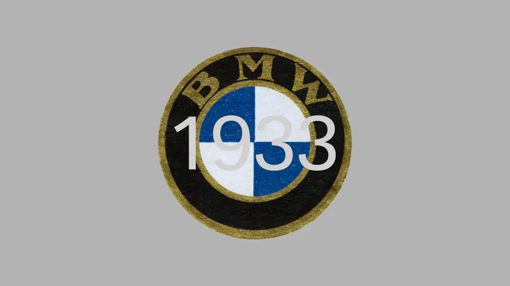
As BMW expanded from aircraft engines into motorcycles and automobiles, the logo needed to work across more products and formats.
Design Adjustments
- Cleaner typography in the outer ring
- More balanced proportions between inner and outer circles
- Improved legibility for print and manufacturing
During this period, BMW focused less on decoration and more on clarity and reproducibility, aligning with broader industrial design trends.
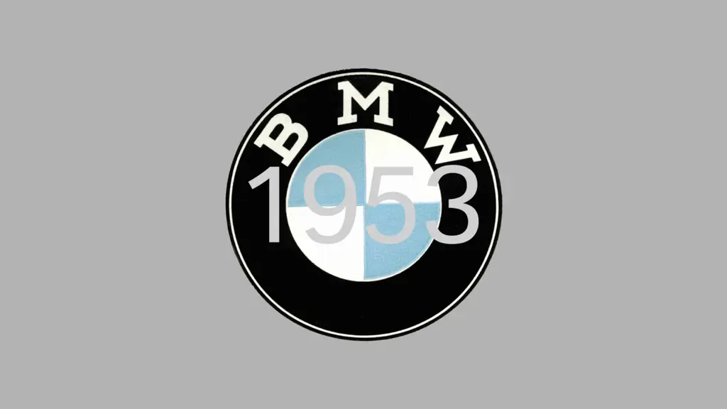
The Modernization Phase: Subtle Visual Enhancements (1970s–1990s)
By the late 20th century, BMW had established itself as a premium automotive brand. Rather than reinventing its logo, BMW chose to enhance visual quality without changing structure.
Notable Changes
- Introduction of glossy finishes
- Slightly darker blue tones
- Increased contrast for better visibility
These refinements helped BMW’s logo stand out in advertising, dealership signage, and vehicle badging—without compromising brand recognition.
The 3D Era: Depth and Metallic Effects (2000s–2010s)
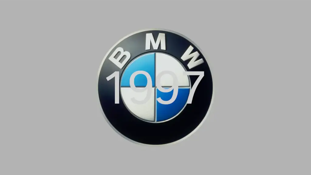
Like many car brands in the early 2000s, BMW embraced three-dimensional logo design.
Characteristics of the 3D BMW Logo
- Metallic gradients and chrome effects
- Shadowing to create depth
- Premium, high-tech visual language
This version aligned well with physical car badges and luxury branding at the time. However, it posed challenges for digital use, especially at smaller sizes.
BMW Flat Logo Redesign (2020–Present)

In 2020, BMW introduced a flatter, more minimalist version of its logo for digital and communication purposes.
Why BMW Simplified Its Logo
- Improved performance on digital platforms
- Better scalability for apps and screens
- Alignment with modern minimalist design trends
Importantly, BMW did not abandon its iconic circular structure or color system. Instead, it removed unnecessary visual effects while preserving brand DNA.
This redesign demonstrates how brands can modernize without losing identity.
What BMW Logo Evolution Teaches Modern Brands
BMW’s logo history provides several valuable branding lessons:
- Consistency builds long-term trust
- Strong structure matters more than decorative effects
- Small refinements can have a big impact
Rather than chasing trends, BMW focused on controlled evolution, ensuring each change strengthened brand recognition.
Applying BMW Design Principles with AI Logo Tools
Most startups and small businesses do not have access to decades of design refinement or large branding teams. However, the principles behind BMW logo evolution are now more accessible than ever.
With AI-powered tools like ailogocreator.io, users can:
- Create clean, structured logos inspired by iconic brands
- Apply minimalist design principles effectively
- Build professional brand identities without design experience
By studying successful brands like BMW and leveraging AI logo generators, modern creators can design logos that are both timeless and adaptable.
BMW Logo Evolution as a Model for Timeless Design

The evolution of the BMW logo proves that great design does not require constant reinvention. Instead, it thrives on clarity, consistency, and thoughtful adaptation.
For anyone building a brand today, BMW’s logo history offers a powerful lesson: evolve carefully, design intentionally, and always think long-term.
👉 Try ailogocreator.io to start designing a logo inspired by proven brand principles.
- Car Logo Evolution
- Volkswagen Logo Evolution
- Audi Logo Evolution
- Porsche Logo Evolution
- Mercedes-Benz Logo Evolution
CommentsTake the first comment