
Amazon’s “smile” arrow is one of the most recognizable symbols in modern commerce. But this iconic mark didn’t appear overnight. Between 1995 and 2000, Amazon evolved from a startup online bookstore into a global retail giant—and its visual identity had to evolve just as quickly to keep up.
For entrepreneurs and designers, Amazon’s design journey offers a masterclass in scaling a brand. It moved from a literal, illustrative logo to a clean, scalable system that works everywhere.
In this case study, we will break down:
- The Timeline: A visual history from 1995 to 2000.
- Business Context: Why the logo changed at each specific stage.
- Design Tradeoffs: What was gained (and lost) in each redesign.
- Reusable Lessons: How you can apply these principles to your own brand using modern tools like AILogoCreator.
The Amazon Logo Timeline (At a Glance)
Before diving deep, here is the quick evolution of the brand identity:
| Era | What it looked like | What it communicated | Why it mattered |
| 1995–1997 | Abstract “A” + river-like form + amazon.com | “New internet bookstore” + a literal nod to Amazon | Early web needed obvious identity cues |
| 1997–1998 | amazon.com wordmark + tagline “Earth’s Biggest Bookstore” | Authority + clarity (we sell books) | Trust-building while e-commerce was still new |
| 1998 (experiments) | Cleaner wordmarks, simplified layout, occasional color accents | Transition from “bookstore” to a broader retail brand | Expansion beyond books + international growth |
| 1998–2000 | Lowercase wordmark + underline (pre-smile) | Stability + motion/delivery hint | Preparing a system that works everywhere |
| 2000 | The famous smile arrow from A → Z | “Everything from A to Z” + customer happiness + delivery | A single mark that scales across products + packaging |
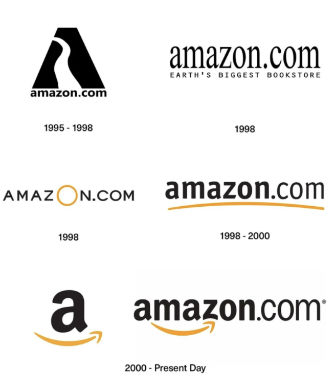
1. 1995–1997: The “River A” Era (The Startup Phase)
Visual Concept:
The original logo featured a bold, abstract letter “A” with a negative space shape cutting through it, resembling a winding river. Beneath it sat the URL: amazon.com.
The Business Context:
In the mid-90s, the internet was new. Amazon needed to anchor its name (inspired by the Earth’s biggest river) to its visual identity. The logo was illustrative and symbolic.
Design Analysis:
- Pros: It was distinctive and told a story about the name.
- Cons: It was hard to scale. Complex textures and shapes often suffer on low-resolution screens or small formats (like favicons).
💡 Key Lesson: Early-stage startups often over-explain with their logos. As you grow, clarity usually wins over complexity.
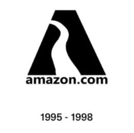
2. 1997–1998: Building Trust with “Earth’s Biggest Bookstore”
Visual Concept:
Amazon shifted to a cleaner serif wordmark combined with the bold claim: “Earth’s Biggest Bookstore.”
The Business Context:
With the introduction of 1-Click Shopping in 1997, Amazon needed to transition from a “web experiment” to a trusted retailer. A classic serif font signaled authority, literacy, and tradition—perfect for selling books.
Design Analysis:
- Pros: Highly readable and established clear market positioning.
- Cons: The tagline became a trap. As Amazon planned to sell music, videos, and gifts, being labeled a “bookstore” became a limitation.
💡 Key Lesson: Use taglines as “training wheels.” They explain what you do when you are new, but your logo should be flexible enough to survive without them when you pivot.
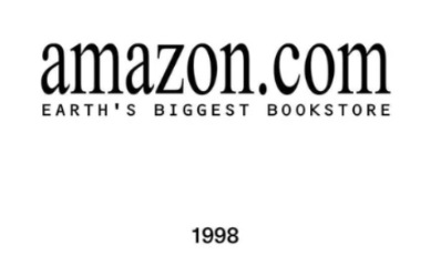
3. 1998: The Year of Rapid Experimentation
1998 was a pivotal year. Amazon expanded into new markets (UK, Germany) and new categories (Music, DVD). The brand could no longer look like a library; it needed to look like a tech giant.
During this transition, Amazon briefly tested two distinct styles:
- The Serif Wordmark (Simplified): Removing the tagline to allow for category expansion.
- The All-Caps + Yellow “O”: A bold, geometric experiment. The large yellow ring was striking but lacked a deeper meaning.
💡 Key Lesson: When your business roadmap changes (e.g., expanding product lines), your visual identity must follow. Don’t be afraid to iterate rapidly until the system fits the new strategy.
4. 1998–2000: The Underline (The Precursor to the Smile)
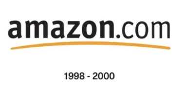
Visual Concept:
The logo settled into a lowercase, sans-serif font (amazon.com) with a simple gold curve underlining the text.
The Business Context:
This version bridged the gap. The lowercase letters felt approachable and modern (unlike the stiff caps of 1998), and the gold line added a touch of warmth and motion without being distracting.
Design Analysis:
The “swosh” or underline is a classic design device. It provides a base for the logo and suggests forward momentum. However, it wasn’t fully “ownable” yet—it was just a decoration.
5. 2000–Present: The “Smile” Arrow (A to Z)
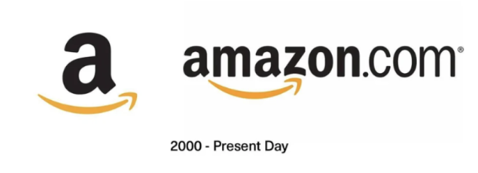
In 2000, the branding agency Turner Duckworth helped Amazon refine the underline into the legendary arrow we know today.
The Hidden Meanings:
This isn’t just a curved line. It performs three strategic jobs at once:
- The Smile: The curve represents customer satisfaction and friendliness.
- The Journey: The arrow points from the letter A to Z, symbolizing that Amazon sells everything from A to Z.
- The Connection: It visually connects the start and end of the brand name, creating a contained unit.
Why It Works:
This logo conquered the world because it is system-ready. The “Smile” stands alone on shipping boxes, app icons, and Prime Video screens. It doesn’t need the word “Amazon” to be recognized.
How to Apply These Lessons to Your Brand (Without Copying)
You don’t need Amazon’s budget to apply their design strategy. The goal is to build a logo that is scalable, simple, and tells a story.
Here is a 3-step framework to create a modern, e-commerce-ready logo using AI tools.
Step 1: Start with a Clean Wordmark
Amazon moved from complex illustrations to simple text. If you are building a brand, prioritize readability.
- Try this: Use AILogoCreator (Text-to-Logo mode).
- Prompt Idea: “Minimalist lowercase wordmark for an e-commerce brand, geometric sans-serif font, high readability, friendly and modern.”
Step 2: Add a “Signature Gesture”
Amazon used the smile. Nike uses the swoosh. You need one visual element that makes you unique.
- Try this: In AILogoCreator, experiment with adding an accent.
- Prompt Idea: “Modern logo with a subtle curved underline or accent stroke, warm orange color, signifying speed and delivery.”
Step 3: Test It in the Real World (Mockups)
A logo might look good on screen but fail on a box. Amazon’s logo works because it looks great on cardboard.
- Action: Use the Mockup Generator to instantly see your logo on packaging, shipping boxes, and store signs. This validates if your design is “retail-ready.”
Pro Tip: Don’t stop at static images. Use an Animated Logo Reveal for your social media intros. Motion makes a digital brand feel more premium immediately.
FAQ: Common Questions About Amazon’s Logo
What was Amazon’s first logo?
Amazon’s first logo (1995) was a translucent letter “A” with a river shape flowing through it, placed above water ripples. It was designed to represent the Amazon River.
What does the arrow in the Amazon logo mean?
The arrow serves a dual purpose: it forms a smile to represent customer happiness, and it points from the “A” to the “Z” in the name, signifying that the store offers every product from A to Z.
When was the Amazon smile logo introduced?
The current version of the logo featuring the smile arrow connecting A to Z was introduced in early 2000.
Can I use the Amazon font?
The Amazon logo uses a custom typeface (close to Franklin Gothic or Officina Sans). For your own brand, you should avoid copying it directly to prevent trademark issues. Instead, use tools like AILogoCreator to generate original typography that captures a similar “friendly but corporate” vibe.
Disclaimer: Amazon and the Amazon logo are trademarks of Amazon.com, Inc. or its affiliates. This article is for educational and design analysis purposes only.
CommentsTake the first comment