
So, have you heard of PUMA? If you’re into sports or fashion, it’s a brand you can’t avoid. When you think of “PUMA,” what comes to mind? Speed, strength, and stylish design, right? These elements make up PUMA’s brand image. Let’s take a journey through the evolution of the PUMA logo together.
Overview of the PUMA Brand
Brand Background
PUMA’s beginnings trace back to 1924, starting from the Dassler Brothers Shoe Factory. However, due to war and other events, the brothers eventually went their separate ways, leading to Rudolf Dassler founding PUMA in 1948. It’s a pretty dramatic story, isn’t it?

Even after the brand was established, the competition was intense. But by focusing on quality and innovation, PUMA gradually solidified its position. Simply making shoes wasn’t enough to gain consumers’ trust. They continuously improved their products based on market feedback. Such efforts are likely why PUMA is so beloved.
Corporate Philosophy
Have you heard of PUMA’s corporate philosophy, “Forever Faster”? It’s very important to the brand. This philosophy is deeply rooted in the brand’s core, emphasizing speed not just in product development but also in marketing strategies.

This philosophy is crucial. You can feel it in the products and campaigns, such as creating impressively fast shoes or launching campaigns that showcase hidden strength beyond appearance. As a result, consumers feel this sense of speed and develop a strong connection with the brand. This may be why everyone loves PUMA.
Logo Design Evolution
Early Stages
PUMA’s logo design is quite different now compared to the past. In 1948, the first design combining text and symbol appeared, and looking at it now, it has a certain charm. Back then, many people probably still thought, “What’s PUMA?”
Design changes with the times. The logo symbolized the brand’s beginnings and was likely refreshing to see. However, at the start, complex logos could be a disadvantage for a brand with low visibility.
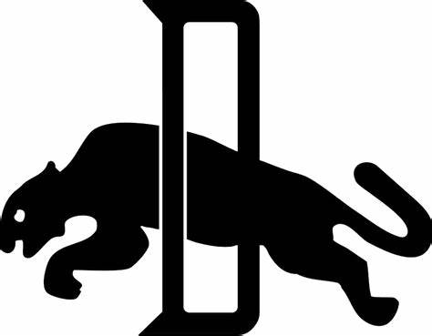
Classic Leap: 1960s-1980s
From the 1960s through the 1980s, PUMA made notable changes to the logo. One distinct feature was the leaping puma mark. Everyone loves the dynamic jumping aspect, representing the brand’s speed and power.
The logo from this era is truly classic, and it’s a design everyone has seen at least once. It’s amazing how recognizable PUMA became. It took a lot of time and effort to gain that recognition.
Modern Design: From 1988 to Present
Since 1988, the logo design has become even simpler. This simplicity aims to adapt to the current digital era, making high visibility important.
A simpler design allows the logo to stand out across all digital media. This is crucial even when viewed on smartphones today. A logo isn’t just a mark; it communicates the brand’s entirety. It’s quite profound.
Extension: Reconstructing Classics with Modern Design Tools
In contemporary brand design, combining history with modern aesthetics is crucial. There’s an interesting tool called AILogoCreator. By using it, various design options can be explored to breathe new life into classic designs.

By retaining the essence of the past while adding modern elements, an original design that stands out from other brands can emerge. This enhances PUMA’s allure, bridging the brand’s history with the present.
Integration of Brand and Design
Expression of Brand Identity
Do you know how much the PUMA logo expresses the brand’s identity? Just by looking at the design, you recognize it as “PUMA!” It contains agility, vitality, and innovation.
Designers likely give a lot of thought to express these features. Incorporating brand philosophy into design is challenging, but PUMA has succeeded admirably.
Global Expansion of the Brand
PUMA is a global brand, but cultures differ greatly across countries. They adjust logo designs accordingly. For instance, certain colors might be favored more in one country due to cultural preferences.
To attract consumers with localized designs, understanding trends and customs in each country is vital. This is where the marketing team’s skills come into play. It’s interesting to think about the strategies PUMA has employed to expand globally.
Integration of Technology and Design, Introduction of AILogoCreator
AI design tools? That’s something new. This AILogoCreator tool can supposedly analyze consumer preferences to create better designs.
By using this tool, consumer preferences can be visualized in data. Future designs seem like they’re going to be something spectacular.
Brand Innovation and Collaboration
Logo Design in Cross-Industry Collaboration
PUMA isn’t just a sports brand. They’ve collaborated with high-fashion designers like Jil Sander and Philippe Starck. Isn’t that impressive? It diversifies PUMA’s image more and more.
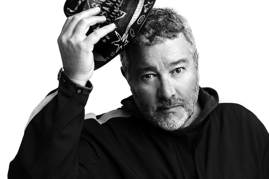
In such cross-industry collaborations, new essences are added to PUMA’s design. It doesn’t feel like the usual PUMA; there’s something special about it. PUMA seems to have many faces.
Logo Design in Digital Transformation
We’re in a digital era now, with things like the metaverse and digital platforms emerging. PUMA needs to adapt its logo accordingly.
By using AILogoCreator, logos that stand out in virtual scenes can be found. It’s interesting to explore designs that not only attract attention digitally but also effectively convey PUMA’s message. Technology is advancing, and the future of PUMA’s development is something to look forward to.
Conclusion
Let’s reflect on the evolution of the PUMA brand logo we’ve seen so far. It consistently evolves while embodying its philosophy. PUMA’s sense of speed and strength remain crucial components in maintaining its market competitiveness.
Future design trends and the potential impact of AI technology garner attention. Tools like AILogoCreator might enable PUMA to continue evolving. The fusion of technology and design might reveal amazing new worlds to us!
CommentsTake the first comment