
In the complex world of finance, where trust and reputation are paramount, a bank’s logo serves as a visual cornerstone of its brand identity. It tells a story, reflects the bank’s values, and signifies stability and reliability to customers and stakeholders alike. This article delves into the logos of the ten largest banks in the United States, exploring their historical evolution, design principles, symbolism, and impact on both the market and consumer perception.

Background on the Significance of Logos in Branding
Logos are vital components of any brand’s identity. They provide an immediate visual impression that can communicate a business’s core values, culture, and mission. In banking, a sector driven by trust and security, a logo can significantly enhance or undermine these perceptions. An effective logo should strike a balance between being modern yet timeless, unique but understandable, simple yet significant.
The financial titans at the forefront of the U.S. banking industry manage trillions in assets and have millions of customers worldwide. These banks include JPMorgan Chase, Bank of America, Wells Fargo, Citigroup, Goldman Sachs, Morgan Stanley, U.S. Bancorp, Truist Financial Corporation, PNC Financial Services, and HSBC USA. Each bank’s logo serves as a unique hallmark of its brand identity, symbolizing its legacy and its aspirations.

To thoroughly analyze each bank’s logo, a set of criteria and a methodical approach were used to ensure comprehensive insight into their design philosophy and branding strategy.Each bank’s logo was analyzed based on several criteria, including historical evolution, color and typography, symbolism, design principles, and cultural impact. This holistic approach ensures a deep understanding of how these logos contribute to the banks’ overarching brand strategy.
Explanation of the Design Principles Considered
The logos were evaluated based on design principles such as simplicity, relevance, memorability, versatility, and timelessness. These principles guide how a logo can effectively communicate a brand’s message while adapting to varying contexts and mediums.The research methodology involved a combination of qualitative analysis, including historical and contextual reviews, alongside comparative evaluations of the visual elements and their implied meanings. This approach draws connections between design choices and consumer perceptions.
Logo Analysis of the 10 Largest U.S. Banks
JPMorgan Chase
Background and Legacy:
JPMorgan Chase, a leader in global finance, has a long history dating back to the early 19th century. The legacy of J.P. Morgan, one of America’s most influential financiers, threads through its heritage, leaving a legacy of financial acumen and growth.

Logo Design and Evolution:
The current logo, adopted in 2008, features a simple yet powerful geometric symbol alongside its modern wordmark. This design reflects a synthesis of its historical roots and forward-thinking vision, echoing the stability that the bank embodies.
Elements and Design Principles:
- Color Palette: The deep blue color choice conveys trust and professionalism, essential attributes in the financial sector.
- Shape and Structure: The geometric octagon represents balance, security, and continuity, resonating with the bank’s solid foundation.
- Typography: The sleek, modern typeface speaks to JPMorgan Chase’s ability to adapt and innovate in a rapidly changing financial landscape.
Symbolism and Meaning:
The octagonal mark acts as a visual metaphor for the bank’s comprehensive and inclusive approach to financial services, symbolizing both progress and tradition.
Market and Cultural Impact:
Its simplicity and distinctiveness have garnered global recognition, reinforcing JPMorgan Chase’s status as a reliable and prestigious institution.
Bank of America
Background and Heritage:
Founded in Charlotte, North Carolina, in the early 20th century, Bank of America has grown into one of the world’s leading financial institutions, known for supporting local enterprises and boosting economic growth.
Logo Creation and Changes:
The current logo, crafted after merging with NationsBank in 1998, features a stylized American flag that signifies its commitment to nationwide presence and American values.
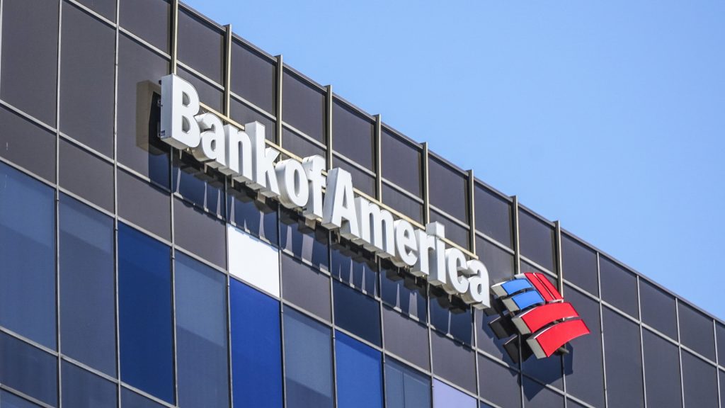
Design Elements and Concepts:
- Color Use: The red, white, and blue colors underscore its American heritage and invoke national pride.
- Iconography: The flag motif emphasizes unity, strength, and service.
- Typography: A clean and contemporary font subtly underscores modernity and approachability.
Interpretations and Implications:
The logo integrates themes of patriotism and connectivity, aiming to foster trust and loyalty among American customers.
Cultural and Market Resonance:
Widely recognized, the logo signifies stability and trust, playing an instrumental role in maintaining Bank of America’s strong brand identity across diverse markets.
Wells Fargo
Heritage and Background:
Wells Fargo is deeply rooted in American history, tracing back to stagecoach transport and gold rush banking services in the mid-1800s.
Logo Design Journey:
Its logo showcases a signature stagecoach, a reminiscence of its beginnings and prolonged legacy in banking.
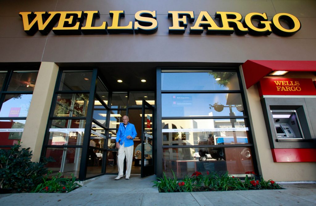
Design Elements and Artistic Vision:
- Color Selection: Predominantly red, this projects warmth and energy, attributes essential for customer engagement.
- Imagery: The stagecoach icon is nostalgic, symbolizing reliability and progression over time.
- Typography: The bold serif font denotes tradition and strength, vital for an established financial institution.
Symbolic Meanings:
The stagecoach signifies reliability, endurance, and a pioneering spirit, bridging its historical roots with present-day operations.
Cultural and Business Influence:
The logo has been effective in brand reinforcement, making Wells Fargo a household name synonymous with reliability and customer intimacy.
Citigroup
Background Information:
As a financial powerhouse, Citigroup was established from a series of mergers throughout the 20th century, culminating into an influential global presence.
Logo’s Origin and Adaptation:
Citigroup introduced its current logo post-merger in 1998; it features a simple arc that accentuates global coverage and modern innovation.
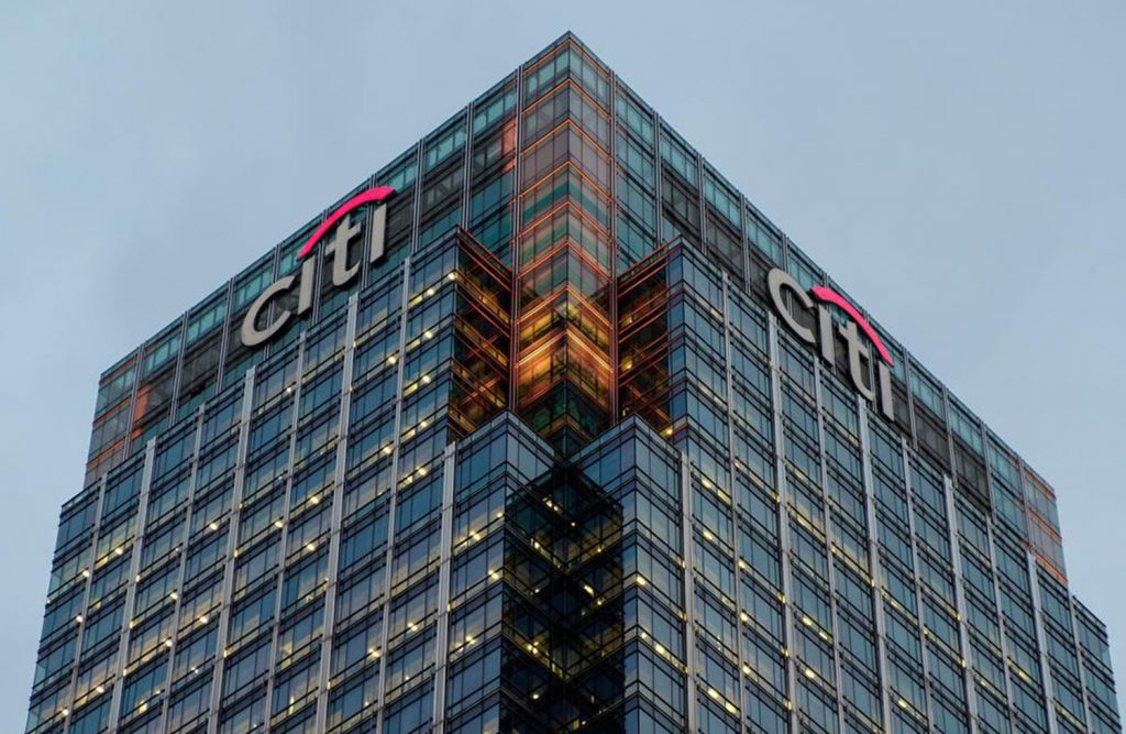
Key Elements and Design Ideology:
- Color Dynamics: Leveraging red for vibrancy and blue for trust, the palette embodies balance and dynamism.
- Symbolism: The arc over the ‘t’ functions as an umbrella, symbolizing protection and far-reaching solutions.
- Typeface: A sans-serif font lends modernity and readability, complementing its global approach.
Conceptual and Symbolic Insight:
Citi’s logo represents protection and global gateways, resonant with its extensive services and geographical outreach.
Cultural and Market Impact:
Instant recognition and strong market presence arise from its concise design, positioning Citigroup as a reliable global financial leader.
Goldman Sachs
Historical and Institutional Background:
Founded in 1869, Goldman Sachs is a prestigious institution in investment banking and financial services, known for sophisticated financial solutions.
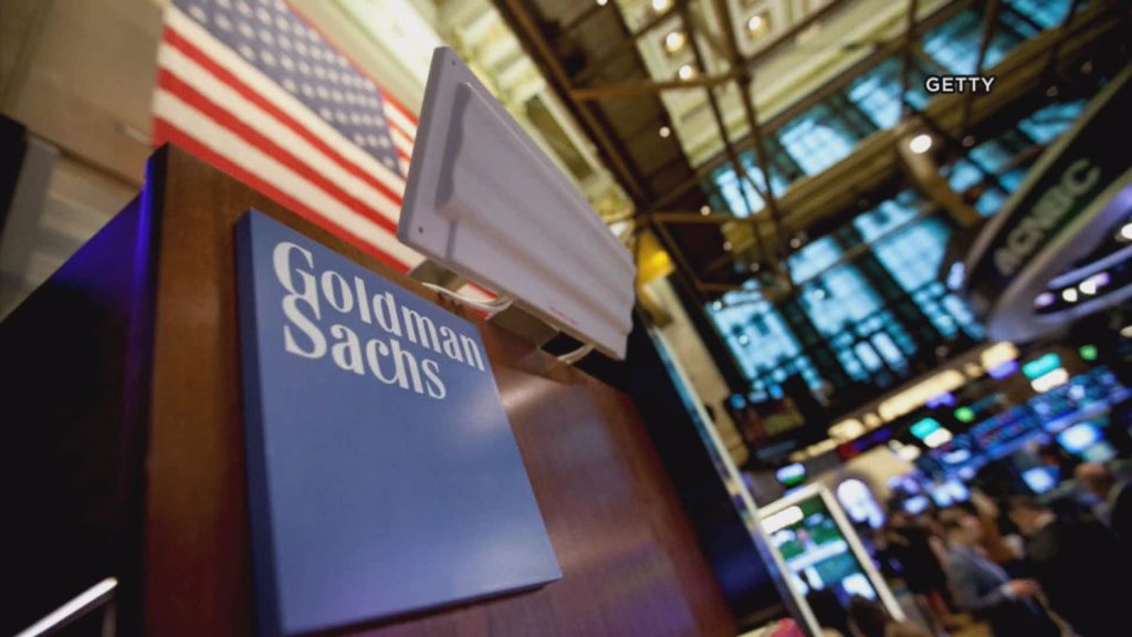
Development of Current Logo:
The logo is deliberately minimalistic, casting a focus on the name rather than intricate design to signify professionalism and reserved prestige.
Design Components and Principles:
- Color Scheme: The classic blue echoes trust and depth in client relationships.
- Typography: A straightforward, sans-serif font exudes clarity and authority.
Symbolic Interpretation:
The logo’s reserved elegance reflects Goldman Sachs’ philosophical depth and focus on quality services, a visual echo of their market position.
Market and Cultural Significance:
This minimalist approach effectively communicates stability and expertise, key attributes sustaining Goldman Sachs’ elite reputation.
Morgan Stanley
Corporate Background:
Morgan Stanley’s genesis in 1935 marks decades of providing cutting-edge financial services, anchored by globalization and competitive strategies.
Evolving Logo Story:
The logo employs a timeless design where clarity and elegance characterize its brand communication strategy.
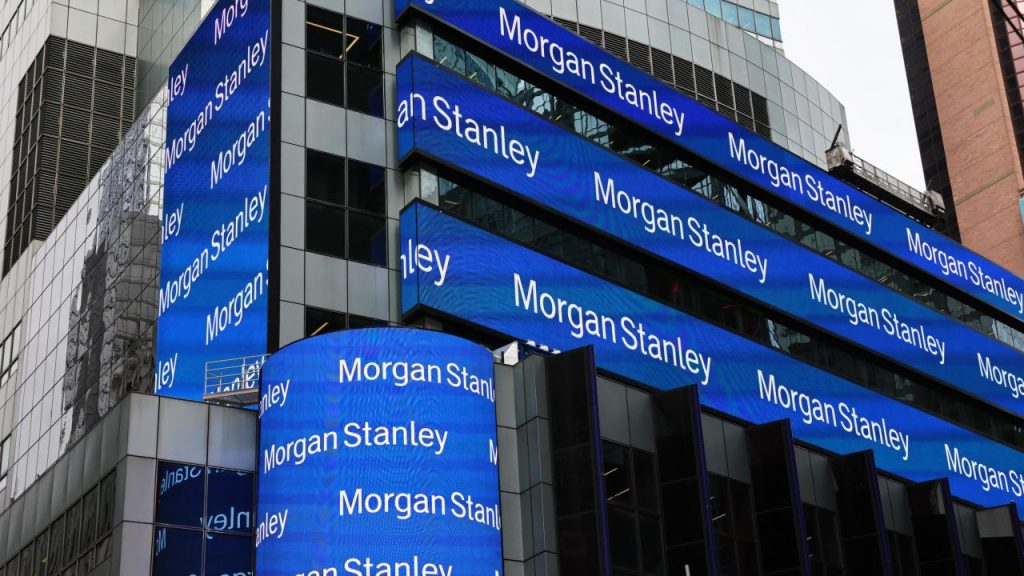
Artistic Components and Design Strategy:
- Color Choice: Predominantly blue; it aligns with intelligence and stability.
- Typography: A classic font with character spacing signifies professionalism and intellectual leadership.
Symbolic and Conceptual Meaning:
The enduring design embodies tradition harmonized with modernity, projecting unwavering growth and foresight.
Cultural and Economic Influence:
The brand image invokes trust, enhancing Morgan Stanley’s stature in a market swayed by tradition and innovation.
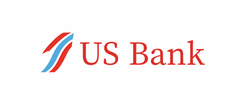
U.S. Bancorp
Historical Context and Background:
Emerging from regional roots, U.S. Bancorp reflects a journey defined by local engagement and strategic expansions.
Logo Design Evolution:
The logo uniquely blends patriotic symbols with modern design to emphasize its American identity and regional influence.
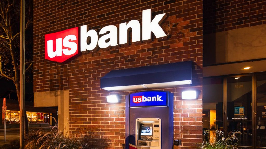
Visual Elements and Design Dynamics:
- Color Emphasis: Red and blue color usage ties into national heritage, typifying trust and growth.
- Imagery: Its shield shape is representative of security and strength.
- Typography: The bold font is a testament to assurance and robustness.
Symbolic Representation:
U.S. Bancorp’s logo symbolizes protection and trust, encapsulating its regional commitment and nationwide reach.
Cultural and Financial Impact:
Widely recognized as an emblem of reliability, the logo strengthens its community-based branding and customer loyalty.
Truist Financial Corporation
Background and Institutional History:
Truist emerged from a momentous merger between BB&T and SunTrust banks, completed in 2019, marking a new era in banking collaborations.
Development of the Logo:
Truist’s logo signifies union, reflecting its creation through merging legacies and aiming for a balanced future.
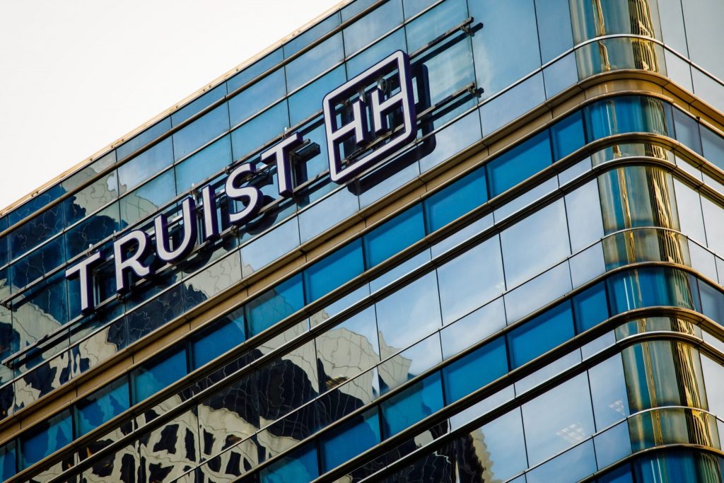
Design Foundation and Elemental Structure:
- Palette: Blue and purple highlight a merger of trust and innovation.
- Iconography: Interlocking ‘T’ and ‘U’ reflect fusion, created to symbolize unity and forward movement.
- Typography: The font choice is sleek, modern, and unifying.
Symbolic Insights:
The logo is both emblematic of new beginnings and harmonious collaboration, linking its dual heritage with a shared future.
Market and Societal Impact:
Innovative and striking, Truist’s logo heralds a unified brand identity, establishing cultural resonance and financial fortitude.
PNC Financial Services Group
History and Background:
With roots stretching back to 1845, PNC Financial represents a significant regional presence buttressed by innovative financial solutions.
Logo’s Historical Development:
The current logo manifests PNC’s community focus and innovation, a calculated balance mirrored in the design’s simplicity.
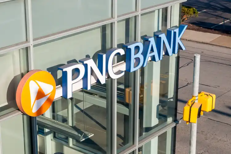
Design Elements and Philosophies:
- Color Palette: Orange imbues warmth and approachability, contrasted by cooler, stabilizing hues.
- Symbol: The triangular icon represents progress and unity, foundational elements of their brand ethos.
- Typography: A streamlined, contemporary font underscores directness and openness.
Symbolic Meaning and Representation:
PNC’s logo symbolizes energy and inclusivity, attuned to fostering community relationships and innovation.
Cultural and Business Impact:
By projecting warmth and trust, it enhances brand visibility across varied regions, fortifying market share and customer loyalty.
HSBC USA
Background and History:
An extension of the global HSBC network, HSBC USA embodies international banking sophistication and service excellence.
Origin and Evolution of the Logo:
The logo is universal yet distinctly recognizable, combining minimalist design with powerful symbolism to reflect heritage and modern ambitions.
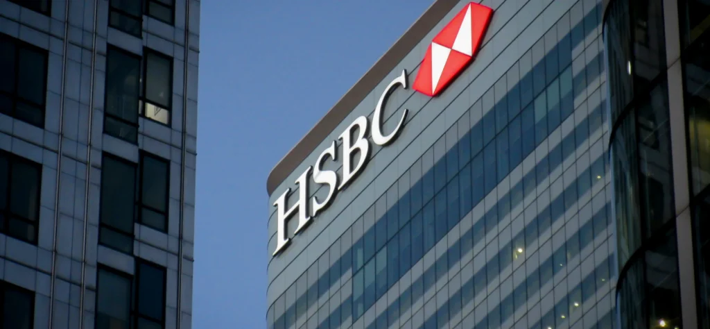
Design Concepts and Elemental Use:
- Color Dynamics: Red and white colors ensure visibility and invoke vitality.
- Symbolic Shape: Its hexagonal motif is a strong cross-cultural connector, representing balance and flexibility.
- Font Choice: A classic, simple font ensures readability and timeless appeal.
Symbolism and Interpretation:
The minimalist hexagon is emblematic of stability and global insight, crucial to HSBC’s worldwide brand consistency.
Cultural and Financial Resonance:
Governed by clarity and progression, the logo sustains global recognition, endorsing HSBC’s consistent service excellence.
Comparative Analysis
Common Design Elements Among Top Bank Logos
Certain shared elements, such as the color blue, indicate a common objective among banks to project trust and confidence. Geometric shapes and simplistic typography often convey a forward-thinking and stable image. These unifying elements reveal essential considerations in financial branding: ensuring clarity, unity, and recognition are maintained on a global stage.
Differences in Design Approach and Their Implications
Despite shared elements, each bank’s individual approach reveals nuanced differences that stem from their unique histories and strategic goals. While Wells Fargo and U.S. Bancorp emphasize regional roots through historical iconography, institutions like Citigroup and HSBC highlight their global reach using minimalist, modern designs geared towards international audiences.

Impact of Logo on Consumer Perception and Trust
The strategic use of elements like color, typography, and symbolism helps to cultivate consumer trust while enhancing brand recall. Consumers’ perceptions of reliability, innovation, and professionalism are influenced by logo design, which plays a critical role in a brand’s ability to connect with and retain its audience.
Future of Logo Design in the Banking Sector
Analysis of Upcoming Trends
Innovations in technology and evolving consumer expectations are likely to drive future logo trends. Increasingly digital lifestyles demand logos that perform well across screens and devices, necessitating design simplicity and adaptability. Banks may also explore more personalized branding opportunities, allowing for logos that engage customers on a deeper, more individualized level.

Role of AI in Evolving Brand Identities
AI platforms like AILogoCreator.io are poised to revolutionize logo design, offering capabilities for data-driven insights and creative flexibility at scale. Incorporating AI into design processes can lead to more dynamic and responsive logo designs that can adapt to changing consumer tastes and technological advancements.
AILogoCreator.io: Innovating Logo Design
Introduction to AILogoCreator.io
AILogoCreator.io is setting new standards in design, blending creativity with technology to assist brands in developing compelling visual identities. For banks, this includes designing logos that are not only visually appealing but also communicate trustworthiness and innovation.

Key Features Beneficial for Bank Logo Design
AILogoCreator.io offers features such as real-time customization, design element suggestions, and AI-driven analytics to predict market responses. This makes it particularly advantageous for financial institutions that require precision and creativity in their branding efforts.
Design Process with AILogoCreator.io
- Initial Input and Briefing: Users provide an outline of their brand’s vision and desired stylistic elements.
- Creative Exploration: The platform generates multiple design options based on input parameters, highlighting diverse stylistic possibilities.
- Customization and Refinement: Users can tweak fonts, colors, and additional elements, tailored to match the brand’s persona.
- Feedback Integration and Finalization: The platform uses an AI feedback loop to integrate market best practices and finalize the design, ready for download in various formats suitable for diverse media.
Final Thoughts on Logos as Financial Brand Ambassadors
Summary of Key Findings from the Logo Analysis
The logos of America’s largest banks reveal how design can encapsulate complex identities with elegance and efficacy. As visual ambassadors, these logos serve as touchpoints of brand values, heritage, and ambitions, meticulously crafted to resonate with both local and global audiences.
Implications for the Banking Industry and Future Trends
As markets evolve, banks must continue to innovate in branding, leveraging new technologies and design strategies to reinforce their identities. While embracing change, the enduring principles governing logo design—simplicity, memorability, and adaptability—are likely to remain pivotal.

The Power of Logos in Shaping Brand Identity
Ultimately, logos possess tremendous power in not only symbolizing but actively shaping brand identity. Through thoughtful design and strategic execution, logos become much more than mere visuals—they become integral components of a bank’s legacy and future success.
Questions and Answers
- What makes a bank logo effective?
An effective bank logo is distinguishable, evokes trust, and aligns seamlessly with the bank’s core values while being versatile and timeless. - How do cultural trends impact bank logos?
Cultural trends influence the evolution of bank logos by necessitating adaptations that resonate with contemporary values, technological progress, and market expectations. - How does AI enhance logo design?
AI facilitates more sophisticated and tailored logo design, offering data-driven insights and optimizing designs for modern demands, all while drastically reducing design time and costs.
CommentsTake the first comment