
I. About Porsche
A Brief Overview of Porsche’s Legacy
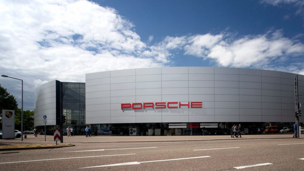
Porsche, headquartered in Stuttgart, Germany, stands as a paragon of automotive excellence and has cultivated an illustrious reputation over the years for producing top-tier sports cars known for their performance and design sophistication. Ferdinand Porsche initially founded the company in 1931 with the intention of offering vehicle development consultancy. Rapidly, Porsche evolved to create their own vehicles, notably launching the Porsche 356 in the late 1940s. This model set the benchmark for future designs, showcasing a harmony of lightweight construction, power, and superior mechanics—principles that continue to underpin Porsche’s design philosophy today.
One of the most significant contributors to Porsche’s legendary status is its commitment to continuous innovation—whether it’s in engine design, aerodynamics, or materials engineering. Porsche vehicles have always been at the forefront of utilizing cutting-edge technology, ensuring not only speed and performance but also safety and reliability. This constant drive for perfection has allowed Porsche to prosper and grow into the global powerhouse it is today, with a loyal customer base that appreciates the blend of luxury and high-performance vehicles.
Central to this brand identity is the Porsche logo, which reflects not just the company’s German origins but also its ongoing legacy of luxury and performance. The crest is not merely a brand symbol but a badge of status and sophistication around the globe. It has evolved alongside the company, maintaining its iconic elements while adapting to modern design needs, thus reinforcing Porsche’s brand as both a custodian of tradition and a leader in innovation.
The narrative of the Porsche logo is as compelling as that of the brand itself. It is a testament to Porsche’s philosophy—ensuring that the story of speed and elegance is communicated through its emblem across the decades. Understanding the story behind this logo is crucial to comprehending how it contributes to Porsche’s identity as a brand that embodies both prestige and technological prowess.
II. The Origins of Porsche
Founding of Porsche
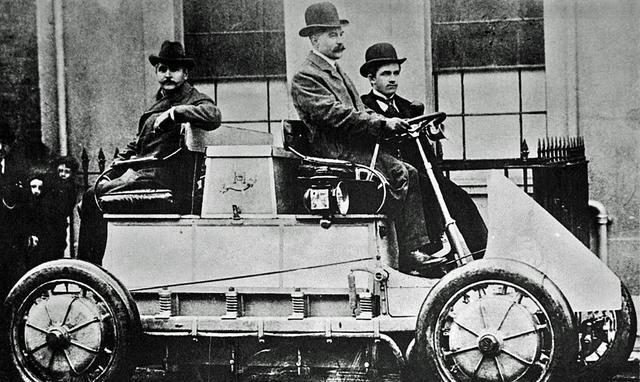
The genesis of Porsche as a car manufacturer can be traced back to 1931, when Ferdinand Porsche, a noted automotive engineer, decided to establish his own consultancy company, Dr. Ing. h.c. F. Porsche GmbH. Initially, the company focused on vehicle development work for other manufacturers. Ferdinand Porsche’s background included working for major automotive firms like Daimler-Benz and Steyr, where he contributed to several successful designs. His experience and vision laid the groundwork for the innovative solutions Porsche would later be known for.
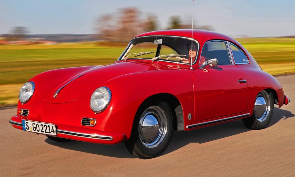
By the late 1940s, with the onset of post-war recovery, Porsche transitioned from merely providing development consultancy to manufacturing its own cars. August 1948 marked the debut of the Porsche 356, the company’s first production sports car, which incorporated numerous parts from Volkswagen due to resource constraints. This vehicle would set the standard for all Porsches that followed, emphasizing speed, performance, and innovative engineering—pillars that were pivotal in shaping the company’s early mission and vision: to produce sophisticated vehicles that would command respect and prestige in the automotive world.
Porsche’s founding vision capitalized on three main objectives: quality engineering, unique design, and high performance. This vision established Porsche’s reputation for excellence and laid the foundation for its expansion into various segments of the automotive industry, including the development of high-performance cars and motorsports. Such dedication to these principles has propelled the brand into becoming synonymous with luxury and high performance, positioning it among the top tiers of luxury automotive manufacturers.
Early Brand Identity
Creating a brand identity in its formative years presented Porsche with several challenges as it sought to establish a distinctive image in a burgeoning automotive industry. This was a time when the car market was fast-evolving with numerous competitors, making it imperative for Porsche to craft a unique identity that would set it apart. The essence of the Porsche brand was rooted in a commitment to exceptional craftsmanship, pioneering technology, and the creation of driving machines that were as pleasurable as they were technically advanced.
Porsche’s initial branding was heavily influenced by its cultural and geographic roots in Germany, a country recognized for its engineering prowess. This heritage was cleverly encapsulated within the company’s early branding efforts, drawing upon German engineering’s long-standing traditions of precision and reliability. These attributes were harmoniously reflected in the design and performance of the cars themselves—traits that were intuitively communicated to consumers endowing the Porsche brand with a reputation that transcended national borders.
Fundamentally, Porsche’s early brand identity revolved around a simple yet profound principle: constructing vehicles that delivered an unparalleled driving experience. This was achieved through meticulous attention to detail in areas such as aerodynamics, weight distribution, and power-to-weight ratio, which in conjunction facilitated the creation of vehicles that were not merely transportation means but emblems of sporting prowess and manufacturing excellence. This essence of performance and quality has endured over the decades, continually propelling Porsche to the zenith of automotive branding.
III. The Birth of the Porsche Logo
Initial Logo Design
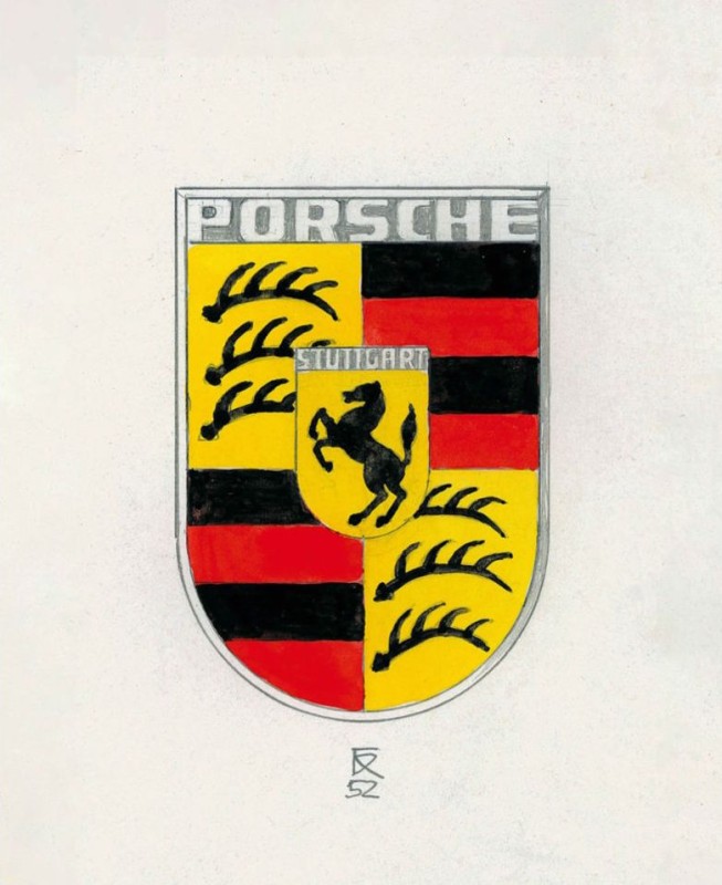
The Porsche logo as we recognize it today was conceptualized in the early 1950s and was officially introduced in 1952. It is often viewed as a visual embodiment of the brand’s identity—an identity steeped in automotive excellence and innovation. The creation of the logo brought together illustrious elements, infusing them with meaning that transcended mere aesthetics. This emblem was designed to represent the values and the geographic roots of the company, serving as a badge of honor that adorned every Porsche vehicle.
The initial design incorporated a central horse motif, inspired by the city of Stuttgart’s coat of arms. The horse symbolizes speed and dynamism, reflecting Porsche’s dedication to performance and precision engineering. Encircling the horse are the antlers, which are also an element of the crest of the Free State of Württemberg, highlighting the company’s connection to its Germanic origins. Completing the design are the alternating bars of black and red, which inject a sense of drama and boldness that align with Porsche’s creative ethos.
The coloring and design choices made in the formation of the Porsche logo were deliberate and meticulously planned. The bold reds and blacks in the logo exude power and seriousness, while the golden hue suggests opulence and prestige—qualities that Porsche cars inherently exhibit. This careful balance of visual elements ensured that the logo would serve not only as a brand marker but also as a symbol of the company’s quality and ambitions.
Collaborative Design Efforts
The creation of the Porsche logo was not an isolated endeavor but rather the result of collaborative efforts, combining the creative vision of various key figures within the company. Among them was Ferry Porsche, Ferdinand Porsche’s son, who played an instrumental role in steering the design direction that the logo would take. Collaborations with external designers and heraldic experts also contributed valuable insights which helped shape the initial design into an emblem that accurately resonated with the nascent brand’s values and aspirations.
Key considerations during the design process involved ensuring that the logo would stand the test of time, maintaining relevance across decades, and adapting to cultural and market changes without losing its essence. This was achieved by anchoring the logo’s design in historically significant symbolism and contemporary aesthetic principles that offered both durability and flexibility.
Several influences helped carve the pathway for the logo’s distinct design, not least of which was the desire to celebrate local heritage and imply an aspirational quality that would help Porsche appeal to international markets. Thus, the Porsche logo evolved as a rich tapestry of historical, cultural, and stylistic considerations—creating an iconic brand marker that continues to thrive as a cherished identifier of one of the most revered names in the automotive industry.
IV. Evolution of the Porsche Logo
Major Milestones in Logo Evolution
Over the years, the Porsche logo has witnessed several modifications, each tailored to enhance its appeal and maintain its relevance as the company expanded globally. These changes have reflected not only design trends and technological capabilities of the times but also pivotal moments in Porsche’s corporate history. Key milestones in this evolution have given the logo its distinctive identity, blending traditional elements with modern needs.
In 1952, an important change to the Porsche logo marked an important milestone in the evolution of Porsche’s brand image. In this year, Porsche’s logo began to use a combination of horses, antlers, and black and red bars. Specifically, this logo combines the symbols of the previous two periods – the heraldic shield and the horse shield. The designers tried to preserve the famous tradition and emphasize the historical roots, and they used the authentic coats of arms of the Free People’s State of Württemberg and Stuttgart to achieve this. This logo embeds one logo into another, placing the symbol with the horse in the center of an old coat of arms made up of four parts with six bifurcated horns and eight stripes. At the same time, the year’s logo appeared on the steering wheel of a Porsche for the first time, and from 1954 onwards on the front bonnet of every Porsche. The design not only reflects Porsche’s strong connection to the cultural and historical context of Stuttgart and Württemberg, but has also become an iconic feature of the Porsche brand.
In 1963, Porsche’s logo underwent significant changes, marking the brand’s shift towards modernization and a sense of luxury. Here are the key points of the changes to Porsche’s logo in 1963:
- Modernization of Design: In 1963, Porsche introduced a more modern version of its logo to match its increasingly modern vehicle models.
- Color Changes: Yellow was replaced with gold, giving the logo a more luxurious appearance. Additionally, gold lines were added between the black and red stripes, making the logo’s contours more distinct and sharply defined.
- Adjustment of Shield Shape: The bottom of the shield was narrowed, creating a more streamlined appearance, which enhanced the sense of speed.
- Sharpening the Bottom: To sharpen the bottom, the deer antlers were shortened, emphasizing the power and competitive spirit of the sports cars.
- Flattening the Central Coat of Arms: The central Stuttgart coat of arms was flattened, making more room for other elements.
- Optimization of the Horse Image: Designers made the black horse more elegant by adding flowing mane and separating some details with lines of different colors, highlighting the company’s dynamism and the agility of its cars.
- Change in Text Logo: In 1963, Porsche also designed an additional text logo, which could be used separately or placed beneath the ornate gold logo. The custom sans-serif font features all uppercase letters, with clean, smooth lines that are slightly extended and flat, appearing strong and confident.
These changes not only elevated the luxury and modernity of Porsche’s brand image but also corresponded with the launch of the iconic sports car, the Porsche 911, marking an important moment in the history of the Porsche brand.
- 1994: Improved printing technology enabled a fine-tuning of the logo, allowing for greater detail and definition. This change was crucial in a time where Porsche was reinforcing its branding in international markets. Here, the elements of the logo were further emphasized, ensuring every nuance in the design remained visible and recognizable.
In 2014, Porsche updated its logo, but the changes were relatively minor and subtle. This update is mainly to make the logo more visual in modern digital and print applications. Specific changes include:
- Some fine adjustments have been made to the details of the shield and the horse to make it clearer and more modern.
- A more modern font and typography are used to make the logo look more fashionable as a whole.
- The original design elements, such as the city name of Stuttgart and the traditional shield shape, have been retained, but the details have been improved.
These updates are designed to make the logo more recognizable and applied in a modern environment while maintaining the brand’s traditional and classic elements.
2014 – 2023
In 2023, Porsche has updated its iconic logo to celebrate its 75th anniversary. Here’s how the Porsche logo will change in 2023:
- Material and texture changes: The new logo is made of brushed metal, which makes the logo look more modern and high-end. The antler area changes from a grainy background to a brushed texture, and the red area changes to a honeycomb texture design.
- Color adjustments: The gold part has become more subtle, and the red stripes have also been adjusted to provide a more three-dimensional visual effect.
- Three-dimensional effect: The new logo design adds a three-dimensional effect to make the logo look more three-dimensional and dynamic.
- Font update: The “PORSCHE” letters use a new bold font that stands out more.
- Reinvention of the Prancing Horse in the center: The image of the Prancing Horse in the middle has been redesigned with the addition of the word “Stuttgart” in the Porsche font, which is the origin of Porsche.
- Red stripe design: The red stripe adopts a three-dimensional honeycomb structure, symbolizing the lightweight construction of a Porsche sports car.
- Debut of the new logo: The new logo is expected to debut on the new Porsche Panamera by the end of 2023 and gradually be rolled out to other models.
These changes aim to maintain the classic elements of the Porsche logo, while introducing a modern design that adapts to the changes in the electrification era and connects the brand’s history with its future.
2023 – now
Each transformation of the logo has served to strengthen the brand’s image and preserve its longstanding identity, ensuring that it remains a beacon of automotive prestige and innovation.
Iconic Design Elements
The enduring elements of the Porsche logo—the horse, the antlers, and the color scheme—serve as vibrant symbols of the brand’s heritage and values. The horse in the center is a powerful image drawn from the Stuttgart coat of arms. Symbolizing speed, strength, and agility, it underpins Porsche’s association with high performance and elite engineering.
The antlers reflect the crest of Württemberg, connecting the brand to its geographic origins in Germany and emphasizing values such as tradition and resilience. These heraldic symbols strike a balance between flair and steadiness—qualities that Porsche vehicles have embodied in their engineering and performance.
Equally significant are the logo’s colors. The combination of black, red, and gold is not just aesthetically pleasing but is representative of strength, luxury, and excellence—elements that define the Porsche brand narrative. This thoughtful selection of design cues ensures that the logo not only captures the brand’s present-day identity but also pays tribute to its illustrious past.
In summary, the Porsche logo is a complex tapestry of historical symbols, stylistic nuance, and modern aesthetic principles. Each iteration and design decision made along the way has been pivotal to the emblem’s ability to communicate Porsche’s brand ethos over decades and across generations.
V. Symbolism and Design Philosophy
Significance of the Logo’s Elements
The Porsche logo’s components are deeply rooted in symbolism, thoughtfully chosen to convey brand identity and upscale market position. The most prominent element, the horse, is derived from the Stuttgart coat of arms. It symbolizes strength, energy, and aspiration, resonant with the high-performance vehicles Porsche produces. Its association with Stuttgart, known as the ‘stud garden,’ reinforces the brand’s roots and standing within the automotive heart of Germany.
Moreover, the antlers intricated in the design represent the word ‘Württembergische,’ reflecting the region’s coat of arms, where Porsche has its origins. The emblem thus carries historical weight and illustrates Porsche’s acknowledgment of its heritage, showcasing respect and tribute to traditions that have stayed enduring within its corporate philosophy.
Furthermore, the logo’s checkered flag motif, visible in the striped patterns and implicit in its dynamic design, represents racing and competition—areas where Porsche has excelled throughout its existence. It highlights the brand’s commitment to innovation, speed, and continuously pushing the envelope in regards to automotive performance.
Philosophy of Design Simplicity and Elegance
Porsche has always epitomized the virtues of simplicity and elegance — whether it’s the design of their cars or the socio-cultural image they promote. This philosophy is illustrated through their logo, which skillfully balances minimalism with a sophisticated nod to intricate design. While the elements of the logo are deeply symbolic, they are also straightforward and visually appealing, underscoring a conscious decision to prioritize clarity and elegance over complexity.
This balance ensures that the logo is instantly recognizable, allowing it to wield the power of both brand recognition and emotional resonance among various audience segments globally. The clear, distinct elements resonate with both modern design principles and traditional craftsmanship philosophies, ensuring the logo is timeless, adaptable, and poised to evolve with Porsche’s innovative strides.
Simplicity here not only reflects aesthetics but also resonates with functional performance—echoing the Porsche vehicles themselves, which are renowned for their engineered simplicity alongside powerful capability. The logo thus becomes an emblematic expression of the brand’s commitment to delivering enduring design that captures the hearts and imaginations of vehicle enthusiasts worldwide.
VI. Modern Adaptations
Current Logo and Recent Modifications
In recent years, the Porsche logo has been adapted to meet the needs of a rapidly changing landscape in digital marketing and global branding. The latest iterations showcase a balance between maintaining the historical essence of the emblem while adapting it for digital clarity and contemporary aesthetics. This modern iteration has subtly refined the texture and depth of the logo, allowing it to stand out in digital interfaces without losing the characteristic elements that connect it to the brand’s prestigious history.
Changes made for the digital age primarily involve color enhancements and textural refinements, allowing the logo to remain vibrant and distinguishable on platforms where digital visibility and branding strategies are crucial. These adaptions ensure that the Porsche logo remains relevant and impactful, resonating with younger demographics while staying true to the heritage that long-time Porsche enthusiasts hold dear.
Adaptation to Digital and Global Markets
The adaptation for digital environments also addresses the growing need for logos to be versatile across a multiplicity of channels and devices. As marketing strategies increasingly leverage online platforms, Porsche has optimized its logo for the digital age, ensuring clarity and uniformity across platforms like social media, websites, and digital advertising campaigns.
Globally, the Porsche logo serves as a cultural bridge. While retaining core powerful elements from its historical lineage, the logo adapts effortlessly to different cultural contexts and market representatives around the world, thereby advancing Porsche’s brand visibility and resonance internationally. This enhances Porsche’s ability to maintain a standardized brand identity while catering to diverse market requirements and consumer expectations around the globe.
By future-proofing its logo design, Porsche ensures that its commitment to excellence is visible everywhere, from showrooms to digital screens. This consistently reinforces brand perception and consumer association with the quality and luxury that Porsche continues to embody, regardless of the market, ensuring the brand remains a formidable force in an ever-evolving global industry.
VII. Designing a Logo with AI: AILogoCreator.io Case Study
Introduction to AILogoCreator
In today’s technologically advanced world, AI tools are redefining the landscape of design, offering innovative solutions that streamline the creative process. AILogoCreator represents a cutting-edge tool that uses generative artificial intelligence to craft logos and brand identities. Its capabilities cater to both startups requiring rapid branding solutions and established businesses seeking to refresh their visual identity.

The advantages of using AI in design processes are multifaceted. AI tools offer unparalleled speed, transforming what was once a time-intensive task into a quick, efficient process that can produce professional-grade logos in mere minutes. Moreover, the ease of customization means that users can create tailored designs without needing in-depth design expertise, democratizing access to quality logo creation.
Designing a Porsche-Inspired Logo with AILogoCreator
Creating a Porsche-inspired logo using AILogoCreator involves a systematic approach that encompasses several easy but impactful steps, drawing inspiration from the precision and elegance typified by Porsche’s design ethos. Here’s a step-by-step breakdown:
- Text to Logo: Begin by entering your company name and a catchy slogan that captures your brand’s essence.
- Style and Color Selection: Opt for styles and colors that channel Porsche’s elegance and heritage. Vibrant yet sophisticated color palettes akin to the Porsche brand can enhance the visual footprint of the logo.
- Customization: Utilize the tool’s customization options to adjust fonts and icons. Incorporating elements that reflect sleekness and speed, such as metallic tones or streamlined symbols, can evoke a Porsche-like aesthetic.
- Preview and Fine-Tune: Review the draft logo, making any necessary tweaks. Ensure the iconography and text complement each other to produce a cohesive and impressive design.
- Download: Once the design is finalized, download the logo in various formats, providing the flexibility needed for different applications, from digital to print media.
Benefits of Using AI for Logo Design
The advantages of employing AI tools like AILogoCreator are numerous. Efficiency is drastically improved, with users achieving professional designs swiftly without sacrificing quality. This speed is beneficial for businesses that require instantaneous brand identity development and deployment.
Customization capabilities with AI also mean that users can make complex adjustments easily, giving them the creative freedom to produce logos that truly represent their unique brands. Moreover, the accessibility of such tools implies that even individuals with minimal design experience can craft premium logos that stand on par with those created by seasoned designers.
Overall, AI logo design tools present a future-facing solution that is poised to redefine how brands approach their visual identity and supporting businesses in staying agile and innovative in a competitive marketplace.
VIII. The Timeless Appeal of the Porsche Logo
Enduring Legacy and Market Presence
The Porsche logo has successfully stood the test of time and continues to be a significant component of the brand’s identity and market presence. Serving as both a distinctive visual signature and a promise of quality, the logo remains an enduring symbol of luxury, prestige, and state-of-the-art engineering. Its appeal transcends mere visual recognition and delves into the realm of emotional connection with consumers.
Consumers and enthusiasts alike associate the Porsche logo with the brand’s commitment to engineering excellence. This association has fostered a strong base of loyal customers who are drawn not only to the vehicles themselves but also to the heritage and stories behind the brand. Each Porsche vehicle that bears the emblem carries with it a piece of the brand’s history, a testament to its renowned legacy in the automotive industry.
As one of Porsche’s most powerful branding tools, the logo facilitates consistent communication of brand values and maintains its market presence by meeting the expectations of a discerning clientele. The continued refinement and relevance of the Porsche logo ensure that it remains a powerful and resonant emblem that conveys trust and performance in both existing and emerging markets.
Cultural and Consumer Impact
Culturally, the Porsche logo has transcended its role as a corporate emblem to become a cultural icon recognized across the world. It stands as a non-verbal manifestation of the brand’s influence in automotive performance, innovation, and luxury. Through decades of motorsport triumphs and engineering accolades, the emblem has come to symbolize aspirational living and the pursuit of excellence.
Impact on consumer perception is equally profound. The emblem is often equated with success, prosperity, and high status, enhancing the desirability not just of Porsche vehicles but of a lifestyle that reflects sophistication and affluence. In visual culture, from fashion to pop culture, the Porsche logo effortlessly encapsulates a statement of quality and premium craftsmanship that resonates with those who seek the extraordinary.
The logo’s impact is further evident in how numerous brands within and beyond the automotive industry strive to emulate its iconic status. As a benchmark of design excellence and brand consistency, the Porsche logo serves as an inspirational reference for companies aiming to achieve similar levels of lasting recognition and consumer loyalty.
IX. FAQs About the Porsche Logo
What elements make the Porsche logo distinctive?
- The logo’s uniqueness is marked by its synthesis of the Stuttgart horse, Württemberg’s antlers, and a striking color palette. These elements collectively encapsulate Porsche’s commitment to heritage and performance, providing a visual cue to its roots and aspirations.
How often has the Porsche logo changed?
- The Porsche logo has witnessed evolution over time, notably undergoing refinements in 1952, 1963, 1973, 1994, and 2008. While the core elements have remained unchanged, these iterations have modernized the emblem to meet contemporary design standards.
What does the horse in the Porsche logo symbolize?
- The central horse derives from the Stuttgart coat of arms, representing power, agility, and a nod to Porsche’s birthplace. This ties the brand to its German heritage and emphasizes its commitment to performance excellence.
- Why is the Porsche logo important in branding?
- The logo is essential as it conveys Porsche’s core principles of innovation, elegance, and superior engineering. It enhances brand recognition globally and signifies a promise of quality and luxury, deeply resonating with consumer expectations.
How does Porsche maintain its brand identity through logo changes?
- Through careful evolution, Porsche’s logo changes preserve fundamental elements tied to its heritage while incorporating contemporary design techniques. This balance ensures that each iteration reflects Porsche’s enduring values while addressing modern branding needs.
What is the Porsche logo’s history?
- Introduced in 1952, the Porsche logo stems from heraldic symbols representing Stuttgart and Württemberg. Over decades, it has become a visual and cultural icon synonymous with premium automotive excellence.
How many times has the Porsche logo changed?
- The logo has undergone noticeable updates five times (1952, 1963, 1973, 1994, and 2008), each innovation designed to meet emerging trends while retaining the logo’s core symbolic essence.
What does the Porsche logo represent?
- Beyond its visual appeal, the Porsche logo represents a blend of tradition, luxury, and cutting-edge technology. It encapsulates a commitment to constant innovation and prestige within the automotive arena.
How has the Porsche logo influenced other automotive logos?
- The Porsche logo has been a benchmark for brand identity in automotive design. Its compelling combination of tradition, elegance, and performance has inspired other brands striving to cultivate their own powerful identities and consumer loyalty.
With an intricate interplay between historical reverence and contemporary relevance, the Porsche logo stands as an emphatic testament to the brand’s illustrious legacy and future-directed innovation. This exploration into the logo’s evolution illustrates how Porsche continues to reinforce its position as a leader in both performance and luxury.
CommentsTake the first comment