
Minimalist logo design is not just a trend—it’s a strategic approach to cut through visual clutter and embed brand recognition deeply in audiences’ minds. Below, we’ll dissect 9 standout cases, decode their design philosophies, and extract actionable tips—plus explore how AI tools like AILogoCreator make minimalist branding accessible to all.
Core Design Principles of Minimalist Logos
Before diving into cases, let’s anchor on the pillars that define successful minimalist logos. These principles ensure “simplicity” doesn’t become “empty”—but rather, a carrier of brand essence.
Simple in Form, Rich in Meaning: Carry Maximum Brand Message with Minimum Elements
- Symbolic Reduction: Strip a logo to its most iconic element.
- Letterform as Icon: Turn brand initials into visual symbols.
- Conceptual Clarity: Every shape must tie to the brand’s core.
Visual Hierarchy: Minimalism is Not Monotony, But Ordered Focus Guidance
- Negative Space Mastery: Use empty space to enhance readability and meaning.
- Line Weight & Rhythm: Consistent line thickness or deliberate variation creates rhythm.
- Color Restraint: Most minimalist logos rely on 1-2 colors (often black/white) to avoid distraction.
In-Depth Analysis of 9 Minimalist Logo Cases
These cases span industries from design studios to tech brands, each demonstrating how minimalist design amplifies brand personality. Let’s break down “what they look like” and, more importantly, “why they work”.
melvinlidesign – Handwritten Minimalism for Personal Branding
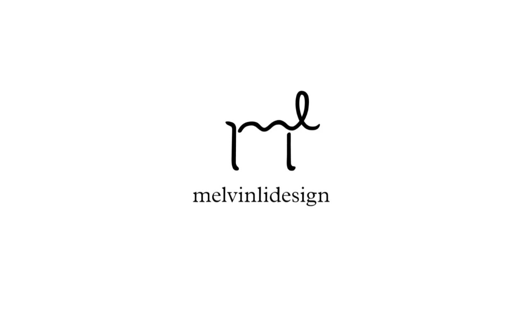
- Brand Context: A personal design studio focused on “creative intimacy” and custom solutions. The logo needs to feel approachable yet professional.
- Design Elements: Fluid script merging “m” and “l” into a single mark, paired with clean sans-serif typography for the brand name.
- Philosophy Breakdown: The handwritten style conveys “human touch” and creativity, while the minimalist structure ensures scalability (works on business cards, websites, and social media avatars).
- Applicability: Perfect for freelancers, personal studios, or creative consultants. It balances personality and professionalism, making the brand feel “custom-made”.
materialoop – Single-Line Narrative of Circularity
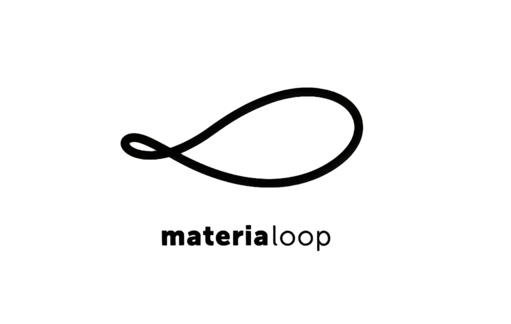
- Brand Context: A brand focused on sustainable material cycles (e.g., recycling, upcycling). The logo must communicate “loop” and “sustainability” instantly.
- Design Elements: A single continuous line forming a loop, evoking both a fish (hinting at eco-friendliness) and an infinite symbol (representing circularity).
- Philosophy Breakdown: The minimalist line eliminates distractions, forcing viewers to focus on “cycle” and “flow”—core to the brand’s mission. The black-and-white palette reinforces modernity and clarity.
- Applicability: Ideal for eco-brands, recycling initiatives, or sustainable product lines. It works across packaging, digital platforms, and educational materials, making “circularity” visual and memorable.
fuji – Fusion of Geometric Letters, Heritage, and Modernity
- Brand Context: A brand with roots in Japanese culture (est. 1952) looking to balance tradition and modernity. The logo needs to feel “timeless” yet “contemporary”.
- Design Elements: Geometrically styled letters “f” and “u” form a shape reminiscent of Mount Fuji, paired with “since 1952” to highlight heritage.
- Philosophy Breakdown: The minimalist geometric forms convey modernity, while the Mount Fuji reference and “1952” anchor the brand in tradition. This duality makes it appealing to both heritage lovers and modern consumers.
- Applicability: Perfect for Japanese-inspired brands (e.g., lifestyle, home goods, or fashion) aiming for a “timeless modern” aesthetic. It works on product labels, storefronts, and digital campaigns, bridging past and present.
sinus – Tech Narrative with Waveform Lettering
- Brand Context: A brand in the audio, tech, or data sector (e.g., sound engineering, analytics). The logo must communicate “precision” and “waveform” (a core concept in these fields).
- Design Elements: The letter “n” in “sinus” is transformed into a sine wave, a fundamental waveform in math and science. The rest of the letters remain clean and sans-serif.
- Philosophy Breakdown: The minimalist modification of a single letter ties the logo directly to the brand’s technical focus, while the overall simplicity ensures it doesn’t feel overly complex. It’s “techy” without being alienating.
- Applicability: Ideal for tech startups, audio brands, or data analytics firms. It works on software interfaces, business cards, and marketing materials, signaling “technical expertise” with subtlety.
MON PETIT – Approachable Narrative with Handwritten Minimalism
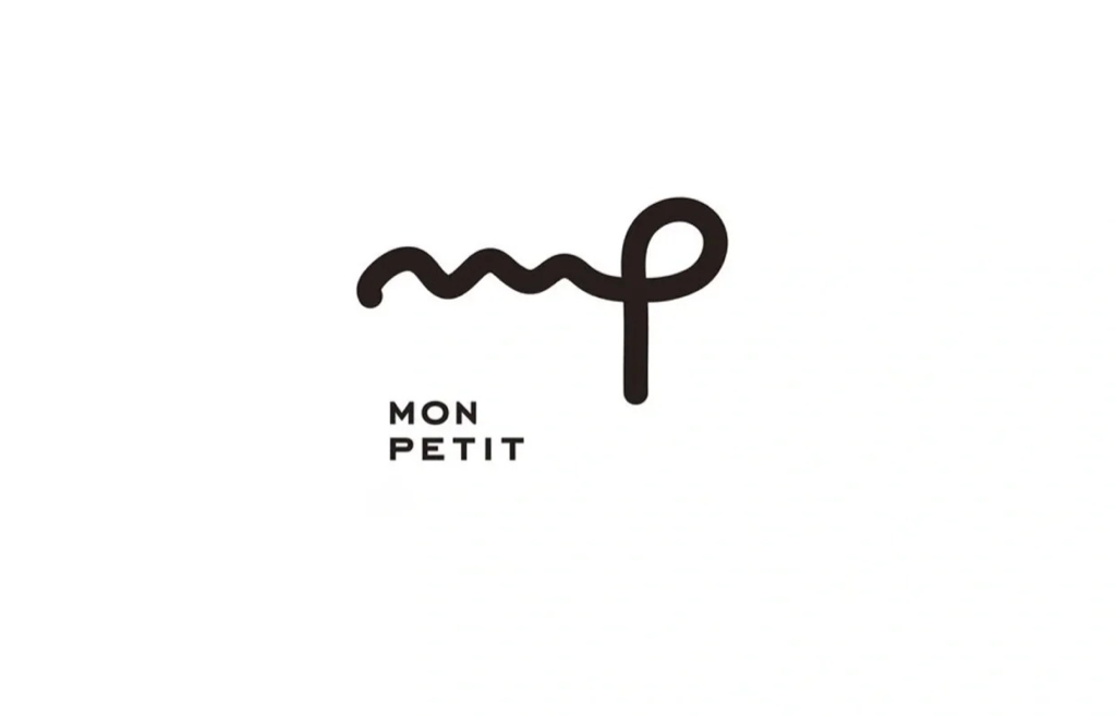
- Brand Context: A brand targeting “personal, intimate” markets (e.g., pet care, luxury accessories, or boutique services). The logo needs to feel “warm” and “exclusive”.
- Design Elements: A fluid, hand-drawn merge of “m” and “p”, paired with bold sans-serif typography for “MON PETIT” (French for “my little one”).
- Philosophy Breakdown: The handwritten style adds warmth and personality, while the minimalist structure keeps it modern and scalable. The French phrase hints at luxury or intimacy, making the brand feel “curated”.
- Applicability: Perfect for pet brands, luxury boutiques, or personal services (e.g., private coaching). It works on product packaging, social media, and store signage, creating an “exclusive yet friendly” vibe.
SEEKER – Exploration Narrative with Geometric Letters
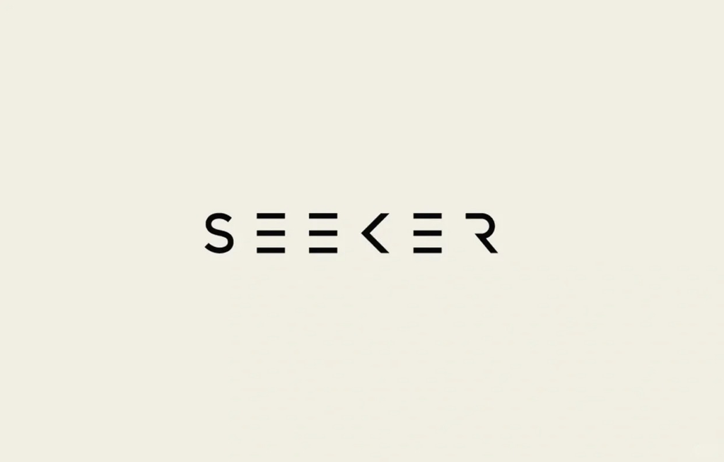
- Brand Context: A brand focused on “discovery” (e.g., tech startups, adventure companies, or consulting firms). The logo must communicate “direction” and “curiosity”.
- Design Elements: The letters “E” are transformed into horizontal lines (suggesting “vision” or “layers”), and “K” into an arrow (hinting at “direction”). The overall typography is bold and geometric.
- Philosophy Breakdown: Each letter modification serves a conceptual purpose—“E”s for insight, “K” for direction—while the minimalist geometry keeps the logo bold and memorable. It’s “explorative” without being overly literal.
- Applicability: Ideal for tech innovators, adventure brands, or strategy consultancies. It works on websites, marketing collateral, and merchandise, signaling “forward-thinking” and “purpose”.
MUKU – Grid Minimalism with Japanese Aesthetics
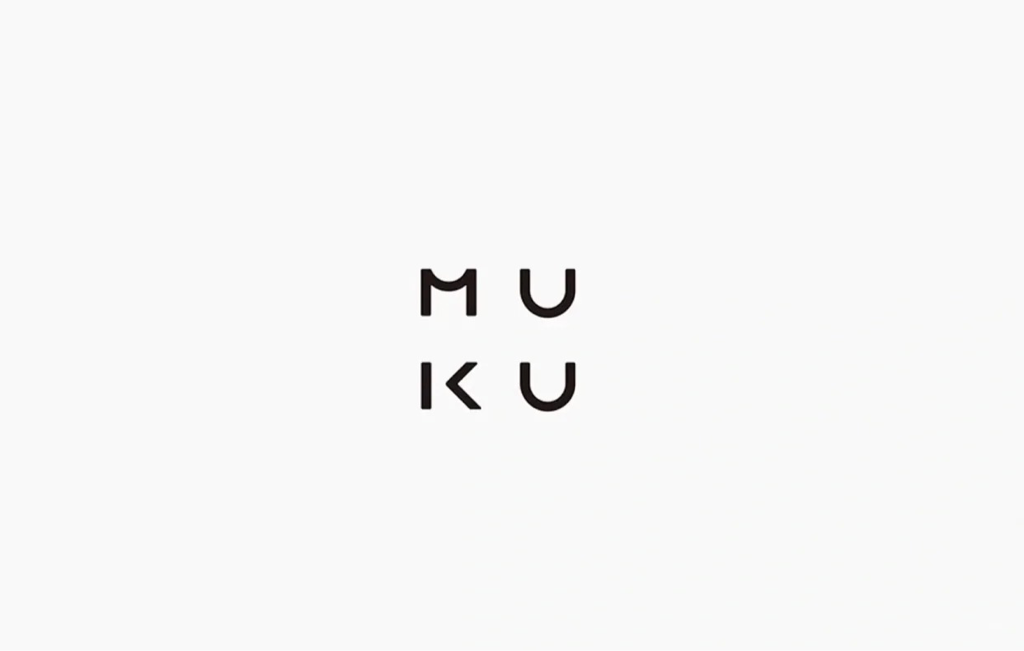
- Brand Context: A brand rooted in Japanese minimalism (e.g., lifestyle, design, or home goods). The logo needs to feel “serene” and “balanced”.
- Design Elements: The letters “M”, “U”, “K”, “U” are arranged in a 2×2 grid, with each letter designed using clean geometric shapes.
- Philosophy Breakdown: The grid layout and geometric letters embody Japanese design principles of “balance” and “negative space”. It’s minimalist to the core, yet each letter is distinct enough to be readable.
- Applicability: Perfect for Japanese-inspired lifestyle brands, design studios, or minimalist home goods. It works on product packaging, websites, and print materials, conveying “calm” and “intentionality”.
MOOD – Emotional Narrative with Typographic Distortion
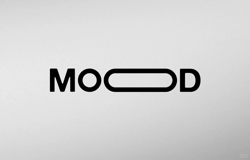
- Brand Context: A brand focused on “atmosphere” or “emotion” (e.g., fashion, beauty, or digital content). The logo must communicate “vibe” and “personality”.
- Design Elements: The word “MOOD” with the two “O”s merged into a single elongated oval, creating a sense of flow and continuity.
- Philosophy Breakdown: The minimalist typographic tweak turns a common word into a unique visual symbol. The elongated “O” suggests “movement” and “variation”—core to how “mood” feels.
- Applicability: Ideal for fashion labels, beauty brands, or digital platforms (e.g., mood boards, playlists). It works on social media, packaging, and digital interfaces, making “vibe” visual and shareable.
41 for only one – Exclusive Narrative with Geometric Numbers
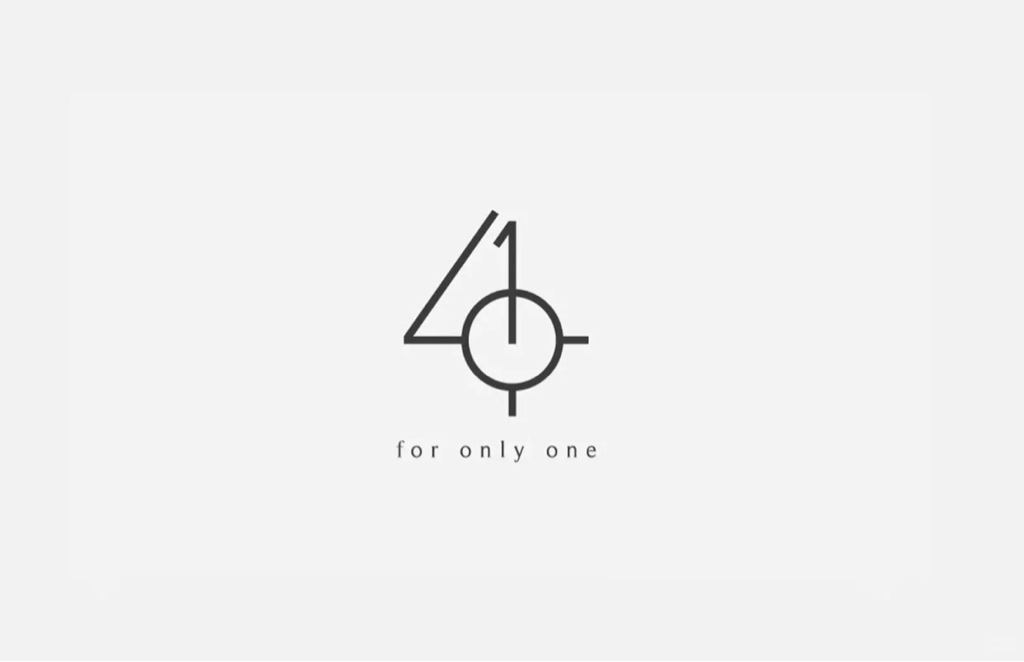
- Brand Context: A brand offering “exclusive, one-of-a-kind” products or services (e.g., custom jewelry, luxury tailoring, or private memberships). The logo must communicate “uniqueness” and “exclusivity”.
- Design Elements: The numbers “4” and “1” are merged into a geometric shape resembling a compass or target, paired with the tagline “for only one”.
- Philosophy Breakdown: The minimalist geometric merge of numbers creates a symbol of “precision” and “uniqueness”. The compass/target imagery reinforces “being the only one” and “customization”.
- Applicability: Perfect for high-end custom brands, exclusive clubs, or luxury services. It works on membership cards, product packaging, and marketing materials, conveying “luxury” and “individuality”.
Practical Tips and Tool Recommendations for Minimalist Logo Design
Now that we’ve dissected 9 cases, let’s distill actionable tips and explore how tools like AILogoCreator can simplify creating minimalist logos—even for non-designers.
Three Practical Tips: Create Minimalist Logos That Are “Simple Yet Extraordinary”
- Focus on One Core Concept: Resist the urge to cram multiple ideas. Pick one core brand trait (e.g., “circularity” for materialoop, “exclusivity” for 41 for only one) and build the logo around it.
- Leverage Negative Space: Use empty space to add hidden meaning. “MOOD” uses negative space in the elongated “O” to suggest “flow”; “SEEKER” uses it to make the arrow “K” feel dynamic.
- Test Scalability: A minimalist logo must look good at any size—from a tiny social media avatar to a large billboard. Ensure lines are bold enough and shapes are distinct even when scaled down.
AILogoCreator: A Minimalist Logo Tool for Non-Designers
- How It Works: Enter your brand name, select “minimalist” as a style, and the AI generates dozens of options in 60 seconds. You can customize shapes, fonts, and colors to match your brand’s core concept.
- Why It’s Useful: It offers minimalist templates optimized for different industries (e.g., tech, lifestyle, luxury). You don’t need design skills—just tweak the generated logos to emphasize “simplicity with purpose”.
- File Formats: Download high-quality files (PNG, SVG, PDF) that work for all applications. The AI ensures each logo is scalable and uses negative space effectively, so your minimalist design looks polished.
The Timeless Value of Minimalist Logos
In a world of visual overload, minimalist logos stand out by doing less—yet saying more. They cut through noise, embed brand recognition, and age gracefully (unlike trendy, complex designs). Whether you’re a startup founder, a freelancer, or a brand manager, the lessons from these 9 cases are clear: focus on your core message, strip away distractions, and let simplicity be your strongest visual asset. And with tools like AILogoCreator, creating a minimalist logo that’s both strategic and beautiful has never been more accessible.
FAQ
Q1: What are the core principles of minimalist logo design, and how to implement them in practical design?
Answer: The core principles are “simple in form but rich in meaning” and “clear visual hierarchy.” Implementation can be approached from two aspects:
- Focus on one core concept: Convey the brand’s core message with minimal elements. For example, “materialoop” uses a single looping line to express “sustainable circulation,” and “sinus” transforms the letter “n” into a sine wave to reflect its tech attributes—avoid overloading with unnecessary symbols.
- Make good use of visual hierarchy: Enhance recognition through negative space and line rhythm. For instance, “MOOD” merges two “O”s into an oval, using negative space to convey “emotional flow”; most minimalist logos use only 1-2 colors (such as the solid black in “fuji”) and consistent line thickness to keep the visual effect uncluttered.
Q2: How can non-design professionals quickly create industry-specific minimalist logos using AILogoCreator?
Answer: No design skills are required—you can complete the process in 3 steps:
- Input clear requirements: Enter your brand name, slogan, and select your industry (e.g., environmental protection, technology, Japanese lifestyle). The tool will recommend minimalist design directions based on industry characteristics.
- Customize style and elements: Choose your preferred type (handwritten minimalism, geometric minimalism, etc.) from the “minimalist style template library.” Further adjust the font (e.g., the handwritten font of “melvinlidesign,” the bold geometric font of “SEEKER”), line details, and color scheme (focus on 1-2 colors).
- Confirm and download: Preview how the logo looks in different scenarios (business cards, webpages, packaging). The tool automatically optimizes scalability, and you can finally download commercial formats like SVG/PNG. The entire process takes only around 1 minute.
Q3: What are the differences in element selection for minimalist logo design across industries such as environmental protection, technology, and Japanese lifestyle?
Answer: Element selection should align with the core attributes of the industry. The specific differences are as follows:
- Environmental protection industry: Emphasize “circulation” and “nature” symbols. For example, “materialoop” uses a single looping line to represent “material recycling.” Low-saturation colors like green or earth tones are preferred, and complex patterns are avoided.
- Technology industry: Favor “geometric” and “precision” elements. Examples include the waveform letter of “sinus” and the arrow-shaped “K” of “SEEKER.” Calm colors like black, white, or silver-gray are commonly used, with lines mostly being straight or regular curves.
- Japanese lifestyle industry: Highlight “balance” and “negative space.” For instance, “MUKU” adopts a 2×2 geometric grid layout for letters, and “fuji” features a geometric Mount Fuji shape. Restrained color schemes (e.g., off-white, light gray) are used to emphasize the “serene minimalism” aesthetic.
Q4: How to ensure that minimalist logos remain clearly recognizable across different sizes (e.g., social media avatars, large billboards)?
Answer: The key lies in “avoiding risks during initial design” and “verifying through later testing”:
- Optimize details during design: Prioritize thick lines and simple geometric shapes (such as the merged geometric number shape of “41 for only one”). Avoid overly thin lines or complex small elements—overly thin lines tend to blur when scaled down, and small elements may be lost in avatar-sized displays.
- Test scalability: Scale the logo down to 20x20px (to simulate avatars) and up to 1000x1000px (to simulate billboards). Check if core symbols (e.g., the looping line of “materialoop,” the oval of “MOOD”) remain recognizable.
- Leverage tool advantages: Minimalist logos generated by AILogoCreator are automatically optimized for line thickness and proportion. The downloaded SVG vector format supports infinite scaling, eliminating concerns about distortion.
Q5: Do minimalist logos generated by AILogoCreator have complete commercial copyright, and what commercial scenarios can they be used for?
Answer: Users can obtain complete commercial copyright, and the logos are suitable for a wide range of scenarios:
- Copyright rights: Users hold full ownership and royalty-free usage rights for minimalist logos generated by the tool. No additional copyright fees are required, and the logos can be used in profit-driven scenarios such as commercial promotions and product sales.
- Applicable scenarios: They cover all commercial needs, including online (social media avatars, official website logos, e-commerce platform logos) and offline (product packaging, store signs, business cards, brochures). For example, personal studios can use handwritten minimalist logos (in the style of “melvinlidesign”) for business cards, and eco-brands can use circular minimalist logos (in the style of “materialoop”) for packaging.
CommentsTake the first comment