
Starbucks, a behemoth in the coffee industry, is synonymous with quality and ubiquity. From its humble beginnings as a single store in Seattle to becoming a global cultural icon, the brand has consistently leveraged its logo to maintain a powerful, coherent brand identity. The Starbucks logo is not simply a mark of ownership but a visual representation of a journey and an experience. It tells the story of a brand that understands the value of evolution while maintaining its core identity. Today we take a deep dive into Starbucks’ journey of change, looking at its brand narrative, consumer perception, and global expansion through the evolution of its logo.
The Origin of the Starbucks Logo
Historical Background of Starbucks
Starbucks was founded in 1971 by three partners—English teacher Jerry Baldwin, history teacher Zev Siegl, and writer Gordon Bowker—united by their love for coffee and tea. The business started in Seattle’s Pike Place Market, where they sold high-quality coffee beans and equipment. Unlike today’s experience-focused cafes, the original Starbucks was a retailer and roaster of whole bean and ground coffee, tea, and spices.
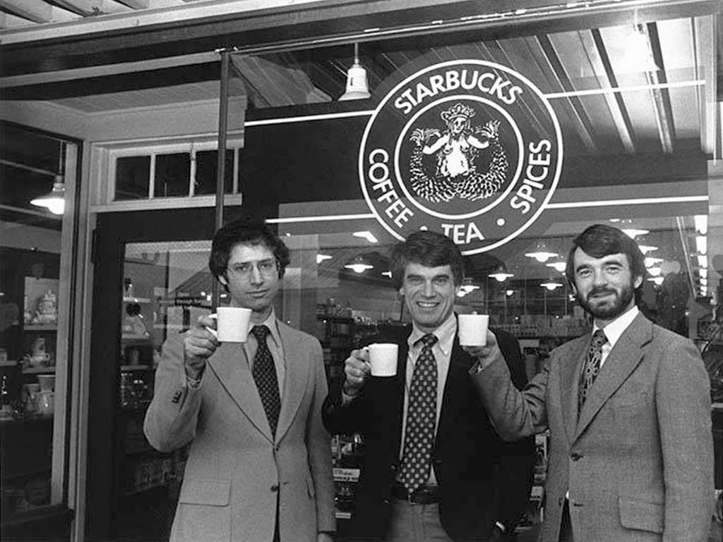
The founders were deeply influenced by entrepreneur Alfred Peet, who had begun importing fine Arabica coffees into the United States during the 1950s. Starbucks’ original intent was to share the knowledge and appreciation for the nuanced flavors of coffee and tea, creating an informed community around their products.
Initial Logo Design
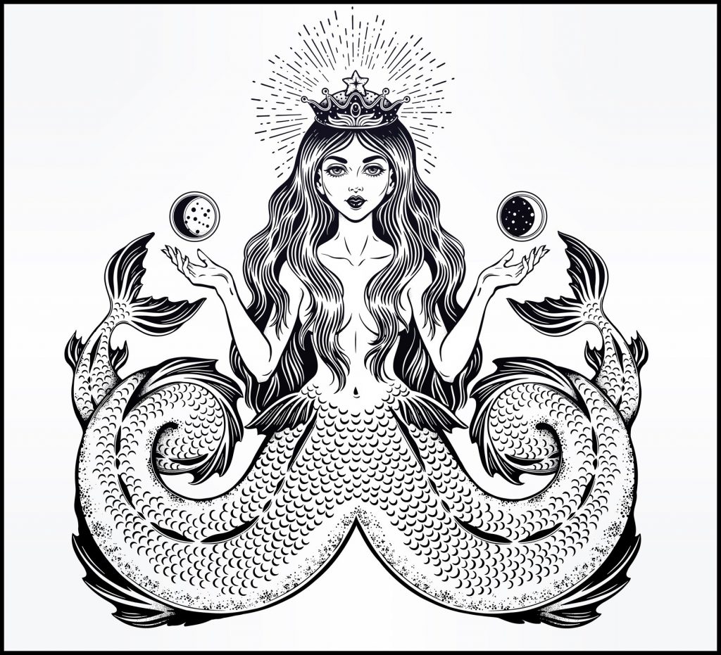
The original Starbucks logo played a crucial role in conveying the brand’s rich heritage and innovative spirits. Bowker was inspired by the sea, and he scoured library books until he found the siren, a twin-tailed mermaid, in a 16th-century Norse woodcut. This mythical creature was perfect for engaging consumers’ imaginations, representing the company’s maritime roots and their aim to offer alluringly rich flavors.
Inspiration Behind the Original Siren Logo
The siren wasn’t just a whimsical choice; it symbolized allure and mystery—a perfect metaphor for Starbucks’ offerings. Starbucks aimed to create an enchanting experience for consumers, enticing them into a realm of rich flavors and aromas. This idea of allure was central to Starbucks, positioning their brand as the gateway to an enthralling coffee experience.
The Significance of the Mermaid/Siren Iconography
The concept of a mermaid, or siren, is steeped in mythology, often portrayed as a beautiful creature whose singing lured sailors to shipwreck. For Starbucks, this symbol encapsulated the enticing aroma and taste of their coffee, suggesting that once you’ve had a taste, you’ll be drawn back for more—a powerful brand assertion.
Explanation of the Original Logo’s Color Scheme and Design Elements
The original logo was designed in a deep brown color, representing the natural roasted coffee beans and the earthiness of coffee. The twin-tailed siren in the center was surrounded by text, stating “Starbucks Coffee, Tea, and Spices,” which conveyed the wide range of high-quality products Starbucks offered. This early logo laid the foundation for an adventurous brand image, inviting consumers to experience novel flavors.
Evolution of the Starbucks Logo
First Major Redesign: 1987
1987 marked a pivotal change for Starbucks as it transitioned from a coffee bean roaster and retailer into an espresso bar model. This transformation necessitated a logo redesign that would not only reflect the brand’s expanded vision but also appeal to a broader audience.
1971 – 1987
Transition from Brown to Green: Significance of Color Change
One of the most striking changes in the logo redesign was the shift from brown to green. Green is often associated with growth, health, and freshness—themes that aligned well with Starbucks’ expanding footprint and sustainability goals. This color change symbolized a new era for Starbucks, marking its entry into the café culture and signaling a refreshing and inviting customer experience.
Modifications to the Siren’s Appearance and Details
The redesign also saw significant changes in the siren’s presentation. She was refined and cleaned up, with simplified design elements that would allow the logo to scale easily and maintain clarity across different sizes and mediums. The siren was given a softer, more approachable look, highlighting a friendly, customer-focused brand identity.
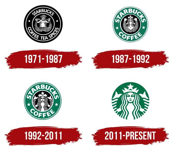
1987 – 1992
Subsequent Changes: 1992, 2008, 2011
Starbucks has continued to fine-tune its logo to maintain relevance and resonance with its audience without losing the iconic elements that make it instantly recognizable.
Tweaks and Adjustments for Modern Appeal and Minimalism
In 1992, further modifications were made as Starbucks prepared for its initial public offering. The siren’s image was brought closer, focusing on her face, which added to the modern, minimalistic appeal of the logo. This change ensured the logo’s adaptability across new markets and platforms, aligning with the evolving aesthetics of the 1990s. This minimalist approach reduced clutter, placing a spotlight on the siren and enhancing the brand’s sophisticated image.
1992 – 2011
Emphasis on the Brand Identity and Cultural Adaptation
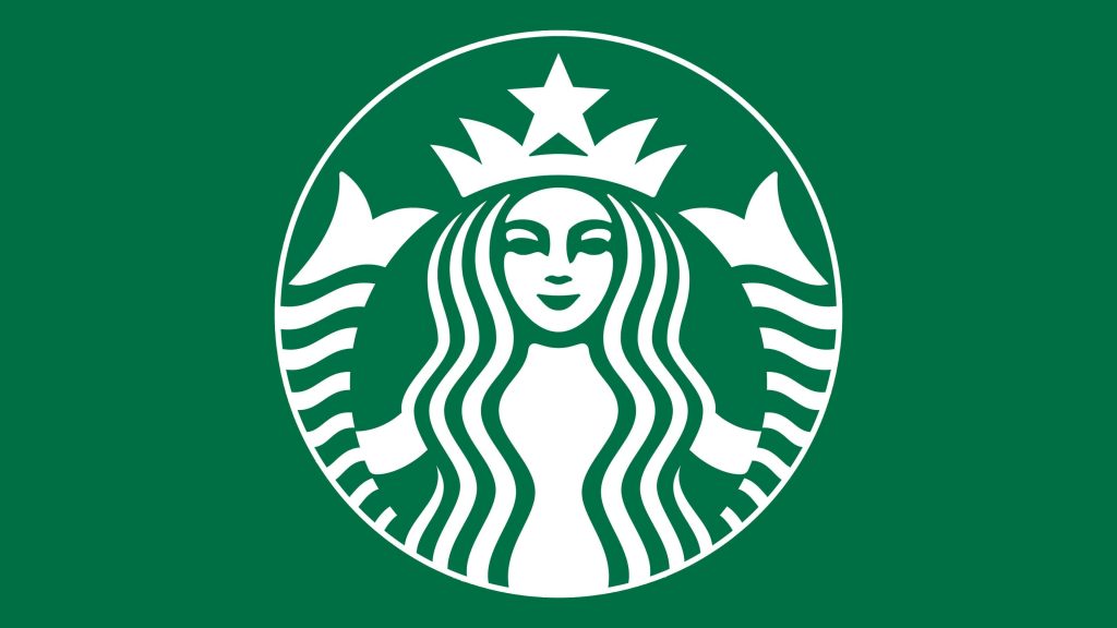
The 2008 and 2011 updates responded to Starbucks’ growing international presence and the need for a logo that was culturally adaptable. In 2011, during its 40th-anniversary celebration, Starbucks took a bold step by removing the outer ring text entirely, allowing the emblematic siren to stand alone. This move was a testament to the brand’s confidence in its global recognition and the universal appeal of its uncoupled design.
2011 – today
Removing Text for a More Universal Icon
By eliminating the text, Starbucks highlighted the siren as the singular brand iconography, symbolizing a global, language-neutral identity. The siren had already achieved the level of fame where her image alone could evoke the Starbucks brand in any cultural setting, emphasizing the company’s emphasis on visual communications in diverse regions.
A Deeper Dive into the Logo’s Design Elements
Iconography of the Siren
Origin of the Siren Mythology and Appropriation for Branding
The siren’s mythological roots provide rich symbolism for Starbucks. Associated with enchantment and desire, the siren represents Starbucks’ promise of irresistible coffee experiences. By choosing a figure from mythology, Starbucks imbued its brand with mysticism, hinting that every cup of coffee offers a story and an experience.
Symbolism and Public Perception of the Siren
Over time, the public has come to associate the Starbucks siren with more than mythological allure. She symbolizes a lifestyle choice, representing global connections and sophisticated tastes. This perception complements Starbucks’ image as a purveyor of exclusive and indulgent coffee experiences, forging an emotional bond with consumers.
Typography and Style
Evolution of Font Choices Throughout Starbucks’ History
Starbucks has seen an evolution from rustic to refined font styles in different components of its branding. Although the main logo now lacks text, the typography used in other Starbucks branding and marketing materials features clean, modern fonts that communicate clarity and approachability.
Consistency and Changes in Typography Style and Their Marketing Impact
Consistency in the peripheral use of typography across digital and print channels ensures Starbucks maintains a coherent brand voice. While the siren stands alone, the fonts continue to reinforce Starbucks’ sophisticated yet accessible positioning. This strategy ensures the brand’s communications resonate with various audiences, contributing to an enduring brand legacy.
Color Palette and Aesthetic
Analysis of the Signature Green: Psychological Effects and Market Positioning
Green is a color imbued with complex psychological implications. It’s associated with nature, health, and serenity, which complements Starbucks’ image as an environmentally conscious and consumer-friendly brand. This color aids in positioning Starbucks as a rejuvenating and socially responsible choice, enhancing customer trust in a crowded beverage market.
Balance and Harmony in Design – Modernism vs. Tradition
Starbucks’ pursuit of balance and design harmony reflects their commitment to modernism without abandoning tradition. This approach aids in creating a brand identity that is dynamic and evolved, yet firmly rooted in its iconic heritage. This equilibrium ensures Starbucks can remain relevant while cherishing its origins, appealing across generations and cultures.
Designing an AI-Inspired Logo Like Starbucks
Understanding Branding Needs
Designing a logo that embodies a brand’s essence, much like Starbucks’ siren, requires a blend of art and strategic insight.
Determining Core Values and Brand Personality That the Logo Should Embody
Identifying what makes a brand unique is the first step in logo creation. In Starbucks’ case, the siren aligns with core values of quality, mystery, and sophistication. Any new brand must pinpoint similar values and express them powerfully through design.
Evaluating the Target Audience and Market Trends
Understanding the intended audience is crucial for resonating with customers. Evaluating demographics and market trends ensures the logo will not only attract but also communicate effectively with its target market. Starbucks keeps this principle central, reflecting inclusivity and universal appeal.
Utilizing AILogocreator.io

Step-by-Step Guide to Creating a Logo Using AI Logo Creator
AILogocreator.io simplifies the process of crafting logos, leveraging artificial intelligence to match design preferences with business needs. This modern tool offers:
- Inputting Brand Name and Industry: Begin by providing basic brand identifiers to contextualize the design.
- Choosing a Fitting Style and Color Scheme: Select colors and styles that reflect brand personality while considering market appeal, just as Starbucks’ green conveys eco-conscious sophistication.
- Customizing with Fonts, Icons, and Other Elements: Use intuitive tools to modify fonts and iconography, ensuring brand values are communicated effectively.
- Previewing and Finalizing the Design: Evaluate different iterations to select a design that aligns with core brand messages.
- Downloading and Utilizing the Industry-Standard Files: Ensure the final design is available across necessary formats for coherent branding implementation.
Advantages of AI in Modern Logo Design
- Speed and Efficiency in Creating Designs: AI expedites the creative process, allowing businesses to focus on brand development without extended design cycles.
- Customized Suggestions Based on Industry Trends: AI can incorporate emerging trends, ensuring designs remain competitive and compelling.
Impact of the Logo on Starbucks’ Branding
Market Recognition and Consumer Perception
How the Logo Maintains Brand Consistency and Aids in Recognition
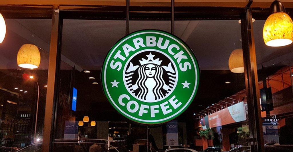
Starbucks’ logo plays a central role in brand consistency, ensuring every customer interaction is infused with familiarity and trust. Its simple yet powerful imagery is like a beacon, guiding brand communication across diverse markets and enhancing recognition.
starbucks brand logo:
Case Studies or Surveys on Public Perception of Starbucks’ Logo
Numerous studies highlight Starbucks’ logo as a brilliant case study in effective brand management. Consumers consistently cite the logo as one of the most recognizable in the world, attributing brand loyalty and trust to its enduring image. Surveys underscore how well the logo supports Starbucks’ position as a leader in quality, consistency, and customer experience.
Influence on Global Expansion
Role of the Logo in Adapting to Various Cultural Markets
Starbucks’ logo allows seamless adaptation into varied cultural marketplaces. The siren transcends language barriers, symbolizing universal quality and alluring experiences, thereby reinforcing Starbucks’ branding in every location it enters.
Testimonies or Feedback from Different International Marketing Campaigns
International campaigns consistently reflect the success of Starbucks’ logo in unifying its global brand presence. Feedback underscores its power in harmonizing local cultural nuances with a cohesive, central brand message. Such campaigns are testaments to its adaptability and global appeal, driving deeper connections with customers worldwide.
Adapting to Digital and Social Media Landscapes
Versatility of the Logo in Digital Formats
The simplified, iconic nature of the Starbucks logo makes it highly versatile in digital spaces. As consumer interactions increasingly migrate online, the logo’s scalability and simplicity ensure visibility and impact across varied digital formats and platforms.
Case Examples of Successful Logo Use in Social Media
Starbucks’ creative use of its logo in social media campaigns highlights its strength in the digital age. From seasonal adaptations to community-driven projects, the logo serves as a central, unifying motif, enhancing messaging and inspiring engagement.
Challenges and Opportunities
Navigating Public Opinion and Controversy
Addressing Branding Controversies and Customer Feedback
Starbucks’ brand has faced scrutiny and adaptation over the years, not least due to changes in its iconic logo. While some changes have been met with skepticism, Starbucks’ adept handling of customer feedback and branding controversies highlights its robust crisis management and PR strategies. They leverage controversy as an opportunity for engagement and dialogue, ensuring the brand evolves based on consumer insights.
Balancing Modern Appeal with Traditional Values
One of Starbucks’ greatest challenges, and concurrent opportunities, is maintaining its modern appeal while staying true to its heritage. As consumer tastes shift, Starbucks must continually adapt its branding strategies to reflect current aesthetics without sacrificing the core elements that have anchored its success.
Future Trends in Logo Design
Predictions on Potential Future Changes and Adaptations
As technology and consumer preferences evolve, so too will the elements in logo design. Future Starbucks logo adaptations will likely emphasize interactivity, adaptability, and sustainability—reflecting both technological advancements and global priorities.
Emerging Trends in AI-Driven Design Processes
AI-driven processes are expected to revolutionize logo design, providing more personalized, data-driven approaches to creativity. Companies like Starbucks may use AI to derive insights from social trends, consumer behaviors, and design innovations to ensure their logo remains competitive and forward-thinking in a dynamic marketplace.
The Timelessness of the Siren
The Starbucks logo narrative, marked by thoughtful evolution and strategic branding, underscores the brand’s journey from a quaint Seattle coffee shop to a global cultural staple. The siren, deeply entrenched in myth and meaning, has become a symbol of universal allure, representing Starbucks’ core values of quality and innovation. As Starbucks navigates the future, balancing innovation with tradition, the siren will continue to guide the brand through new territories, upholding Starbucks’ promise to offer more than just coffee but an unparalleled experience, one cup at a time.
Frequently Asked Questions
Why did Starbucks choose a siren for their logo?
- The siren was chosen for its mythical allure, symbolizing the rich and enticing nature of Starbucks’ coffee. Rooted in maritime folklore, it represents the crashing wave of flavors and experiences that Starbucks invites its customers to explore, aligning perfectly with the founders’ aspirations to beckon coffee lovers with an enchanting promise of quality and depth.
How has the Starbucks logo changed over time?
- The Starbucks logo has evolved through strategic refinements that reflect its brand journey—from a detailed, text-heavy brown design focusing on its offerings in 1971 to the modern, universally recognized green siren that stands alone today. This change mirrors Starbucks’ growth strategy, enhancing modern appeal and minimizing language barriers while maintaining its core symbolic elements.
Why did Starbucks change from brown to green?
- The color shift from brown to green in 1987 was a calculated rebranding move to mark Starbucks’ transition into the café industry, conveying growth, freshness, and sustainability. Green proved more vibrant and inviting, setting the tone for Starbucks’ eco-conscious and health-oriented brand trajectory that has since become a foundational element in its identity.
What is the myth behind the Starbucks logo?
- The two-tailed siren originates from Greek mythology, symbolizing seduction and adventure on the high seas. For Starbucks, it encapsulates the seductive power of quality coffee to entice and captivate, offering each customer a journey into a world of flavor. This enduring symbol bridges Starbucks’ heritage with its modern brand values, cultivating intrigue and connection in every sip.
Who is Starbucks named after?
- Starbucks derives its name from Starbuck, the first mate of the Pequod in Herman Melville’s “Moby-Dick.” This homage reflects a mix of novelistic romance and nautical adventure, echoing the founders’ vision of exoticism and storytelling centered around coffee. Starbuck’s connection to seafaring exploration parallels the brand’s spirit of offering uncharted coffee experiences.
Who is the lady on the Starbucks symbol?
- The iconic lady on the Starbucks logo is a siren, a mythical creature known for her enchanting beauty and mysterious allure. As the company’s emblem, she embodies the captivating quality of Starbucks coffee, designed to attract and immerse consumers in its aromatic world. Her image has been central to communicating the brand’s values, promising indulgence and sophistication.
What does the symbol mean at Starbucks?
- At the heart of Starbucks’ branding, the symbol represents more than just coffee; it signifies a culture of community, storytelling, and innovative spirit. The siren stands as a beacon of the brand’s commitments—quality, unique experiences, and global connection—anchoring Starbucks as not just a purveyor of beverages but as a facilitator of meaningful experiences.
What is the meaning of the two-tailed siren?
- The two-tailed siren harkens back to ancient depictions in Greek mythology, symbolizing seduction and the duality of temptation and satisfaction—apt metaphors for coffee consumption. This imagery relates to Starbucks’ brand philosophy of offering a balanced experience—both indulgent and comforting, a journey into flavors that beckon involvement and familiarity.
What is the Starbucks logo supposed to represent?
- The logo is a visual encapsulation of Starbucks’ ethos—a blend of tradition, allure, and modernity. It captures the brand’s essence of offering more than beverages: it narrates a legacy of innovation and exploration, ties into the roots of imagination, and solidifies Starbucks’ place as a cultural and communal experience provider across the globe.
How does the Starbucks logo influence the brand’s global image?
The Starbucks logo has become synonymous with quality and upscale coffee culture worldwide. It balances classical allure with global modernity, allowing Starbucks to weave its brand narrative into varied cultural tapestries while remaining distinctly recognizable. The logo’s universal appeal fosters an image of inclusivity and excellence, enhancing its stature as a transcultural lifestyle icon.
CommentsTake the first comment