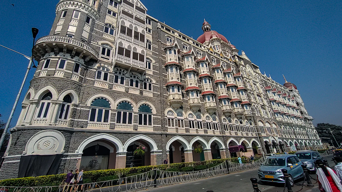
The U.S. hotel market continues to thrive, with annual occupancy rates expected to rise to 63.6 percent. In this bustling industry, a hotel’s logo plays a crucial role in brand image building. A well-designed logo not only creates a visual identity that guests can easily recognize but also establishes trust and credibility. It reflects the hotel’s service philosophy and cultural characteristics, making it a vital aspect of branding. When selecting standout logos, factors like recognition, trust, and positioning are key. These elements help top 10 hotel brands distinguish themselves and attract their target market effectively.
1. Marriott International

Design Elements
Color Scheme
Marriott International‘s logo features a sophisticated color palette that exudes elegance and professionalism. The primary colors, deep red and white, symbolize luxury and purity. This combination creates a striking visual impact, making the logo easily recognizable among the top 10 hotel brands. The use of red conveys warmth and passion, aligning with Marriott’s commitment to providing exceptional guest experiences.
Typography
The typography in Marriott’s logo is clean and modern. It uses a sans-serif font that communicates simplicity and clarity. This choice reflects the brand’s focus on delivering straightforward and reliable services. The bold lettering ensures that the logo stands out, reinforcing Marriott’s position as a leader in the hospitality industry.
Brand Recognition
Historical Context
Marriott International has a rich history that dates back to 1927. Over the years, the brand has evolved, but its logo has consistently maintained elements that honor its heritage. The logo’s design pays homage to the company’s roots while embracing modern aesthetics. This balance between tradition and innovation has helped Marriott remain one of the top 10 hotel brands in the U.S. market.
Market Impact
Marriott’s logo plays a crucial role in its market impact. As a symbol of trust and quality, it attracts a diverse clientele, from business travelers to vacationing families. The logo’s consistent presence across various platforms ensures brand recognition and loyalty. By leveraging platforms like CampaignDrive, Marriott maintains brand consistency at the local level, enhancing its market presence and customer engagement.
2. Hilton Hotels & Resorts
Design Elements
Iconography
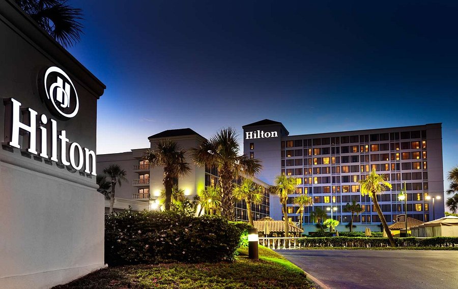
Hilton Hotels & Resorts has a logo that stands out with its distinctive iconography. The logo features a stylized “H” that represents the brand’s commitment to hospitality and excellence. This simple yet effective design element makes it easy for guests to recognize the brand instantly. The “H” serves as a symbol of Hilton’s dedication to providing top-notch service and comfort to its guests. By focusing on a single, memorable icon, Hilton ensures that its logo remains etched in the minds of travelers.
Modernization
Hilton has embraced modernization in its logo design to keep up with the evolving market. The brand has made subtle changes over the years to reflect its growth and transformation. These updates have helped Hilton maintain a fresh and contemporary image while staying true to its roots. The modernized logo aligns with Hilton’s strategy of unifying its brand family and symbolizing its ongoing evolution. This approach not only enhances brand consistency but also differentiates Hilton from other top 10 hotel brands.
Brand Recognition
Global Presence
Hilton’s logo is recognized worldwide, thanks to its extensive global presence. With hotels in over 100 countries, Hilton has established itself as a leader in the hospitality industry. The logo’s consistent use across various platforms reinforces its brand identity and ensures that guests associate it with quality and reliability. Hilton’s global reach allows it to cater to a diverse clientele, making it one of the most recognizable names among the top 10 hotel brands.
Consumer Perception
Consumer perception plays a crucial role in Hilton’s brand recognition. The logo conveys a sense of luxury and trust, which resonates with travelers seeking a premium experience. Hilton’s commitment to modernization and consistency in its logo design has positively influenced consumer perception. Guests view Hilton as a brand that values innovation and excellence, further solidifying its position in the competitive U.S. market. By maintaining a strong and positive image, Hilton continues to attract loyal customers and new guests alike.
3. Hyatt Hotels Corporation
Design Elements
Simplicity
Hyatt Hotels Corporation embraces simplicity in its logo design. The clean and straightforward design reflects the brand’s commitment to providing uncomplicated and seamless experiences for guests. By avoiding unnecessary embellishments, Hyatt ensures that its logo remains easily recognizable and memorable. This approach aligns with the brand’s philosophy of offering straightforward luxury, making it a standout among the top 10 hotel brands.

Versatility
The versatility of Hyatt’s logo allows it to adapt across various platforms and mediums. Whether displayed on hotel signage, digital platforms, or marketing materials, the logo maintains its integrity and impact. This adaptability ensures consistent brand recognition, reinforcing Hyatt’s position in the competitive hospitality market. The logo’s design accommodates different cultural contexts, appealing to a diverse global audience.
Brand Recognition
Innovation
Hyatt’s commitment to innovation is evident in its brand recognition strategy. The company continually seeks new ways to enhance guest experiences, and its logo reflects this forward-thinking approach. By incorporating modern design elements, Hyatt stays relevant and appealing to contemporary travelers. This focus on innovation sets Hyatt apart from other top 10 hotel brands, attracting guests who value cutting-edge hospitality.
Market Position
Hyatt’s strong market position is bolstered by its recognizable logo. The logo serves as a symbol of quality and reliability, fostering trust among guests. Hyatt’s strategic use of its logo across various channels ensures that it remains a prominent player in the U.S. hotel market. The brand’s emphasis on simplicity and versatility in its logo design contributes to its enduring appeal and success.
4. InterContinental Hotels Group (IHG)
Design Elements
Symbolism
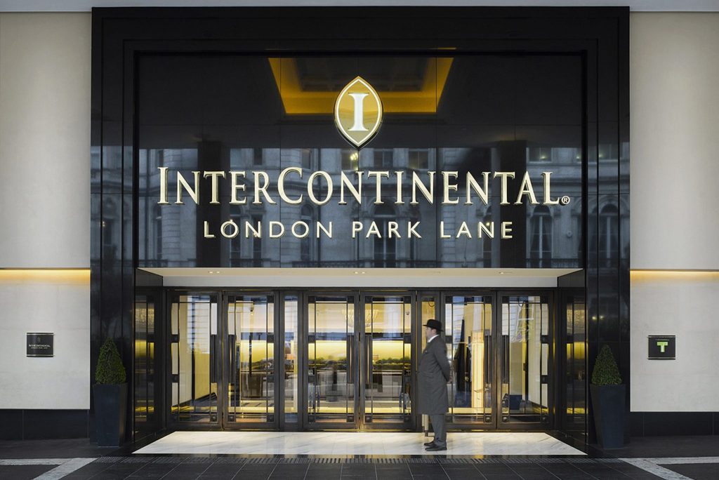
InterContinental Hotels Group (IHG) uses symbolism effectively in its logo design. The logo features a globe, representing the brand’s extensive global reach and commitment to international hospitality. This symbol conveys a sense of adventure and exploration, appealing to travelers who seek unique experiences. The globe also signifies IHG’s dedication to connecting people and cultures, making it a standout among the top 10 hotel brands.
Consistency
Consistency plays a crucial role in IHG’s logo design. The brand maintains a uniform look across all its properties and marketing materials. This consistency ensures that guests recognize the IHG logo wherever they go, reinforcing brand identity and trust. A strong and consistent brand can significantly impact a hotel’s success by creating memorable guest experiences that keep customers coming back. IHG’s commitment to consistency helps it maintain a strong presence in the competitive hospitality market.
Brand Recognition
Heritage
IHG’s rich heritage contributes to its brand recognition. Established in 1946, the brand has a long history of providing exceptional hospitality services. The logo reflects this heritage by incorporating elements that honor its past while embracing modern design trends. This blend of tradition and innovation helps IHG stand out among the top 10 hotel brands, attracting guests who appreciate a brand with a storied history.
Customer Loyalty
Customer loyalty is a key aspect of IHG’s brand recognition strategy. The logo serves as a symbol of quality and reliability, fostering trust among guests. IHG’s commitment to delivering exceptional service and memorable experiences encourages repeat visits and builds a loyal customer base. By maintaining a consistent and recognizable logo, IHG strengthens its connection with guests, ensuring they return time and again.
5. Wyndham Hotels & Resorts
Design Elements
Boldness
Wyndham Hotels & Resorts showcases boldness in its logo design. The logo features strong lines and a confident typeface, which immediately grabs attention. This bold approach reflects Wyndham’s commitment to making a significant impact in the hospitality industry. By choosing a design that stands out, Wyndham ensures that its logo remains memorable among the top 10 hotel brands. The boldness of the logo symbolizes the brand’s ambition and readiness to lead in the market.

Adaptability
Adaptability is another key element of Wyndham’s logo design. The logo seamlessly fits across various platforms, from digital media to physical signage. This flexibility allows Wyndham to maintain a consistent brand image, no matter where guests encounter it. The logo’s adaptability also means it can evolve with the brand, accommodating changes in design trends and consumer preferences. As Anne Smith, Vice President of Brand Management and Design, once said, “This redesigned logo serves as a beacon for the new Comfort. It’s more than a change of symbol, it’s a symbol of change.” Wyndham’s logo embodies this philosophy, adapting to meet the needs of a dynamic market.
Brand Recognition
Expansion
Wyndham’s logo plays a crucial role in its expansion strategy. As the brand grows its presence globally, the logo acts as a familiar symbol for travelers. It represents the quality and reliability that guests expect from Wyndham properties. The logo’s widespread recognition helps the brand attract new customers and retain loyal ones. By leveraging its logo, Wyndham can effectively communicate its values and offerings to a broader audience, solidifying its place among the top 10 hotel brands.
Brand Evolution
The evolution of Wyndham’s logo reflects the brand’s journey and growth. Over the years, Wyndham has updated its logo to align with its evolving brand strategy. These changes ensure that the logo remains relevant and appealing to modern travelers. A strong and consistent brand, as noted by industry experts, can significantly impact a hotel’s success. Wyndham’s commitment to evolving its logo demonstrates its dedication to staying ahead in the competitive hospitality market. This ongoing evolution helps Wyndham maintain a fresh and contemporary image, appealing to both new and returning guests.
6. Choice Hotels International
Design Elements
Distinctiveness
Choice Hotels International stands out with its distinctive logo design. The logo features a bold and modern typeface that captures attention. This choice reflects the brand’s commitment to innovation and excellence. The use of vibrant colors adds a touch of energy and dynamism, making the logo memorable among the top 10 hotel brands. By focusing on distinctiveness, Choice Hotels ensures that its logo remains easily recognizable to travelers.
Cohesion
Cohesion plays a vital role in the design of Choice Hotels’ logo. The elements of the logo work harmoniously to create a unified brand image. This cohesion extends across all platforms, from digital media to physical signage. By maintaining a consistent look, Choice Hotels reinforces its brand identity and builds trust with guests. The cohesive design reflects the brand’s dedication to providing a seamless and enjoyable experience for travelers.
Brand Recognition
Market Reach
Choice Hotels boasts an impressive market reach, with properties located across the globe. The logo serves as a symbol of quality and reliability, attracting a diverse clientele. As Brian Quinn, head of development at Choice Hotels, stated, “The Comfort brand is unstoppable.” This statement highlights the brand’s growth and expansion, with nearly 300 properties in its pipeline. The widespread recognition of the logo helps Choice Hotels maintain its position among the top 10 hotel brands.
Brand Strategy
The brand strategy of Choice Hotels focuses on delivering exceptional guest experiences. The redesigned logo acts as a beacon for the brand’s transformation. Anne Smith, vice president of brand management and design, emphasized, “It’s more than a change of symbol, it’s a symbol of change.” This transformation includes renovating lobbies and upgrading guest rooms to provide a consistent and up-to-date experience. By investing in the brand, Choice Hotels strengthens its connection with guests and enhances its market presence.
7. Best Western Hotels & Resorts
Design Elements
Tradition
Best Western Hotels & Resorts embraces tradition in its logo design. The logo features a classic blue and gold color scheme, which evokes a sense of reliability and trust. These colors have been part of the brand’s identity for decades, making it instantly recognizable among travelers. The traditional elements in the logo reflect Best Western’s long-standing commitment to providing quality service and comfort to its guests. This dedication to tradition helps the brand maintain its position among the top 10 hotel brands.
Innovation
While tradition plays a significant role, Best Western also incorporates innovation into its logo design. The brand has updated its logo over the years to keep up with modern design trends. The current logo features a sleek and contemporary font that adds a touch of modernity to the traditional color palette. This blend of tradition and innovation ensures that Best Western remains relevant and appealing to today’s travelers. By balancing these elements, the brand successfully attracts both loyal customers and new guests.
Brand Recognition
Reputation
Best Western’s reputation is a cornerstone of its brand recognition. The logo serves as a symbol of the brand’s commitment to delivering exceptional hospitality experiences. Guests associate the logo with quality and reliability, which enhances their trust in the brand. Best Western’s strong reputation helps it stand out among the top 10 hotel brands, attracting a diverse clientele seeking dependable accommodations.
Consumer Trust
Consumer trust is vital for Best Western’s brand recognition. The logo plays a crucial role in building and maintaining this trust. Guests recognize the logo as a mark of quality and consistency, which reassures them of a positive experience. Best Western’s dedication to upholding high standards of service fosters consumer trust and loyalty. This trust ensures that guests return to Best Western properties time and again, solidifying the brand’s position in the competitive hospitality market.
8. Radisson Hotel Group
Design Elements
Elegance
Radisson Hotel Group‘s logo exudes elegance with its sleek and refined design. The choice of a minimalist style reflects the brand’s commitment to providing a sophisticated experience for its guests. The logo’s clean lines and understated color palette create a sense of luxury without being overly ostentatious. This elegant design appeals to travelers who appreciate subtlety and class, making Radisson a preferred choice among discerning guests.

Simplicity
Simplicity is at the heart of Radisson’s logo design. By focusing on essential elements, the brand ensures that its logo remains easily recognizable and memorable. The straightforward design communicates clarity and reliability, qualities that guests seek in a hotel brand. This simplicity also allows the logo to be versatile, adapting seamlessly across various platforms and media. Radisson’s commitment to simplicity in its logo design reinforces its dedication to providing uncomplicated and enjoyable guest experiences.
Brand Recognition
Global Strategy
Radisson Hotel Group employs a robust global strategy to enhance its brand recognition. The recent rebranding of prizeotel to Prize by Radisson exemplifies this approach. By expanding its presence in Central Europe, Radisson strengthens its market position and increases brand awareness. This strategic move aligns with the group’s dedication to growth and innovation. The consistent use of the Radisson logo across all properties ensures that guests associate it with quality and excellence, reinforcing the brand’s global reputation.
Brand Identity
Radisson’s brand identity centers around delivering exceptional hospitality experiences. The logo serves as a visual representation of this commitment, symbolizing the brand’s values and ethos. By maintaining a consistent and recognizable logo, Radisson builds trust and loyalty among its guests. The logo’s design reflects the brand’s focus on elegance and simplicity, appealing to travelers who value these qualities. Radisson’s strong brand identity helps it stand out in the competitive hospitality market, attracting both new and returning guests.
9. La Quinta Inns & Suites
Design Elements
Vibrancy
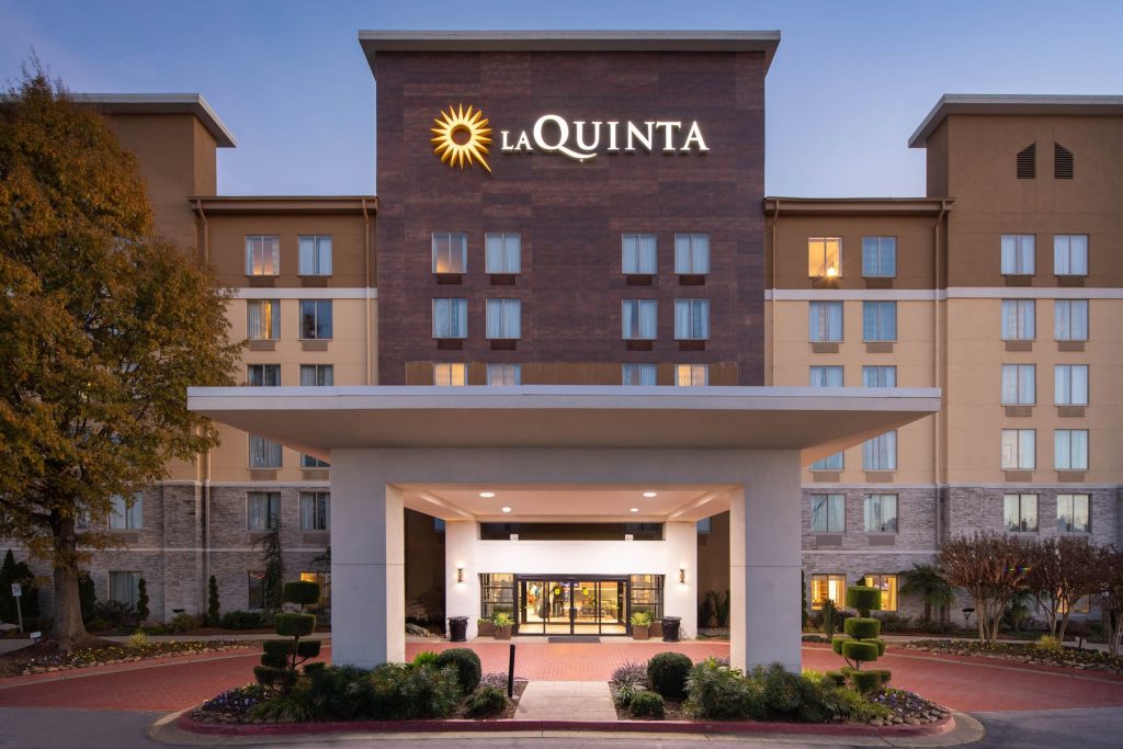
La Quinta Inns & Suites captures attention with its vibrant logo design. The bright yellow sunburst icon symbolizes warmth and energy, inviting guests to experience a welcoming stay. This lively color choice sets La Quinta apart, making it easily recognizable. The vibrancy of the logo reflects the brand’s commitment to providing a cheerful and comfortable environment for travelers.
Approachability
The approachable design of La Quinta’s logo plays a crucial role in its appeal. The friendly font and simple layout convey a sense of ease and accessibility. Guests feel at home when they see the logo, knowing they can expect a pleasant and hassle-free experience. This approachability aligns with La Quinta’s mission to offer quality accommodations at an affordable price, making it a favorite among budget-conscious travelers.
Brand Recognition
Market Niche
La Quinta has carved out a unique market niche by focusing on providing value-driven hospitality. The logo serves as a symbol of this commitment, attracting guests who seek comfort without breaking the bank. By targeting this specific market segment, La Quinta has established itself as a reliable choice for both business and leisure travelers. The brand’s consistent presence in key locations enhances its recognition and appeal.
Customer Engagement
Customer engagement is at the heart of La Quinta’s brand strategy. The logo acts as a familiar touchpoint, fostering a sense of connection with guests. La Quinta actively engages with its audience through loyalty programs and personalized services. This focus on customer satisfaction builds trust and encourages repeat visits. By maintaining a strong relationship with its guests, La Quinta ensures its place among the top 10 hotel brands in the U.S. market.
10. Four Seasons Hotels and Resorts

Design Elements
Luxury
Four Seasons Hotels and Resorts epitomizes luxury through its logo design. The logo features a sophisticated tree emblem, symbolizing growth, strength, and elegance. This design choice reflects the brand’s commitment to providing an unparalleled level of service and comfort. The use of a refined color palette enhances the sense of opulence, making the logo instantly recognizable to those seeking a high-end experience. By focusing on luxury, Four Seasons ensures that its logo resonates with guests who value exclusivity and sophistication.

Timelessness
Timelessness is a hallmark of the Four Seasons logo. The design has remained consistent over the years, maintaining its classic appeal while subtly adapting to modern aesthetics. This timeless quality ensures that the logo remains relevant and appealing to both long-time patrons and new guests. The enduring design reflects the brand’s dedication to offering experiences that transcend trends, providing guests with a sense of continuity and reliability. By embracing timelessness, Four Seasons reinforces its position as a leader in the luxury hospitality market.
Brand Recognition
Prestige
Prestige is at the core of Four Seasons’ brand recognition. The logo serves as a symbol of the brand’s esteemed reputation, attracting discerning travelers from around the world. Guests associate the logo with exceptional service, exquisite accommodations, and unforgettable experiences. This prestigious image sets Four Seasons apart from other hotel brands, making it a preferred choice for those seeking the finest in hospitality. The logo’s consistent presence across various platforms reinforces its prestigious status, ensuring that guests recognize and trust the brand.
The challenge is to use AI to design a hotel brand logo
Design:AILogocreator.io

CommentsTake the first comment